- Power BI forums
- Updates
- News & Announcements
- Get Help with Power BI
- Desktop
- Service
- Report Server
- Power Query
- Mobile Apps
- Developer
- DAX Commands and Tips
- Custom Visuals Development Discussion
- Health and Life Sciences
- Power BI Spanish forums
- Translated Spanish Desktop
- Power Platform Integration - Better Together!
- Power Platform Integrations (Read-only)
- Power Platform and Dynamics 365 Integrations (Read-only)
- Training and Consulting
- Instructor Led Training
- Dashboard in a Day for Women, by Women
- Galleries
- Community Connections & How-To Videos
- COVID-19 Data Stories Gallery
- Themes Gallery
- Data Stories Gallery
- R Script Showcase
- Webinars and Video Gallery
- Quick Measures Gallery
- 2021 MSBizAppsSummit Gallery
- 2020 MSBizAppsSummit Gallery
- 2019 MSBizAppsSummit Gallery
- Events
- Ideas
- Custom Visuals Ideas
- Issues
- Issues
- Events
- Upcoming Events
- Community Blog
- Power BI Community Blog
- Custom Visuals Community Blog
- Community Support
- Community Accounts & Registration
- Using the Community
- Community Feedback
Register now to learn Fabric in free live sessions led by the best Microsoft experts. From Apr 16 to May 9, in English and Spanish.
- Power BI forums
- Forums
- Get Help with Power BI
- Desktop
- Project Management - Dynamic Matrix Headers to sho...
- Subscribe to RSS Feed
- Mark Topic as New
- Mark Topic as Read
- Float this Topic for Current User
- Bookmark
- Subscribe
- Printer Friendly Page
- Mark as New
- Bookmark
- Subscribe
- Mute
- Subscribe to RSS Feed
- Permalink
- Report Inappropriate Content
Project Management - Dynamic Matrix Headers to show resources
HI friends,
for those in the projet management space, I have a tough nut to crack and i'm looking for your help. The goal is to analyse the allocation of tasks for a given resource and see whether they're overallocated. I'm looking to display this inforamtion via a line curve and a matrix visual
Active variables: Start Date, End Date, Work effort (hours), task, responsible
Matrix Visual specs:
- Columns would be displayed dynamically in the matrix, only the the dates between start/end date would appear
- Rows would show the tasks for a given resource
- Values would be the linear distribution of the hours over the duration
i.e. if a task has 100 hours of effort over a duration of 50 days = 2 hours per day that is applied linearly
Curve spec:
- display the cummulative amount of work for a given resource per day
I would add a slicer to allow me to switch between resources
Bonus: If this can be switched to show weeks, months, quarters and years dynamically
Let me know if you have any questions.
Thanks
- Jay
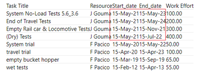
here's some sample data
| Task Title | Resource | Start_date | End_date | Work Effort |
| System No-Load Tests 5.6_3.6 | J Gouma | 15-May-21 | 15-May-23 | 100.00 |
| End of Travel Tests | J Gouma | 15-May-21 | 15-May-24 | 200.00 |
| Empty Rail car & Locomotive Tests | J Gouma | 15-May-21 | 15-Nov-21 | 300.00 |
| (Dry) Tests | J Gouma | 15-May-21 | 15-Jul-22 | 400.00 |
| System trial | F Pacico | 15-May-20 | 15-May-22 | 50.00 |
| travel trial | F Pacico | 15-Apr-20 | 15-Apr-23 | 100.00 |
| empty bucket hopper | F Pacico | 15-Mar-19 | 15-Sep-19 | 65.00 |
| wet tests | F Pacico | 15-Feb-12 | 15-Apr-13 | 55.00 |
- Mark as New
- Bookmark
- Subscribe
- Mute
- Subscribe to RSS Feed
- Permalink
- Report Inappropriate Content
Hi @Anonymous
Based on your description,
-
Goal:
to analyse the allocation of tasks for a given resource and see whether they're overallocated
Visual:
a line curve and a matrix visual
-
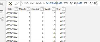
It would be better if you have a calendar table. It’s easy to create one if you don’t have. Your startdate is between 2012,2.15 – 2021,5,15, so I create a calendar table between 2012,2.15 – 2021,5,15 in my sample file.
Then create 4 columns: week, month, quarter, year,
Then we can switch to show weeks, months, quarters and years dynamically by using slicers as you want.
-
Sorry for not understanding your words “Values would be the linear distribution of the hours over the duration i.e. if a task has 100 hours of effort over a duration of 50 days = 2 hours per day that is applied linearly ”
could your add more details? I don’t know what should be put in the value of matrix.. so I just put work effort of your sample data into matrix.
Besides, it’s also not clear that “display the cummulative amount of work for a given resource per day”. Because there are several same resources and several different date periods for a given resource in your sample data. Do you want to summarize the amount from different periods? It would be better to give an example.
Best Regards,
Community Support Team _ Tang
If this post helps, please consider Accept it as the solution to help the other members find it more quickly.
Helpful resources

Microsoft Fabric Learn Together
Covering the world! 9:00-10:30 AM Sydney, 4:00-5:30 PM CET (Paris/Berlin), 7:00-8:30 PM Mexico City

Power BI Monthly Update - April 2024
Check out the April 2024 Power BI update to learn about new features.

| User | Count |
|---|---|
| 109 | |
| 98 | |
| 77 | |
| 66 | |
| 54 |
| User | Count |
|---|---|
| 144 | |
| 104 | |
| 100 | |
| 86 | |
| 64 |


