- Power BI forums
- Updates
- News & Announcements
- Get Help with Power BI
- Desktop
- Service
- Report Server
- Power Query
- Mobile Apps
- Developer
- DAX Commands and Tips
- Custom Visuals Development Discussion
- Health and Life Sciences
- Power BI Spanish forums
- Translated Spanish Desktop
- Power Platform Integration - Better Together!
- Power Platform Integrations (Read-only)
- Power Platform and Dynamics 365 Integrations (Read-only)
- Training and Consulting
- Instructor Led Training
- Dashboard in a Day for Women, by Women
- Galleries
- Community Connections & How-To Videos
- COVID-19 Data Stories Gallery
- Themes Gallery
- Data Stories Gallery
- R Script Showcase
- Webinars and Video Gallery
- Quick Measures Gallery
- 2021 MSBizAppsSummit Gallery
- 2020 MSBizAppsSummit Gallery
- 2019 MSBizAppsSummit Gallery
- Events
- Ideas
- Custom Visuals Ideas
- Issues
- Issues
- Events
- Upcoming Events
- Community Blog
- Power BI Community Blog
- Custom Visuals Community Blog
- Community Support
- Community Accounts & Registration
- Using the Community
- Community Feedback
Register now to learn Fabric in free live sessions led by the best Microsoft experts. From Apr 16 to May 9, in English and Spanish.
- Power BI forums
- Forums
- Get Help with Power BI
- Desktop
- Production Rates by Time
- Subscribe to RSS Feed
- Mark Topic as New
- Mark Topic as Read
- Float this Topic for Current User
- Bookmark
- Subscribe
- Printer Friendly Page
- Mark as New
- Bookmark
- Subscribe
- Mute
- Subscribe to RSS Feed
- Permalink
- Report Inappropriate Content
Production Rates by Time
Hey Guys,
I need to calculate the percentage a machine is on by day, week, month, and year and show this data graphically (line graph). The values outputted from the machine are in seconds and shown below. Is there a way I can use this data to determine the seconds on/ seconds off by day, week, month, and year to show the "Machine on Percentage" only counting days when it is in production - days it has an output of duration (in seconds) for? Meaning some days the factory is not in operation so I dont want to use that day in the calculation.
Thanks!
Data looks like this:
StartDateTime | Duration | EndDateTime |
1/14/2016 8:16 | 202.3 | 1/14/2016 8:19 |
1/14/2016 8:19 | 13.2 | 1/14/2016 8:20 |
1/14/2016 8:20 | 323.6 | 1/14/2016 8:25 |
1/14/2016 8:25 | 19.4 | 1/14/2016 8:25 |
1/14/2016 8:28 | 204.8 | 1/14/2016 8:31 |
1/14/2016 8:31 | 12.9 | 1/14/2016 8:32 |
1/14/2016 8:32 | 357.2 | 1/14/2016 8:38 |
1/14/2016 8:38 | 18.9 | 1/14/2016 8:38 |
- Mark as New
- Bookmark
- Subscribe
- Mute
- Subscribe to RSS Feed
- Permalink
- Report Inappropriate Content
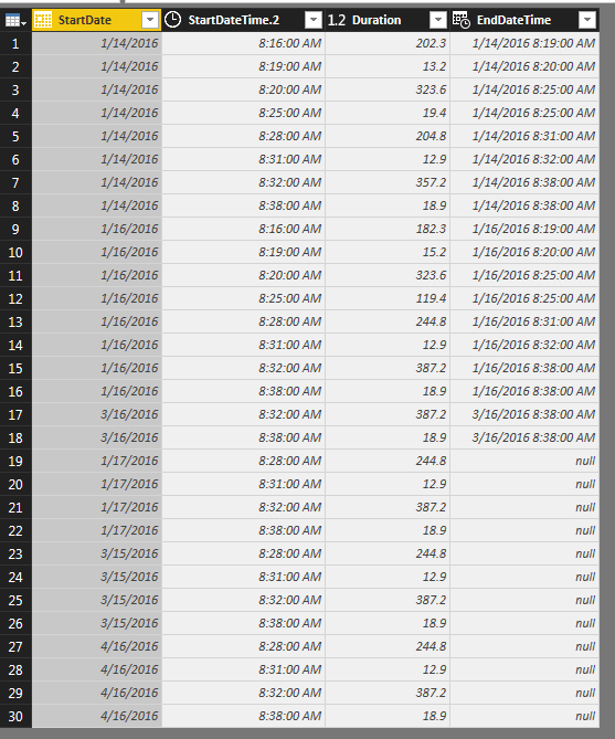
I broke up your Start Date to just the date with a SPLIT when it was in TXT format. Now that we only have a date, PowerBI automatically converted it into Date format as shown below. Now that we have a Date & Duration, we don't need End Time.
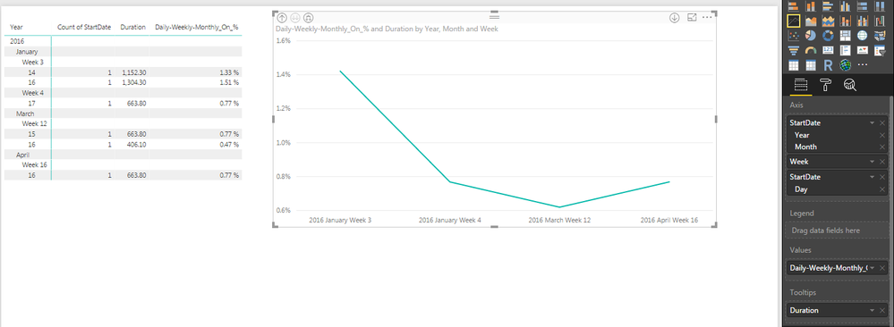
I'm not sure if this is what you had in mind, but trying to graph Daily / Weekly / Monthly seperatly, only works if you DON'T change the timeframe of the visual. I was beating my head on the wall trying to figure out why Weekly & Monthly were always the same value, when I realized when I zoomed out to a Monthly level, the calculated value changed to adjust to the zoom duration.
As a result, I created ONE Measure that autoamatically adjusts depending on the level you look at the data. See below where I have 'daily' level on the Matrix and 'weekly' level on the Line Chart. If you zoom either of these In/Out the line (or value) correctly adjust to accomidate the new level automatically.
Daily-Weekly-Monthly_On_% = SUM(Table1[Duration]) / (86400 * DISTINCTCOUNT(Table1[StartDate]) )
What you can't do, is expect a Daily 1.22% line to stay at 1.22 % when the visual is backed up to the Week level. PowerBI by default will try to SUM the Daily figures, but that's not correct. This is why I'm sicking with the one Measure...
** The AXIS heiarchy is important to put in this order if you want the Visaul(s) to correctly Zoom In/Out in Year / Month / Week / Daily order! **
Forrest
Please give Kudos or Mark as a Solution!
https://www.linkedin.com/in/forrest-hill-04480730/
Proud to give back to the community!
Thank You!
Helpful resources

Microsoft Fabric Learn Together
Covering the world! 9:00-10:30 AM Sydney, 4:00-5:30 PM CET (Paris/Berlin), 7:00-8:30 PM Mexico City

Power BI Monthly Update - April 2024
Check out the April 2024 Power BI update to learn about new features.

| User | Count |
|---|---|
| 110 | |
| 99 | |
| 79 | |
| 64 | |
| 57 |
| User | Count |
|---|---|
| 143 | |
| 109 | |
| 89 | |
| 84 | |
| 66 |


