- Power BI forums
- Updates
- News & Announcements
- Get Help with Power BI
- Desktop
- Service
- Report Server
- Power Query
- Mobile Apps
- Developer
- DAX Commands and Tips
- Custom Visuals Development Discussion
- Health and Life Sciences
- Power BI Spanish forums
- Translated Spanish Desktop
- Power Platform Integration - Better Together!
- Power Platform Integrations (Read-only)
- Power Platform and Dynamics 365 Integrations (Read-only)
- Training and Consulting
- Instructor Led Training
- Dashboard in a Day for Women, by Women
- Galleries
- Community Connections & How-To Videos
- COVID-19 Data Stories Gallery
- Themes Gallery
- Data Stories Gallery
- R Script Showcase
- Webinars and Video Gallery
- Quick Measures Gallery
- 2021 MSBizAppsSummit Gallery
- 2020 MSBizAppsSummit Gallery
- 2019 MSBizAppsSummit Gallery
- Events
- Ideas
- Custom Visuals Ideas
- Issues
- Issues
- Events
- Upcoming Events
- Community Blog
- Power BI Community Blog
- Custom Visuals Community Blog
- Community Support
- Community Accounts & Registration
- Using the Community
- Community Feedback
Register now to learn Fabric in free live sessions led by the best Microsoft experts. From Apr 16 to May 9, in English and Spanish.
- Power BI forums
- Forums
- Get Help with Power BI
- Desktop
- Problem showing values from two different tables b...
- Subscribe to RSS Feed
- Mark Topic as New
- Mark Topic as Read
- Float this Topic for Current User
- Bookmark
- Subscribe
- Printer Friendly Page
- Mark as New
- Bookmark
- Subscribe
- Mute
- Subscribe to RSS Feed
- Permalink
- Report Inappropriate Content
Problem showing values from two different tables based on dates
Hi,
I´m pretty new to Power BI and not a dev so please bear with me.
Im trying to show a combined graph with data from two tables based on dates. Both tables have a date column with date/time. I have tried e few different thing I found googling, but nothing works.
I first tried to create a new table by combining the dates from the two tables and then create relationships from both tables to the new one, no dice, got error messages in the raltionship view that I could not figure out (relationship was set up as "original table" -> "New date table" as a many to one (there are multiple lines on the same dates in the original tables).
I then tried to create a date table based on the "Calendar" funtion and then making the same relations to this table, no errors in the raltionship view this time, but using the count from the original table with the new date table in a graph now creates an emty graph???
Can not share my data here based on sensitivity, but would be very happy if someone can point me to a working solution or ask me for more info if needed.
Br
/Micke
- Mark as New
- Bookmark
- Subscribe
- Mute
- Subscribe to RSS Feed
- Permalink
- Report Inappropriate Content
Hi @mwitt2
Sorry, I don't quite understand what you need.
I guess what you need is to merge the date columns in the two tables and remove duplicates.i will put my pbix file in the end and you can reference.
Date1 table
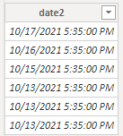
Date2 table
Create a new table
New Table =
DISTINCT(
    UNION(
        DISTINCT( 'date1'[date1] ),
        DISTINCT( 'date2'[date2] )
    )
)
Result:
Best Regards
Community Support Team _ chenwu zhu
If this post helps, then please consider Accept it as the solution to help the other members find it more quickly.
- Mark as New
- Bookmark
- Subscribe
- Mute
- Subscribe to RSS Feed
- Permalink
- Report Inappropriate Content
Hi and thanks for the attention. This part is not the problem, I have already been able to join the two date/time rows from table1 and table2 in to a new timetable. Also created the ralations from table1 dates/time and table2 date/time to the new datetime table, but the outcome is still not what I expected.
When creating the graph I use the date/time from the new datetable as the x-axis, but add the measures from table1 and table2 on the Y-axis. This produces an interesting result....it does show the series from table1, but only the values from table2 when there is a perfect match on the date/time, not the unique date/time for all values, so eigther this is expected or something is broken, either way, I can not achieve the wanted result.
- Mark as New
- Bookmark
- Subscribe
- Mute
- Subscribe to RSS Feed
- Permalink
- Report Inappropriate Content
Hi @mwitt2
You need create relationships between table1 table2 and New date table like the following screenshot:
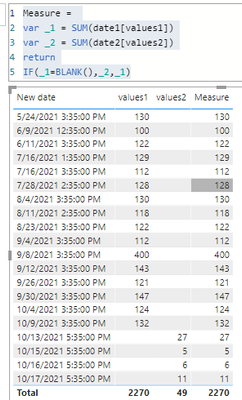
And try measure like this
Measure =
VAR _1 =
    SUM( date1[values1] )
VAR _2 =
    SUM( date2[values2] )
RETURN
    IF( _1 = BLANK(), _2, _1 )
Result:
If the result doesn’t you except ,please provide your example pbix file without sensitivity data.
Best Regards
Community Support Team _ chenwu zhu
If this post helps, then please consider Accept it as the solution to help the other members find it more quickly.
- Mark as New
- Bookmark
- Subscribe
- Mute
- Subscribe to RSS Feed
- Permalink
- Report Inappropriate Content
Thanks, well I´ll try to illustrate what I´m trying to do, but creating new tables, etc seems a bit like overkill:
I have two tables that I would like to pull values from and show on the same timeseries chart. The values are a simple count, should not matter in this case
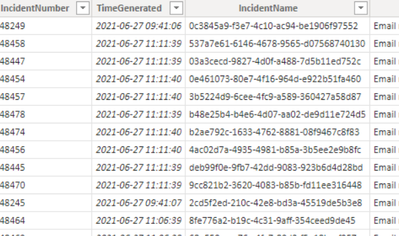
Table1
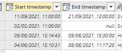
Table2
Trying to just plot this in the same graph using the date/time series from one of the tables does not work (makes sense), the second series will just create an line following the first series and not two independet series of data in the same graph.
Reading up on possible solutions, I ran in to this post (link) suggesting to create a new datetable and pull in both date columns from both tables, then create the relationships from both table1 and table2 and use the new datetable for the x-axis.
Formula for creating the datetable:
TimeTable = DISTINCT(UNION(DISTINCT('Table1'[Time]),DISTINCT('Table2'[Time])))This did not work and gave errors in the relationship view (not any real good data in the error), just presented the warning sign, Looking at the newly created relation, the date-column for the newly created table just read repeated "Error" on each row.
Ok, so I then tried a new solution I found, namelly to use the "Calendar" function (link). Created the table spanning multiple years and then created relations from table1 and table2 to this datetable. This did not create any errors in the relations view, but using the the datetable values for the timeseries generates an empty graph, so no dice.
I hope this at least clarifies the case a bit more, if there are specifics you need, please let me know, but I do not have time to generate the dummy data, etc.
Br
/Micke
- Mark as New
- Bookmark
- Subscribe
- Mute
- Subscribe to RSS Feed
- Permalink
- Report Inappropriate Content
Just a thought...table1 and table2 contains date and time, the created datetable using the "Calendar" function is date only (looking at the field as date/time field shows format like 2021-09-03 00:00:00), so this will not match any date and time records in table1 and table2, right?
- Mark as New
- Bookmark
- Subscribe
- Mute
- Subscribe to RSS Feed
- Permalink
- Report Inappropriate Content
Ok, just verified it myself, does not work with the "Calendar" function for the date table as it is exact match that is required, so I guess my hope is on the first solution that should build the datetable with all existing timestamps...
- Mark as New
- Bookmark
- Subscribe
- Mute
- Subscribe to RSS Feed
- Permalink
- Report Inappropriate Content
Hi @mwitt2 ,
welcome to the forum. Appreciate that you are new to powerbi and the learning curve is steep.
We don't really know how to help you at the moment so you'll have to provide some more details please.
Ideally, if you could fake some data(only has to be a few rows - and not a picture but some data) and post it here with your desired output and an explanation of how to get from a to b, that would be great.
Helpful resources

Microsoft Fabric Learn Together
Covering the world! 9:00-10:30 AM Sydney, 4:00-5:30 PM CET (Paris/Berlin), 7:00-8:30 PM Mexico City

Power BI Monthly Update - April 2024
Check out the April 2024 Power BI update to learn about new features.

| User | Count |
|---|---|
| 109 | |
| 96 | |
| 77 | |
| 66 | |
| 54 |
| User | Count |
|---|---|
| 144 | |
| 104 | |
| 102 | |
| 88 | |
| 63 |


