- Power BI forums
- Updates
- News & Announcements
- Get Help with Power BI
- Desktop
- Service
- Report Server
- Power Query
- Mobile Apps
- Developer
- DAX Commands and Tips
- Custom Visuals Development Discussion
- Health and Life Sciences
- Power BI Spanish forums
- Translated Spanish Desktop
- Power Platform Integration - Better Together!
- Power Platform Integrations (Read-only)
- Power Platform and Dynamics 365 Integrations (Read-only)
- Training and Consulting
- Instructor Led Training
- Dashboard in a Day for Women, by Women
- Galleries
- Community Connections & How-To Videos
- COVID-19 Data Stories Gallery
- Themes Gallery
- Data Stories Gallery
- R Script Showcase
- Webinars and Video Gallery
- Quick Measures Gallery
- 2021 MSBizAppsSummit Gallery
- 2020 MSBizAppsSummit Gallery
- 2019 MSBizAppsSummit Gallery
- Events
- Ideas
- Custom Visuals Ideas
- Issues
- Issues
- Events
- Upcoming Events
- Community Blog
- Power BI Community Blog
- Custom Visuals Community Blog
- Community Support
- Community Accounts & Registration
- Using the Community
- Community Feedback
Register now to learn Fabric in free live sessions led by the best Microsoft experts. From Apr 16 to May 9, in English and Spanish.
- Power BI forums
- Forums
- Get Help with Power BI
- Desktop
- Problem in stacked column chart with a percentage ...
- Subscribe to RSS Feed
- Mark Topic as New
- Mark Topic as Read
- Float this Topic for Current User
- Bookmark
- Subscribe
- Printer Friendly Page
- Mark as New
- Bookmark
- Subscribe
- Mute
- Subscribe to RSS Feed
- Permalink
- Report Inappropriate Content
Problem in stacked column chart with a percentage line
Hi all.
I'm trying to add a line to a stacked column chart in which I have two numerical values. I need to add a line which corresponds to the percentage of the 2 column chart values in termos of one of the 2 values. In other words, I want to calculate the following:
Value 1/ (Value 1+Value 2)*100.
The point here is that I'm representing these 2 values by "business" (shared axis) so that what I actually need is having the percentage of the final calculation by business, as if I was taking directly the final calculation from the column chart. I hope I put it clear....
To sum up, I can't make calculations from the table columns data, but from the final calculations....
Thanks a lot in advance for your kindness.
Solved! Go to Solution.
- Mark as New
- Bookmark
- Subscribe
- Mute
- Subscribe to RSS Feed
- Permalink
- Report Inappropriate Content
Hi @lcg,
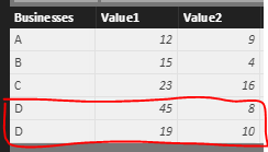
Based on your description, “the only thing I have is two column values and another column called "business"” means your table have three columns, two columns values and one business value, whose structure is same like me. The different is that the correspondent value may belong to one business or another, like the following sample data, right?
When you create a line and stacked column chart, it will category by each business.
Best Regards,
Angelia
- Mark as New
- Bookmark
- Subscribe
- Mute
- Subscribe to RSS Feed
- Permalink
- Report Inappropriate Content
Hi @lcg,
Based on my understanding, you want to represent the Value1/Value2 by business column, and add the percentage as line chart, right? If it is, I try to reproduce your scenario and get expected result.
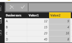
First, I create the sample data like the following picture.
Then create a calculated column using the formula below.
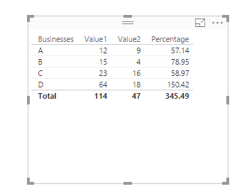
Percentage = Test[Value1]/(Test[Value1]+Test[Value2])*100
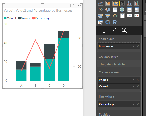
Finally, create a line and stacked column chart, select the Business column as shared axis, the Value1/ Value2 as column as Column values, Percentage column as Line values. And you will get the expected result as the following screenshot.
If this is not what you want, please share more details, or post the sample data for further analysis.
Best Regards,
Angelia
- Mark as New
- Bookmark
- Subscribe
- Mute
- Subscribe to RSS Feed
- Permalink
- Report Inappropriate Content
Thanks a lot, v-huizhn-msft.
You understood welll.
The point is that I do not have any table with the values by business. The only thing I have is two column values and another column called "business" in which the correspondent value may belong to one business or another. in other words, the resulting operations you added are made "internally" by power BI.
Of course, in order to get to your point I could use office or another program to do the neccessary calculations, but I was wondering if I could calculate everything directly using Power BI.
I really appreciate your help and time.
- Mark as New
- Bookmark
- Subscribe
- Mute
- Subscribe to RSS Feed
- Permalink
- Report Inappropriate Content
Hi @lcg,
Based on your description, “the only thing I have is two column values and another column called "business"” means your table have three columns, two columns values and one business value, whose structure is same like me. The different is that the correspondent value may belong to one business or another, like the following sample data, right?
When you create a line and stacked column chart, it will category by each business.
Best Regards,
Angelia
- Mark as New
- Bookmark
- Subscribe
- Mute
- Subscribe to RSS Feed
- Permalink
- Report Inappropriate Content
Does nobody know any solution?? :-/.
Thank you.
Helpful resources

Microsoft Fabric Learn Together
Covering the world! 9:00-10:30 AM Sydney, 4:00-5:30 PM CET (Paris/Berlin), 7:00-8:30 PM Mexico City

Power BI Monthly Update - April 2024
Check out the April 2024 Power BI update to learn about new features.

| User | Count |
|---|---|
| 109 | |
| 95 | |
| 77 | |
| 66 | |
| 53 |
| User | Count |
|---|---|
| 144 | |
| 105 | |
| 102 | |
| 89 | |
| 63 |


