- Power BI forums
- Updates
- News & Announcements
- Get Help with Power BI
- Desktop
- Service
- Report Server
- Power Query
- Mobile Apps
- Developer
- DAX Commands and Tips
- Custom Visuals Development Discussion
- Health and Life Sciences
- Power BI Spanish forums
- Translated Spanish Desktop
- Power Platform Integration - Better Together!
- Power Platform Integrations (Read-only)
- Power Platform and Dynamics 365 Integrations (Read-only)
- Training and Consulting
- Instructor Led Training
- Dashboard in a Day for Women, by Women
- Galleries
- Community Connections & How-To Videos
- COVID-19 Data Stories Gallery
- Themes Gallery
- Data Stories Gallery
- R Script Showcase
- Webinars and Video Gallery
- Quick Measures Gallery
- 2021 MSBizAppsSummit Gallery
- 2020 MSBizAppsSummit Gallery
- 2019 MSBizAppsSummit Gallery
- Events
- Ideas
- Custom Visuals Ideas
- Issues
- Issues
- Events
- Upcoming Events
- Community Blog
- Power BI Community Blog
- Custom Visuals Community Blog
- Community Support
- Community Accounts & Registration
- Using the Community
- Community Feedback
Register now to learn Fabric in free live sessions led by the best Microsoft experts. From Apr 16 to May 9, in English and Spanish.
- Power BI forums
- Forums
- Get Help with Power BI
- Desktop
- Pretty new to Power BI and DAX.
- Subscribe to RSS Feed
- Mark Topic as New
- Mark Topic as Read
- Float this Topic for Current User
- Bookmark
- Subscribe
- Printer Friendly Page
- Mark as New
- Bookmark
- Subscribe
- Mute
- Subscribe to RSS Feed
- Permalink
- Report Inappropriate Content
Pretty new to Power BI and DAX.
Hello everyone!
I'm pretty new to Power BI and DAX. I was referred to this by my colleague who wants me to find out if we can use it as an instrument to provide data to our clients. We used to use scheduling software that did all this us, but were forced switch to a more limited one for this project. So any help would be appreciated 🙂
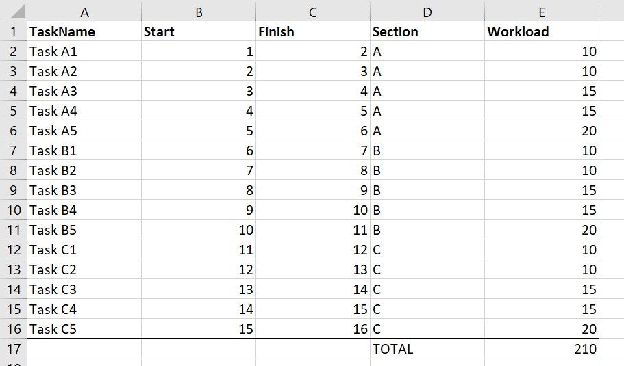
We have data similar to Pic1, with task names and dates and so on.
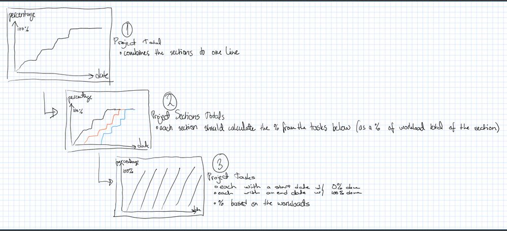
The big idea here is to able to show the relevant data to people. The flow would be in the Draft1 (and because I drew it myself I'll be explaining it here :D)
(1) In the first level of the line chart we want to show the overall timeline for our project
(2) After that we want to provide more detailed data for the separate sections of the project
(3) And thirdly we want to show what is happening in those sections by laying out the Task progress.
I've been going through tutorials and try-and-fail for a couple of days now. I'm able to do all of them separately, except #3. In Pic2 is a illustration how I solved them individually in their own charts.
So my questions:
1: Is it possible to create a drillthrough chart including all the 3 steps?
2: Is there a better way to create a line chart for step 3 (date on x-axis, percentage on y, lines for the tasks start at 0% on start date and end at 100% on the end date) than create a new table for each task and calculate the values for each day?
Solved! Go to Solution.
- Mark as New
- Bookmark
- Subscribe
- Mute
- Subscribe to RSS Feed
- Permalink
- Report Inappropriate Content
Alrighty, thanks for your reply Seward12533!
It indeed is quite a bit different and yet it isn't 😄 Or at least the very basic is similar to PowerPivoting in Excel or so because with that logic I was able to create the first simple visualizations.
I found and tried the Gantt Chart visuals, it might work but we get Gantt from the scheduling software and linear / location-based / flowchart type would be preferred.
But I will discuss with my colleague about your answer and my other findings to see if this is something we want to do / learn.
Thanks again!
- Mark as New
- Bookmark
- Subscribe
- Mute
- Subscribe to RSS Feed
- Permalink
- Report Inappropriate Content
It can do that but will involve learning how PowerBI works (its a very different paradigm that traditional Excel), how to write measures including cumulative sums, filter using calculate, bookmarks to hide/display charts to emulate you drill through, slicers to set up slicers.
Its actually farily easy but the level of understanding is not trivial. But the folks on this site are great so we can guide you as you learn. For best results you may want to maintain two powerbi workbooks one wiht your actual date and one with represtnative (non-confidential) data that you can upload to a public file sharing service (i.e. OneDrive, Box, Google Drive...) and then share and past a link here.
To answer your last question - I woudl use the the GANNT visual form the store for th elast one. And can either have on separate tabs of the report you click through or use Bookmarks to hide and display different charts on the same page by using the bookmarks pane in conjunction with the selection pane.
- Mark as New
- Bookmark
- Subscribe
- Mute
- Subscribe to RSS Feed
- Permalink
- Report Inappropriate Content
Alrighty, thanks for your reply Seward12533!
It indeed is quite a bit different and yet it isn't 😄 Or at least the very basic is similar to PowerPivoting in Excel or so because with that logic I was able to create the first simple visualizations.
I found and tried the Gantt Chart visuals, it might work but we get Gantt from the scheduling software and linear / location-based / flowchart type would be preferred.
But I will discuss with my colleague about your answer and my other findings to see if this is something we want to do / learn.
Thanks again!
Helpful resources

Microsoft Fabric Learn Together
Covering the world! 9:00-10:30 AM Sydney, 4:00-5:30 PM CET (Paris/Berlin), 7:00-8:30 PM Mexico City

Power BI Monthly Update - April 2024
Check out the April 2024 Power BI update to learn about new features.

| User | Count |
|---|---|
| 112 | |
| 100 | |
| 76 | |
| 74 | |
| 49 |
| User | Count |
|---|---|
| 146 | |
| 108 | |
| 106 | |
| 90 | |
| 62 |


