- Power BI forums
- Updates
- News & Announcements
- Get Help with Power BI
- Desktop
- Service
- Report Server
- Power Query
- Mobile Apps
- Developer
- DAX Commands and Tips
- Custom Visuals Development Discussion
- Health and Life Sciences
- Power BI Spanish forums
- Translated Spanish Desktop
- Power Platform Integration - Better Together!
- Power Platform Integrations (Read-only)
- Power Platform and Dynamics 365 Integrations (Read-only)
- Training and Consulting
- Instructor Led Training
- Dashboard in a Day for Women, by Women
- Galleries
- Community Connections & How-To Videos
- COVID-19 Data Stories Gallery
- Themes Gallery
- Data Stories Gallery
- R Script Showcase
- Webinars and Video Gallery
- Quick Measures Gallery
- 2021 MSBizAppsSummit Gallery
- 2020 MSBizAppsSummit Gallery
- 2019 MSBizAppsSummit Gallery
- Events
- Ideas
- Custom Visuals Ideas
- Issues
- Issues
- Events
- Upcoming Events
- Community Blog
- Power BI Community Blog
- Custom Visuals Community Blog
- Community Support
- Community Accounts & Registration
- Using the Community
- Community Feedback
Register now to learn Fabric in free live sessions led by the best Microsoft experts. From Apr 16 to May 9, in English and Spanish.
- Power BI forums
- Forums
- Get Help with Power BI
- Desktop
- Premier League Fantasy Football League PBI Report
- Subscribe to RSS Feed
- Mark Topic as New
- Mark Topic as Read
- Float this Topic for Current User
- Bookmark
- Subscribe
- Printer Friendly Page
- Mark as New
- Bookmark
- Subscribe
- Mute
- Subscribe to RSS Feed
- Permalink
- Report Inappropriate Content
Premier League Fantasy Football League PBI Report
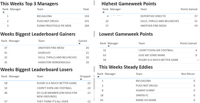
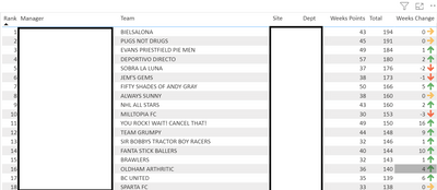
I am new to this community and to using PBI. I have created a report for our work Fantasy Football (Soccer) league for the Premier League 20/21 season. Examples of my report are shown below. Whilst I am pleased with the results I am finding the data generation side a bit more involved than I would like.
For each week of the competition I have to create 3 new columns in the Excel file used for the report, Weeks points, weeks rank on the league and change from previous week. I then have to update the report every week and use the new data in a lot of the visualisations, is there any way I would simplify things to make use of the most up to date data?
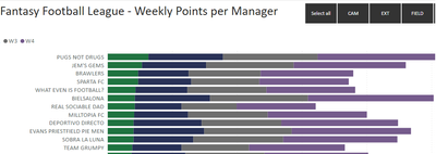
For the weekly points by manager visualisation how can I get it to sort by the most recent weeks data, at present it looks to be sorting by the first weeks data as this is the first field of data used in the visualisation.
Solved! Go to Solution.
- Mark as New
- Bookmark
- Subscribe
- Mute
- Subscribe to RSS Feed
- Permalink
- Report Inappropriate Content
Hi @Anonymous ,
I don't have much experience with scatter charts but let me take a look at a solution.
Regards
Miguel Félix
Did I answer your question? Mark my post as a solution!
Proud to be a Super User!
Check out my blog: Power BI em Português- Mark as New
- Bookmark
- Subscribe
- Mute
- Subscribe to RSS Feed
- Permalink
- Report Inappropriate Content
Hi @Anonymous ,
This has to do with the context of the measure change your Points in week to
Points in week =
CALCULATE (
    SUM ( Points[Points] );
    FILTER (
        ALLSELECTED ( Weeks[Week]; Weeks[Week_Value] );
        Weeks[Week] = MAX ( Weeks[Week] )
    )
)
    - CALCULATE (
        SUM ( Points[Points] );
        FILTER (
            ALLSELECTED ( Weeks[Week]; Weeks[Week_Value] );
            Weeks[Week]
                = MAX ( Weeks[Week] ) - 1
        )
    )
Be aware that this change implies that if you only select one week on your slicer you will get the total points for that week better to use a slicer that is the less than or equal. Doing that then you canalso have the weekly points related with the slicer.
PBIX file attach.
Regards
Miguel Félix
Did I answer your question? Mark my post as a solution!
Proud to be a Super User!
Check out my blog: Power BI em Português- Mark as New
- Bookmark
- Subscribe
- Mute
- Subscribe to RSS Feed
- Permalink
- Report Inappropriate Content
Hi Miguel,
Thanks for your quick reply to my post - I could not see how to upload a file in this community so I enclose a picture of the Excel file I am using with notes displayed, I hope it is sufficient to explain how I am working. I have my Data in a Table in an Excel worksheet.
- Mark as New
- Bookmark
- Subscribe
- Mute
- Subscribe to RSS Feed
- Permalink
- Report Inappropriate Content
Hi @Anonymous ,
Here is a small change on your setup basically I have 3 tables:
- Points
- Team
- Week
- Points (cumulative total per week)
- Teams (Details about the teams information I have added and ID that relates with points)
- Dept
- Manager
- Name
- Site
- Team
- Weeks
- A dimension table to filter and make calculation easier no the weekly values
So has you can see I don't have any other big transformations.
Then added the following measures:
Points
Current points =
CALCULATE (
    SUM ( Points[Points] );
    FILTER ( Weeks; Weeks[Week] = MAX ( Weeks[Week] ) )
)
Points in week =
SUM ( Points[Points] )
    - CALCULATE (
        SUM ( Points[Points] );
        FILTER ( ALL ( Weeks[Week] ); Weeks[Week] = SELECTEDVALUE ( Weeks[Week] ) - 1 )
    )
Rankings
Rank In Week = RANKX(ALLSELECTED(Teams[Name]);CALCULATE([Points in week]))

Total Rank = RANKX(ALLSELECTED(Teams[Name]);CALCULATE([Current points]))

Total Rank previous week =
RANKX (
    ALLSELECTED ( Teams[Name] );
    CALCULATE (
        [Current points];
        FILTER ( ALL ( Weeks[Week] ); Weeks[Week] = MAX ( Weeks[Week] ) - 1 )
    )
)

Rank Variation = [Total Rank previous week] - [Total Rank]
Titles
Title = "Overal Points (Week " & MAX(Points[Week])&")"

Title week = "Total Points per Team (Week " & MAX(Points[Week]) &")"
Now just setup your visualizations:
Check PBIX file attach.
This is just one example and additional interactions can be provided.
Regards
Miguel Félix
Did I answer your question? Mark my post as a solution!
Proud to be a Super User!
Check out my blog: Power BI em Português- Mark as New
- Bookmark
- Subscribe
- Mute
- Subscribe to RSS Feed
- Permalink
- Report Inappropriate Content
Hi Felix,
I really appreciate you taking the time to explain things and to provide an example. It all looks good and is a lot slicker than my original approach.
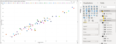
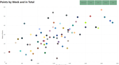
I have had a look at the example file and I have a question about creating the scatter graph. Currently I replace the field used for the vertical axis once a week, using the current weeks points - the horizontal axis uses the total points so that does not change. I had a quick trial but could not figure out which field to use for the vertical axis. Is there a way of having a field that calculates the most recent weeks points?
- Mark as New
- Bookmark
- Subscribe
- Mute
- Subscribe to RSS Feed
- Permalink
- Report Inappropriate Content
Hi @Anonymous ,
I don't have much experience with scatter charts but let me take a look at a solution.
Regards
Miguel Félix
Did I answer your question? Mark my post as a solution!
Proud to be a Super User!
Check out my blog: Power BI em Português- Mark as New
- Bookmark
- Subscribe
- Mute
- Subscribe to RSS Feed
- Permalink
- Report Inappropriate Content
Hi Miguel,
I have had a play around with visualisations in the sample file you provided, for the scatter chart I am close but not quite there. I think what is needed is a calculation to determine the points won for each team for the most recent week, this would be plotted on the Y Axis - in the example illustrated the points per week being used on the Y axis are a much higher figure than the total points to date on the X axis, the X Axis values are true. The result is very close to what I had achieved in a less elegant and more labour intensive approach.
At present the Y Axis values are cumulative points in total rather than the points for the most recent week which is what would make the scatter graph exactly what I am expecting.
- Mark as New
- Bookmark
- Subscribe
- Mute
- Subscribe to RSS Feed
- Permalink
- Report Inappropriate Content
Hi @Anonymous ,
This has to do with the context of the measure change your Points in week to
Points in week =
CALCULATE (
    SUM ( Points[Points] );
    FILTER (
        ALLSELECTED ( Weeks[Week]; Weeks[Week_Value] );
        Weeks[Week] = MAX ( Weeks[Week] )
    )
)
    - CALCULATE (
        SUM ( Points[Points] );
        FILTER (
            ALLSELECTED ( Weeks[Week]; Weeks[Week_Value] );
            Weeks[Week]
                = MAX ( Weeks[Week] ) - 1
        )
    )
Be aware that this change implies that if you only select one week on your slicer you will get the total points for that week better to use a slicer that is the less than or equal. Doing that then you canalso have the weekly points related with the slicer.
PBIX file attach.
Regards
Miguel Félix
Did I answer your question? Mark my post as a solution!
Proud to be a Super User!
Check out my blog: Power BI em Português- Mark as New
- Bookmark
- Subscribe
- Mute
- Subscribe to RSS Feed
- Permalink
- Report Inappropriate Content
Perfecto, thank you very much for sharing your knowledge and experience
- Mark as New
- Bookmark
- Subscribe
- Mute
- Subscribe to RSS Feed
- Permalink
- Report Inappropriate Content
Hi @Anonymous ,
I believe that you don't need to have any other information than the team/player information, week and points in the week.
Using measures or calculated columns you can create the rankings and make the comparisions with previous weeks, and also make the total calculation for YTD also with the rankings and values.
If you can provide a sample of data and the tables you have in your model. You can also provide the columns with the ranks and change for previous week so I can compare the calculations I make with the final result.
You can use a onedrive, google drive, we transfer or similar link to upload your files.
If the information is sensitive please share it trough private message.
Regards
Miguel Félix
Did I answer your question? Mark my post as a solution!
Proud to be a Super User!
Check out my blog: Power BI em PortuguêsHelpful resources

Microsoft Fabric Learn Together
Covering the world! 9:00-10:30 AM Sydney, 4:00-5:30 PM CET (Paris/Berlin), 7:00-8:30 PM Mexico City

Power BI Monthly Update - April 2024
Check out the April 2024 Power BI update to learn about new features.

| User | Count |
|---|---|
| 113 | |
| 100 | |
| 78 | |
| 76 | |
| 52 |
| User | Count |
|---|---|
| 144 | |
| 109 | |
| 108 | |
| 88 | |
| 61 |
