- Power BI forums
- Updates
- News & Announcements
- Get Help with Power BI
- Desktop
- Service
- Report Server
- Power Query
- Mobile Apps
- Developer
- DAX Commands and Tips
- Custom Visuals Development Discussion
- Health and Life Sciences
- Power BI Spanish forums
- Translated Spanish Desktop
- Power Platform Integration - Better Together!
- Power Platform Integrations (Read-only)
- Power Platform and Dynamics 365 Integrations (Read-only)
- Training and Consulting
- Instructor Led Training
- Dashboard in a Day for Women, by Women
- Galleries
- Community Connections & How-To Videos
- COVID-19 Data Stories Gallery
- Themes Gallery
- Data Stories Gallery
- R Script Showcase
- Webinars and Video Gallery
- Quick Measures Gallery
- 2021 MSBizAppsSummit Gallery
- 2020 MSBizAppsSummit Gallery
- 2019 MSBizAppsSummit Gallery
- Events
- Ideas
- Custom Visuals Ideas
- Issues
- Issues
- Events
- Upcoming Events
- Community Blog
- Power BI Community Blog
- Custom Visuals Community Blog
- Community Support
- Community Accounts & Registration
- Using the Community
- Community Feedback
Register now to learn Fabric in free live sessions led by the best Microsoft experts. From Apr 16 to May 9, in English and Spanish.
- Power BI forums
- Forums
- Get Help with Power BI
- Desktop
- Re: spoRe: PowerBI - Comparison visualisation with...
- Subscribe to RSS Feed
- Mark Topic as New
- Mark Topic as Read
- Float this Topic for Current User
- Bookmark
- Subscribe
- Printer Friendly Page
- Mark as New
- Bookmark
- Subscribe
- Mute
- Subscribe to RSS Feed
- Permalink
- Report Inappropriate Content
PowerBI - Comparison visualisation within a dataset using two filters of the same column
Hi All,
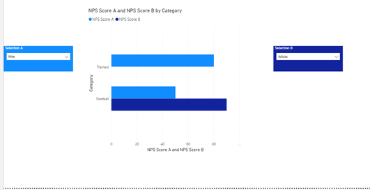
I am developing a tool on PowerBI and trying to create a comparison visualisation that allows me to apply two filters on the same dataset. I have created a sample visualisation below, which I was able to produce by duplicating the original table. However I would like a solution where I do not need to duplicate the table as this doubles the amount of data - and is causing space capacity issues.

As you can see from the visual i have selected two brands so that i can directly compare them across 'category'
Here is the sample dataset:-
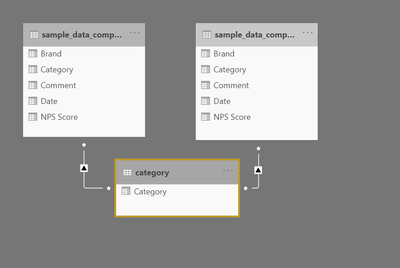
And to make the above visualisation work i had to copy the table by creating a duplicate. Now this works, but effectively doubles the size of the data on the tool, which is not feasible for me. Can anybody recommend an alternative please? Example of data model i used for this visualisation:-
Thanks in advance!
Solved! Go to Solution.
- Mark as New
- Bookmark
- Subscribe
- Mute
- Subscribe to RSS Feed
- Permalink
- Report Inappropriate Content
@Anonymous
You can try selecting the chart and going into Y axis. Here you can change Inner padding to, like, 5, so the bars don't look so scrawny. You can also ramp up the Minimum category width a bit for th same reason, although be careful as this will push your bars off the bounds of the chart if put up too high.
You can also Go to Legend and adjust where this sits to help with the balance of the visual.
Other than these little tweaks, there's not much else you can do. A bar chart is never going to look great with loads of data points on it, it's more for clear, low-volume, comparisons I think.
Maybe try switching to Clustered column chart and see if you find this a bit easier on the eye.
Pete
Now accepting Kudos! If my post helped you, why not give it a thumbs-up?
Proud to be a Datanaut!
- Mark as New
- Bookmark
- Subscribe
- Mute
- Subscribe to RSS Feed
- Permalink
- Report Inappropriate Content
Hi @Anonymous ,
Sorry if I'm oversimplifying this, but can't you just multiselect the brands in your dropdown list A so they both show on the chart?
Either ctrl+click on the second comparison brand on the dropdown, or select the slicer and go to Selection Controls and switch off 'Multi-select with CTRL' so you can just click on/off brands in the drop down.
Pete
Now accepting Kudos! If my post helped you, why not give it a thumbs-up?
Proud to be a Datanaut!
- Mark as New
- Bookmark
- Subscribe
- Mute
- Subscribe to RSS Feed
- Permalink
- Report Inappropriate Content
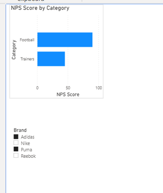
Thanks for your response Pete. If i do that then it aggregates the brands opposed to allowing me to view their scores individually and compare. I.e it would look like this, which is not what i am after..
- Mark as New
- Bookmark
- Subscribe
- Mute
- Subscribe to RSS Feed
- Permalink
- Report Inappropriate Content
Hi @Anonymous
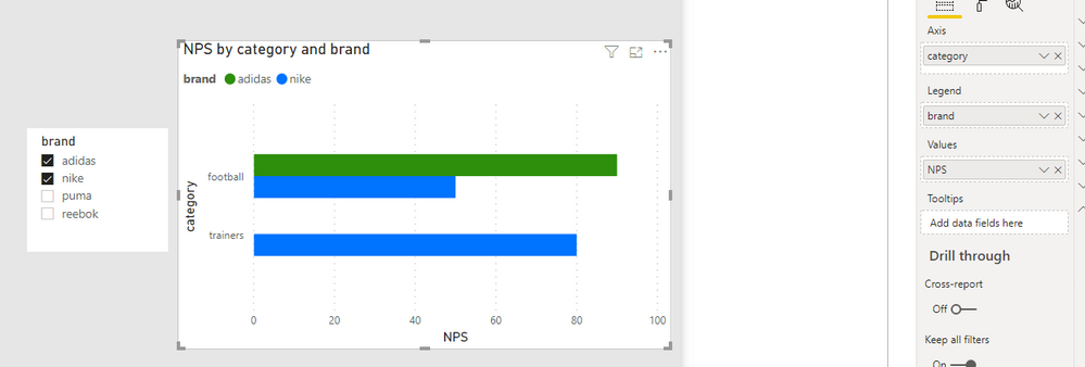
Add the brand into the legend, like this:
Pete
Now accepting Kudos! If my post helped you, why not give it a thumbs-up?
Proud to be a Datanaut!
- Mark as New
- Bookmark
- Subscribe
- Mute
- Subscribe to RSS Feed
- Permalink
- Report Inappropriate Content
That does work Pete. It has less flexibility as you can not aggregate brands together but this could work. Also my actual dataset has tens of brands and so the chart doesn't look great until just 1 or 2 are selected - any workarounds for that?
Thanks,
Anand
- Mark as New
- Bookmark
- Subscribe
- Mute
- Subscribe to RSS Feed
- Permalink
- Report Inappropriate Content
@Anonymous
You can try selecting the chart and going into Y axis. Here you can change Inner padding to, like, 5, so the bars don't look so scrawny. You can also ramp up the Minimum category width a bit for th same reason, although be careful as this will push your bars off the bounds of the chart if put up too high.
You can also Go to Legend and adjust where this sits to help with the balance of the visual.
Other than these little tweaks, there's not much else you can do. A bar chart is never going to look great with loads of data points on it, it's more for clear, low-volume, comparisons I think.
Maybe try switching to Clustered column chart and see if you find this a bit easier on the eye.
Pete
Now accepting Kudos! If my post helped you, why not give it a thumbs-up?
Proud to be a Datanaut!
Helpful resources

Microsoft Fabric Learn Together
Covering the world! 9:00-10:30 AM Sydney, 4:00-5:30 PM CET (Paris/Berlin), 7:00-8:30 PM Mexico City

Power BI Monthly Update - April 2024
Check out the April 2024 Power BI update to learn about new features.

| User | Count |
|---|---|
| 114 | |
| 100 | |
| 78 | |
| 75 | |
| 52 |
| User | Count |
|---|---|
| 144 | |
| 109 | |
| 108 | |
| 88 | |
| 61 |


