- Power BI forums
- Updates
- News & Announcements
- Get Help with Power BI
- Desktop
- Service
- Report Server
- Power Query
- Mobile Apps
- Developer
- DAX Commands and Tips
- Custom Visuals Development Discussion
- Health and Life Sciences
- Power BI Spanish forums
- Translated Spanish Desktop
- Power Platform Integration - Better Together!
- Power Platform Integrations (Read-only)
- Power Platform and Dynamics 365 Integrations (Read-only)
- Training and Consulting
- Instructor Led Training
- Dashboard in a Day for Women, by Women
- Galleries
- Community Connections & How-To Videos
- COVID-19 Data Stories Gallery
- Themes Gallery
- Data Stories Gallery
- R Script Showcase
- Webinars and Video Gallery
- Quick Measures Gallery
- 2021 MSBizAppsSummit Gallery
- 2020 MSBizAppsSummit Gallery
- 2019 MSBizAppsSummit Gallery
- Events
- Ideas
- Custom Visuals Ideas
- Issues
- Issues
- Events
- Upcoming Events
- Community Blog
- Power BI Community Blog
- Custom Visuals Community Blog
- Community Support
- Community Accounts & Registration
- Using the Community
- Community Feedback
Register now to learn Fabric in free live sessions led by the best Microsoft experts. From Apr 16 to May 9, in English and Spanish.
- Power BI forums
- Forums
- Get Help with Power BI
- Desktop
- PowerBI Bin Feature not giving the same result as ...
- Subscribe to RSS Feed
- Mark Topic as New
- Mark Topic as Read
- Float this Topic for Current User
- Bookmark
- Subscribe
- Printer Friendly Page
- Mark as New
- Bookmark
- Subscribe
- Mute
- Subscribe to RSS Feed
- Permalink
- Report Inappropriate Content
PowerBI Bin Feature not giving the same result as Excel FREQUENCY()
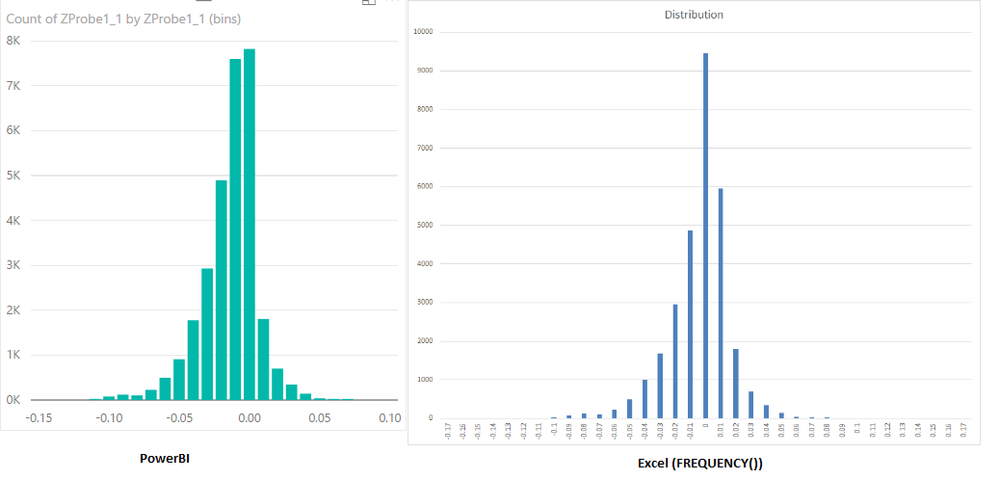
I just tried out the group bin feature in PowerBI desktop, but it seems it doesn't behave the same way as Excel's FREQUENCY() function. See picture. Is there a way make it match how FREQUENCY works? Don't mind the colors and bar widths. I'm talking about the values of the bars being different.
Solved! Go to Solution.
- Mark as New
- Bookmark
- Subscribe
- Mute
- Subscribe to RSS Feed
- Permalink
- Report Inappropriate Content
Hi @carlomendoza,
The Group bin feature in PowerBI desktop is not the same as that in Excel. It only supports specific interval (bin size) that displayed in x-axis. For example, the x-axis can show value like 0,5,10,15,etc, but cannot show values as 0,5,6,8,9,etc. which is supported in Excel. That is the reason why the values of the bars are different.
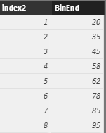
In PowerBI, you can try the workaround below. First, you need a table with bin data and add an index column (in query edit) to it. Use the following formula to add an calculate column:
BinStart =
SUMX (
    FILTER ( BinTable, BinTable[index2] = EARLIER ( BinTable[index2] ) - 1 ),
    BinTable[BinEnd]
)
Then, cross join the Bin table with the table which contains the value columns need to be count. Create a calculate table based on that crossjoin table:
CrossJoin = CROSSJOIN(Bin,BinTable)

NewTable =
CALCULATETABLE (
    'CrossJoin',
    FILTER (
        'CrossJoin',
        'CrossJoin'[Values] > 'CrossJoin'[BinStart]
            && 'CrossJoin'[Values] <= 'CrossJoin'[BinEnd]
    )
)

column = NewTable[BinStart]&"~"&NewTable[BinEnd]
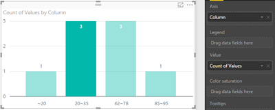
Then, use the last table view to create bar chart.
Thanks,
Yuliana Gu
If this post helps, then please consider Accept it as the solution to help the other members find it more quickly.
- Mark as New
- Bookmark
- Subscribe
- Mute
- Subscribe to RSS Feed
- Permalink
- Report Inappropriate Content
Are there new features that make this easier?
- Mark as New
- Bookmark
- Subscribe
- Mute
- Subscribe to RSS Feed
- Permalink
- Report Inappropriate Content
Yes, now its much easier. PowerBI has a "group" feature that you can use. Simply right click on the Field and select New Group and you can do it that way.
- Mark as New
- Bookmark
- Subscribe
- Mute
- Subscribe to RSS Feed
- Permalink
- Report Inappropriate Content
Hi @carlomendoza,
The Group bin feature in PowerBI desktop is not the same as that in Excel. It only supports specific interval (bin size) that displayed in x-axis. For example, the x-axis can show value like 0,5,10,15,etc, but cannot show values as 0,5,6,8,9,etc. which is supported in Excel. That is the reason why the values of the bars are different.
In PowerBI, you can try the workaround below. First, you need a table with bin data and add an index column (in query edit) to it. Use the following formula to add an calculate column:
BinStart =
SUMX (
    FILTER ( BinTable, BinTable[index2] = EARLIER ( BinTable[index2] ) - 1 ),
    BinTable[BinEnd]
)
Then, cross join the Bin table with the table which contains the value columns need to be count. Create a calculate table based on that crossjoin table:
CrossJoin = CROSSJOIN(Bin,BinTable)

NewTable =
CALCULATETABLE (
    'CrossJoin',
    FILTER (
        'CrossJoin',
        'CrossJoin'[Values] > 'CrossJoin'[BinStart]
            && 'CrossJoin'[Values] <= 'CrossJoin'[BinEnd]
    )
)

column = NewTable[BinStart]&"~"&NewTable[BinEnd]
Then, use the last table view to create bar chart.
Thanks,
Yuliana Gu
If this post helps, then please consider Accept it as the solution to help the other members find it more quickly.
- Mark as New
- Bookmark
- Subscribe
- Mute
- Subscribe to RSS Feed
- Permalink
- Report Inappropriate Content
Hi,
I just found a much easier and faster way to do the same thing. All you have to do is go into edit queries and add a conditional column. Then start from the largest bin and start adding conditions "greater than" next interval. See full example here: http://exceleratorbi.com.au/conditional-columns-power-bi-desktop/
After you add the conditional column, you can then create visuals on that conditional column.
- Mark as New
- Bookmark
- Subscribe
- Mute
- Subscribe to RSS Feed
- Permalink
- Report Inappropriate Content
KUDOS!! It does work, but It takes a loonnggg time to follow & create 3 tables just to put the counts into bins! Wow, excel is much easier, just one simple 10-sec function called "Frequency". Power BI needs to do something about that! But thanks so much for your help!
Helpful resources

Microsoft Fabric Learn Together
Covering the world! 9:00-10:30 AM Sydney, 4:00-5:30 PM CET (Paris/Berlin), 7:00-8:30 PM Mexico City

Power BI Monthly Update - April 2024
Check out the April 2024 Power BI update to learn about new features.

| User | Count |
|---|---|
| 109 | |
| 98 | |
| 80 | |
| 64 | |
| 57 |
| User | Count |
|---|---|
| 145 | |
| 111 | |
| 92 | |
| 84 | |
| 66 |


