- Power BI forums
- Updates
- News & Announcements
- Get Help with Power BI
- Desktop
- Service
- Report Server
- Power Query
- Mobile Apps
- Developer
- DAX Commands and Tips
- Custom Visuals Development Discussion
- Health and Life Sciences
- Power BI Spanish forums
- Translated Spanish Desktop
- Power Platform Integration - Better Together!
- Power Platform Integrations (Read-only)
- Power Platform and Dynamics 365 Integrations (Read-only)
- Training and Consulting
- Instructor Led Training
- Dashboard in a Day for Women, by Women
- Galleries
- Community Connections & How-To Videos
- COVID-19 Data Stories Gallery
- Themes Gallery
- Data Stories Gallery
- R Script Showcase
- Webinars and Video Gallery
- Quick Measures Gallery
- 2021 MSBizAppsSummit Gallery
- 2020 MSBizAppsSummit Gallery
- 2019 MSBizAppsSummit Gallery
- Events
- Ideas
- Custom Visuals Ideas
- Issues
- Issues
- Events
- Upcoming Events
- Community Blog
- Power BI Community Blog
- Custom Visuals Community Blog
- Community Support
- Community Accounts & Registration
- Using the Community
- Community Feedback
Register now to learn Fabric in free live sessions led by the best Microsoft experts. From Apr 16 to May 9, in English and Spanish.
- Power BI forums
- Forums
- Get Help with Power BI
- Desktop
- Power BI clustered chart too long - How to show fu...
- Subscribe to RSS Feed
- Mark Topic as New
- Mark Topic as Read
- Float this Topic for Current User
- Bookmark
- Subscribe
- Printer Friendly Page
- Mark as New
- Bookmark
- Subscribe
- Mute
- Subscribe to RSS Feed
- Permalink
- Report Inappropriate Content
Power BI clustered chart too long - How to show full version?
Hi friends,
I'm creating a clustered column chart for my work with Power BI. However, the number of value is too long that need to use a scroll bar. Therefore, when I export it to powerpoint, it will show as picture which can not move the scroll bar.
How to fix this (mean how Power BI can show the full width of clustered chart?).
One more point. I dont know why the blank space between each column is different?
Thanks a lot.
- Mark as New
- Bookmark
- Subscribe
- Mute
- Subscribe to RSS Feed
- Permalink
- Report Inappropriate Content
Hi @Tumitran_1576,
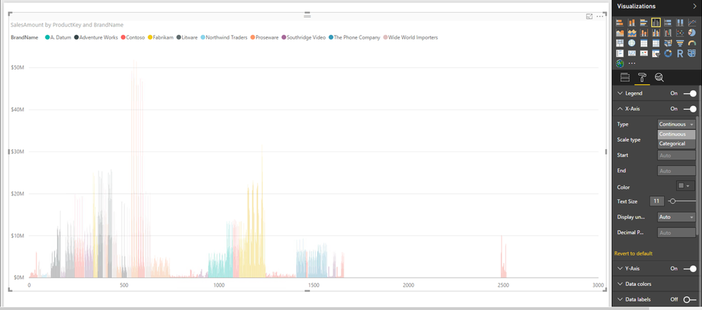
You can change Type of X-Axis from Categorical to Continuous, this way, you will not have scroll bar in clustered column chart. There is an example for your reference.
In addition, as you add a field into Legend section of the chart, the blank space is different. If you remove field from Legend section, you should not get such issue.
Thanks,
Lydia Zhang
If this post helps, then please consider Accept it as the solution to help the other members find it more quickly.
- Mark as New
- Bookmark
- Subscribe
- Mute
- Subscribe to RSS Feed
- Permalink
- Report Inappropriate Content
Thanks @v-yuezhe-msft (Lydia),
But which version of Power BI are you using? I use Power BI Desktop.
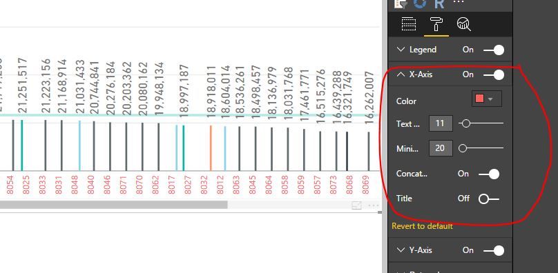
I cannot find the Type within X-axis like yours.
- Mark as New
- Bookmark
- Subscribe
- Mute
- Subscribe to RSS Feed
- Permalink
- Report Inappropriate Content
Hi @Tumitran_1576,
My Power BI Desktop version is: 2.43.4647.541 64-bit (February 2017).
The Type option is only avaliable when you drag numeric type or Date type field to Axis. In your sceanrio, you drag text field to Axis, right? If so, you can change the data type of the field to whole number, then you can change the Type of X-Axis.
Thanks,
Lydia Zhang
If this post helps, then please consider Accept it as the solution to help the other members find it more quickly.
- Mark as New
- Bookmark
- Subscribe
- Mute
- Subscribe to RSS Feed
- Permalink
- Report Inappropriate Content
Hi @v-yuezhe-msft,
I've got the idea, thanks for your help. It can show full chart now.
However, the x-axis in the chart is the Name of all my store. So, after changing to number, with Type: Continuous, it will show as range, which is not the purpose of this chart.
- Mark as New
- Bookmark
- Subscribe
- Mute
- Subscribe to RSS Feed
- Permalink
- Report Inappropriate Content
Hi @Tumitran_1576,
In this case, I would recommend you submit a feedback in this thread about that scroll bar in visuals is not displayed properly.
Thanks,
Lydia Zhang
If this post helps, then please consider Accept it as the solution to help the other members find it more quickly.
Helpful resources

Microsoft Fabric Learn Together
Covering the world! 9:00-10:30 AM Sydney, 4:00-5:30 PM CET (Paris/Berlin), 7:00-8:30 PM Mexico City

Power BI Monthly Update - April 2024
Check out the April 2024 Power BI update to learn about new features.

| User | Count |
|---|---|
| 113 | |
| 97 | |
| 85 | |
| 70 | |
| 61 |
| User | Count |
|---|---|
| 151 | |
| 121 | |
| 104 | |
| 87 | |
| 67 |


