- Power BI forums
- Updates
- News & Announcements
- Get Help with Power BI
- Desktop
- Service
- Report Server
- Power Query
- Mobile Apps
- Developer
- DAX Commands and Tips
- Custom Visuals Development Discussion
- Health and Life Sciences
- Power BI Spanish forums
- Translated Spanish Desktop
- Power Platform Integration - Better Together!
- Power Platform Integrations (Read-only)
- Power Platform and Dynamics 365 Integrations (Read-only)
- Training and Consulting
- Instructor Led Training
- Dashboard in a Day for Women, by Women
- Galleries
- Community Connections & How-To Videos
- COVID-19 Data Stories Gallery
- Themes Gallery
- Data Stories Gallery
- R Script Showcase
- Webinars and Video Gallery
- Quick Measures Gallery
- 2021 MSBizAppsSummit Gallery
- 2020 MSBizAppsSummit Gallery
- 2019 MSBizAppsSummit Gallery
- Events
- Ideas
- Custom Visuals Ideas
- Issues
- Issues
- Events
- Upcoming Events
- Community Blog
- Power BI Community Blog
- Custom Visuals Community Blog
- Community Support
- Community Accounts & Registration
- Using the Community
- Community Feedback
Register now to learn Fabric in free live sessions led by the best Microsoft experts. From Apr 16 to May 9, in English and Spanish.
- Power BI forums
- Forums
- Get Help with Power BI
- Desktop
- Re: Power BI Visual - Guidance
- Subscribe to RSS Feed
- Mark Topic as New
- Mark Topic as Read
- Float this Topic for Current User
- Bookmark
- Subscribe
- Printer Friendly Page
- Mark as New
- Bookmark
- Subscribe
- Mute
- Subscribe to RSS Feed
- Permalink
- Report Inappropriate Content
Power BI Visual - Guidance
Hello -
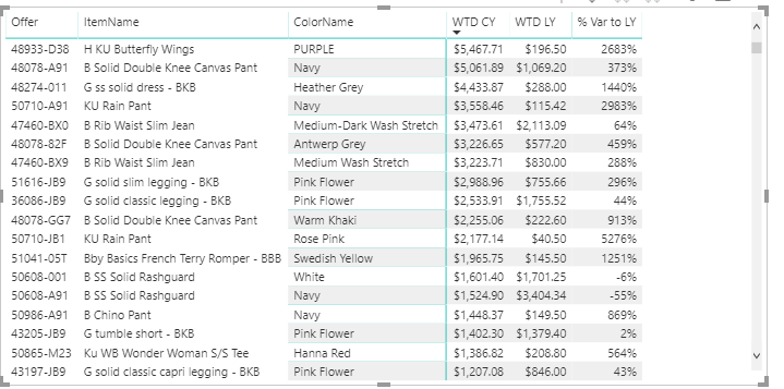
I have the following dataset below. I'd like for the WTD CY, WTD LY to be side by side bars and the % Var to LY to be like a card at the end of the bars.
Is this possible? I would appreciate some guidance.
Thank you
- Mark as New
- Bookmark
- Subscribe
- Mute
- Subscribe to RSS Feed
- Permalink
- Report Inappropriate Content
Not sure what you mean by side by side bars.
If you mean two bar plots side by side you just need to click on the bar chart (horizontal or vertical) and then select WTD cy or WTD ly. This will just display the total though. If you wanted to filter it based on one of the other columns you can add a "visual level filter" by dragging a field to that section of the fields editor and choosing the filter option for that field. This will filter to just the data belonging to whatever filter you choose. IF you want multiple bars for levels of a different field then add the field to the Axis.
If you want one bar plot with comparing WTD cy and WTD ly then choose the clustered bar chart (third and fourth option on top row of visualizations) and add those two fields. Again you can filter this if you want.
Maybe neither is what you want, I wasn't sure.
- Mark as New
- Bookmark
- Subscribe
- Mute
- Subscribe to RSS Feed
- Permalink
- Report Inappropriate Content
Thanks for the response. Let me see if I can explain better.
For each offer, name, color I would like the following:
- Section 1: One bar for WTD CY stacked right next to the bar for WTD LY. At the end of these bars typically where you would find a data label, I'd like the % Var to LY value shown.
- Section 2: One bar for MTD CY stacked right next to the bar for MD LY. At the end of these bars typically where you would find a data label, I'd like the % Var to LY value shown.
-Section 3 One bar for YTD CY stacked right next to the bar for YTD LY. At the end of these bars typically where you would find a data label, I'd like the % Var to LY value shown.
The clustered bar chart gets me close. I don't know how to put the % var LY to display at the ends of the appropriate bars. Also is there a way to zoom in on the clustered bar chart so that the bars aren't so tiny?
Helpful resources

Microsoft Fabric Learn Together
Covering the world! 9:00-10:30 AM Sydney, 4:00-5:30 PM CET (Paris/Berlin), 7:00-8:30 PM Mexico City

Power BI Monthly Update - April 2024
Check out the April 2024 Power BI update to learn about new features.

| User | Count |
|---|---|
| 109 | |
| 96 | |
| 77 | |
| 66 | |
| 53 |
| User | Count |
|---|---|
| 144 | |
| 105 | |
| 102 | |
| 89 | |
| 63 |

