- Power BI forums
- Updates
- News & Announcements
- Get Help with Power BI
- Desktop
- Service
- Report Server
- Power Query
- Mobile Apps
- Developer
- DAX Commands and Tips
- Custom Visuals Development Discussion
- Health and Life Sciences
- Power BI Spanish forums
- Translated Spanish Desktop
- Power Platform Integration - Better Together!
- Power Platform Integrations (Read-only)
- Power Platform and Dynamics 365 Integrations (Read-only)
- Training and Consulting
- Instructor Led Training
- Dashboard in a Day for Women, by Women
- Galleries
- Community Connections & How-To Videos
- COVID-19 Data Stories Gallery
- Themes Gallery
- Data Stories Gallery
- R Script Showcase
- Webinars and Video Gallery
- Quick Measures Gallery
- 2021 MSBizAppsSummit Gallery
- 2020 MSBizAppsSummit Gallery
- 2019 MSBizAppsSummit Gallery
- Events
- Ideas
- Custom Visuals Ideas
- Issues
- Issues
- Events
- Upcoming Events
- Community Blog
- Power BI Community Blog
- Custom Visuals Community Blog
- Community Support
- Community Accounts & Registration
- Using the Community
- Community Feedback
Register now to learn Fabric in free live sessions led by the best Microsoft experts. From Apr 16 to May 9, in English and Spanish.
- Power BI forums
- Forums
- Get Help with Power BI
- Desktop
- Plotting multiple dates per item in a scatter plot
- Subscribe to RSS Feed
- Mark Topic as New
- Mark Topic as Read
- Float this Topic for Current User
- Bookmark
- Subscribe
- Printer Friendly Page
- Mark as New
- Bookmark
- Subscribe
- Mute
- Subscribe to RSS Feed
- Permalink
- Report Inappropriate Content
Plotting multiple dates per item in a scatter plot
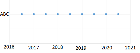
The idea is that I would like to have a timeline or start/end dates on one axis and items on another, where each item has multiple dates to plot (i.e. initial release date, actual release date, release date in X country, etc.). I've tried using both Power Bi Scatterplot and Dot Plot by MAQ Software and I've only been able to plot one date per item. Please let me know if there is a way to do this or if there are any tricks I can use to simulate or get close to this solution.
Thank you in advance for your help.
Solved! Go to Solution.
- Mark as New
- Bookmark
- Subscribe
- Mute
- Subscribe to RSS Feed
- Permalink
- Report Inappropriate Content
It seems like the best way to handle this is going to be to unpivot your data. Transforming it from 1 row per project to multiple rows per project will allow you to plot this the way you want. I went from this:
| Project | Initial Release | Actual Release | Release in US | Release in EU |
| ABC | 1/1/2019 | 2/1/2019 | 3/1/2019 | 4/1/2019 |
| DEF | 1/1/2019 | 1/1/2019 | 1/15/2019 | 3/15/2019 |
| GHI | 1/31/2019 | 3/2/2019 | 2/2/2019 |
To this:
| Project | Release Type | Date |
| ABC | Initial Release | 1/1/2019 |
| ABC | Actual Release | 2/1/2019 |
| ABC | Release in US | 3/1/2019 |
| ABC | Release in EU | 4/1/2019 |
| DEF | Initial Release | 1/1/2019 |
| DEF | Actual Release | 1/1/2019 |
| DEF | Release in US | 1/15/2019 |
| DEF | Release in EU | 3/15/2019 |
| GHI | Initial Release | 1/31/2019 |
| GHI | Release in US | 3/2/2019 |
| GHI | Release in EU | 2/2/2019 |
This puts all dates in the same column, while still associating them with a release type and project.
I ended up using the Dot Plot by MAQ Software, since it gives slightly more control over the fields and allows you to jitter the plot points, so that you don't accidentally hide data. The first thing I did was create a numerical project ID, since all the scatter plots don't like categorical Y axes.
ProjectID = RANKX(ALLSELECTED('Project Releases (2)'), 'Project Releases (2)'[Project], SELECTEDVALUE('Project Releases (2)'[Project]), ASC, Dense)The actual ID doesn't matter, just the fact that each project gets a unique numerical number.
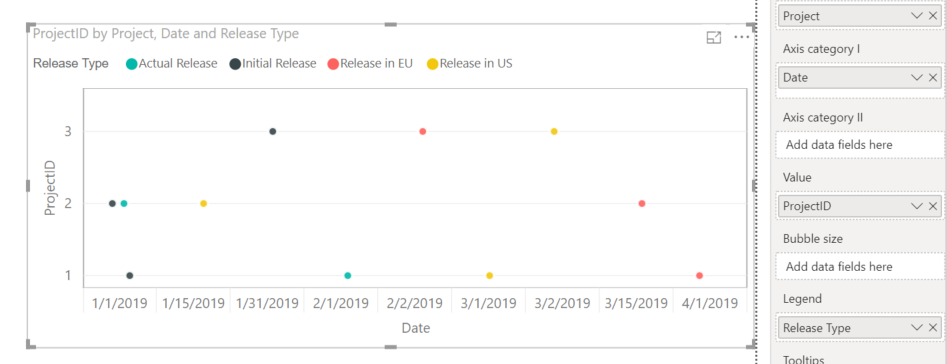
From there, I played around with the various options until I got a scatter plot that looks vaguely like the one you described:
Honestly, at the end of the day, this is not a particularly elegant solution. The dates are categorical, you can't color by Project name, there's no easy way to see what the project name is without hovering over a point, among others. The current available scatter plot options just do not play well with data that isn't straight numerical info with a single category.
You're more likely to be able to find success by using one of the calendar or timeline visualizations out there instead of trying to force a scatterplot to do this work for you. Good luck
- Mark as New
- Bookmark
- Subscribe
- Mute
- Subscribe to RSS Feed
- Permalink
- Report Inappropriate Content
A mapping table would likely work.
As far as actually using categorical data as an axis, there might be some way with the MAQ dot plot to swap the axes, but it still doesn't treat dates as continuous as far as I can tell.
The other option is to develop your own dot plot visual, but that may be a little bit too much effort for this.
- Mark as New
- Bookmark
- Subscribe
- Mute
- Subscribe to RSS Feed
- Permalink
- Report Inappropriate Content
@Anonymous you will need to set up a date table and then create relationships to this date table for each of your dates, one will be the primary relationship and you can create that measure easily, but then you have to use your inactive relationship to create the rest, these will be denoted in your relationships by a dotted line. For those measures you will need to create a use relationship measure.
ie.
primary relationship


CALCULATE ( sum(measuredvalue));

inactive relationships;
CALCULATE (
    sum(measuredvalue);
    USERELATIONSHIP (
        inactivedatename;
        'Date'[Date]
        )
)
more information here
https://www.sqlbi.com/articles/userelationship-in-calculated-columns/
and feel free to ask me questions.
If I took the time to answer your question and I came up with a solution, please mark my post as a solution and /or give kudos freely for the effort 🙂 Thank you!
Proud to be a Super User!
- Mark as New
- Bookmark
- Subscribe
- Mute
- Subscribe to RSS Feed
- Permalink
- Report Inappropriate Content
@vanessafvg Thank you for your help! Unfortunately, I'm looking to plot multiple dates per item, not perform any calculations with a measure column. Here is an example of what I'm trying to simulate:
- Mark as New
- Bookmark
- Subscribe
- Mute
- Subscribe to RSS Feed
- Permalink
- Report Inappropriate Content
It seems like the best way to handle this is going to be to unpivot your data. Transforming it from 1 row per project to multiple rows per project will allow you to plot this the way you want. I went from this:
| Project | Initial Release | Actual Release | Release in US | Release in EU |
| ABC | 1/1/2019 | 2/1/2019 | 3/1/2019 | 4/1/2019 |
| DEF | 1/1/2019 | 1/1/2019 | 1/15/2019 | 3/15/2019 |
| GHI | 1/31/2019 | 3/2/2019 | 2/2/2019 |
To this:
| Project | Release Type | Date |
| ABC | Initial Release | 1/1/2019 |
| ABC | Actual Release | 2/1/2019 |
| ABC | Release in US | 3/1/2019 |
| ABC | Release in EU | 4/1/2019 |
| DEF | Initial Release | 1/1/2019 |
| DEF | Actual Release | 1/1/2019 |
| DEF | Release in US | 1/15/2019 |
| DEF | Release in EU | 3/15/2019 |
| GHI | Initial Release | 1/31/2019 |
| GHI | Release in US | 3/2/2019 |
| GHI | Release in EU | 2/2/2019 |
This puts all dates in the same column, while still associating them with a release type and project.
I ended up using the Dot Plot by MAQ Software, since it gives slightly more control over the fields and allows you to jitter the plot points, so that you don't accidentally hide data. The first thing I did was create a numerical project ID, since all the scatter plots don't like categorical Y axes.
ProjectID = RANKX(ALLSELECTED('Project Releases (2)'), 'Project Releases (2)'[Project], SELECTEDVALUE('Project Releases (2)'[Project]), ASC, Dense)The actual ID doesn't matter, just the fact that each project gets a unique numerical number.
From there, I played around with the various options until I got a scatter plot that looks vaguely like the one you described:
Honestly, at the end of the day, this is not a particularly elegant solution. The dates are categorical, you can't color by Project name, there's no easy way to see what the project name is without hovering over a point, among others. The current available scatter plot options just do not play well with data that isn't straight numerical info with a single category.
You're more likely to be able to find success by using one of the calendar or timeline visualizations out there instead of trying to force a scatterplot to do this work for you. Good luck
- Mark as New
- Bookmark
- Subscribe
- Mute
- Subscribe to RSS Feed
- Permalink
- Report Inappropriate Content
@Cmcmahan This is great, thank you so much! I agree that using a calendar/timeline is much easier and I do have those visuals already on my dashboard, but I was hoping to find different ways to visualize the data. Is there any possibility of a work around to get non-numerical data (the Project name) displayed on either of the axes?
The only other alternative I can think of is to display a mapping table (projectID to Project name) or to just hover over a point to read the Project name.
- Mark as New
- Bookmark
- Subscribe
- Mute
- Subscribe to RSS Feed
- Permalink
- Report Inappropriate Content
A mapping table would likely work.
As far as actually using categorical data as an axis, there might be some way with the MAQ dot plot to swap the axes, but it still doesn't treat dates as continuous as far as I can tell.
The other option is to develop your own dot plot visual, but that may be a little bit too much effort for this.
- Mark as New
- Bookmark
- Subscribe
- Mute
- Subscribe to RSS Feed
- Permalink
- Report Inappropriate Content
Helpful resources

Microsoft Fabric Learn Together
Covering the world! 9:00-10:30 AM Sydney, 4:00-5:30 PM CET (Paris/Berlin), 7:00-8:30 PM Mexico City

Power BI Monthly Update - April 2024
Check out the April 2024 Power BI update to learn about new features.

| User | Count |
|---|---|
| 113 | |
| 100 | |
| 78 | |
| 76 | |
| 52 |
| User | Count |
|---|---|
| 144 | |
| 109 | |
| 108 | |
| 88 | |
| 61 |

