- Power BI forums
- Updates
- News & Announcements
- Get Help with Power BI
- Desktop
- Service
- Report Server
- Power Query
- Mobile Apps
- Developer
- DAX Commands and Tips
- Custom Visuals Development Discussion
- Health and Life Sciences
- Power BI Spanish forums
- Translated Spanish Desktop
- Power Platform Integration - Better Together!
- Power Platform Integrations (Read-only)
- Power Platform and Dynamics 365 Integrations (Read-only)
- Training and Consulting
- Instructor Led Training
- Dashboard in a Day for Women, by Women
- Galleries
- Community Connections & How-To Videos
- COVID-19 Data Stories Gallery
- Themes Gallery
- Data Stories Gallery
- R Script Showcase
- Webinars and Video Gallery
- Quick Measures Gallery
- 2021 MSBizAppsSummit Gallery
- 2020 MSBizAppsSummit Gallery
- 2019 MSBizAppsSummit Gallery
- Events
- Ideas
- Custom Visuals Ideas
- Issues
- Issues
- Events
- Upcoming Events
- Community Blog
- Power BI Community Blog
- Custom Visuals Community Blog
- Community Support
- Community Accounts & Registration
- Using the Community
- Community Feedback
Register now to learn Fabric in free live sessions led by the best Microsoft experts. From Apr 16 to May 9, in English and Spanish.
- Power BI forums
- Forums
- Get Help with Power BI
- Desktop
- Plotting Calculated Column Months into a stack col...
- Subscribe to RSS Feed
- Mark Topic as New
- Mark Topic as Read
- Float this Topic for Current User
- Bookmark
- Subscribe
- Printer Friendly Page
- Mark as New
- Bookmark
- Subscribe
- Mute
- Subscribe to RSS Feed
- Permalink
- Report Inappropriate Content
Plotting Calculated Column Months into a stack column chart
Hello,
I'm a new PowerBI user who just started learning this program.
I'm working on a resource loading visualization that pulls data from a database and applies a function to calculate the load of each item at the particular month. I have a 12 calculated columns (Months of 2020) which I would like to plot on a line chart showing the sum of the data in each month over the year.
However, I can't seem to find the correct x-axis to plot this data.
Sorry if this has been raised, I've been searching the forums but unable to find a solution which works for me.
Thanks!
- Mark as New
- Bookmark
- Subscribe
- Mute
- Subscribe to RSS Feed
- Permalink
- Report Inappropriate Content
Thanks everybody for the replies.
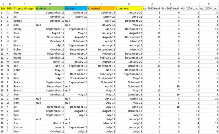
Unfortunately as my data is confidential I am unable to share it. I've created a dummy database in excel as shown here.
Columns A-G are fixed and queried from an online database. Columns H and beyond are my calculated columns done in Power BI, they display the load of each project at a particular month. A project progresses along stages and naturally the load also changes. My intent is to eventually achieve a Visual where I can filter by the appropriate manager and it shows a timeline of his/her total load per month.
I thought I could separate the monthly loads on another table but I couldn't get it to refer to the main dataset (which contains the project stage for load calculation)
From what I understand from the previous advice, it seems that I need to duplicate 12 entries per Project? Wouldn't that be far too complicated?
Thanks again to all who had replied.
- Mark as New
- Bookmark
- Subscribe
- Mute
- Subscribe to RSS Feed
- Permalink
- Report Inappropriate Content
Hi @AngusTan ,
I'm not sure how you define "Load". For example, why the jan 2020 load in the first row is 5. Appreciate for your explanation.
Best regards,
Jay
If this post helps, then please consider Accept it as the solution to help the other members find it.
- Mark as New
- Bookmark
- Subscribe
- Mute
- Subscribe to RSS Feed
- Permalink
- Report Inappropriate Content
Hi @AngusTan ,
Please refer to the formula below to create a calculated table.
BTW, it would be better to share some sample data to us if you don't have any Confidential Information. In that case we might be able to help you find another way instead of creating 12 calculated column.
Table 2 =
UNION (
    SELECTCOLUMNS (
        'Table',
        "item", 'Table'[Item],
        "person", 'Table'[Person],
        "amount", 'Table'[Jan],
        "month", "Jan"
    ),
    SELECTCOLUMNS (
        'Table',
        "item", 'Table'[Item],
        "person", 'Table'[Person],
        "amount", 'Table'[Feb],
        "month", "Feb"
    )
)
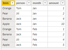
Result would be shown as below.
Best Regards,
Jay
Community Support Team _ Jay Wang
If this post helps, then please consider Accept it as the solution to help the other members find it more quickly.
If this post helps, then please consider Accept it as the solution to help the other members find it.
- Mark as New
- Bookmark
- Subscribe
- Mute
- Subscribe to RSS Feed
- Permalink
- Report Inappropriate Content
Hi @AngusTan
Why not store the Months as rows instead of Columns?
Its a lot easier to handle data in this format in Power BI.
Mariusz
If this post helps, then please consider Accepting it as the solution.
- Mark as New
- Bookmark
- Subscribe
- Mute
- Subscribe to RSS Feed
- Permalink
- Report Inappropriate Content
Hey @Mariusz ,
Thanks for the quick reply!
The reason why I didn't store the months as rows is because the rows are already populated with a list of items. I've plotted an example below.
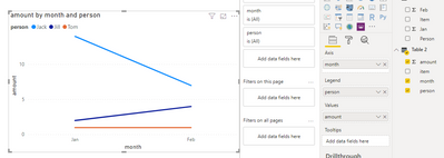
Thus the intent would be to display a Column or Area Chart, showing the Total number of fruits purchased by a person per month. In Jack's case, I should be able to visualise the total number of fruits he purchased every month, over the entire year; i.e; 14 fruits in Jan, 7 Fruits in Feb and so on...
I can plot it using a Clustered Column chart but I am unable to format the axis labels with months as per traditional timeline charts.
Columns 'Item' and 'Person' are fixed and obtained from an online database, and there are several columns I used to calculate the number of fruits purchased by a particular person in a particular month (actual number of rows, additional columns not shown for simplicity).
Thanks!
| Item | Person | Jan | Feb |
| Apple | Jack | 10 | 5 |
| Orange | Tom | 1 | 1 |
| Pear | Jill | 2 | 4 |
| Banana | Jack | 4 | 2 |
- Mark as New
- Bookmark
- Subscribe
- Mute
- Subscribe to RSS Feed
- Permalink
- Report Inappropriate Content
Hi,
As suggested, it would still be the best layout to get all months in a single column. We will then build a date column and a Calendar Table. Then create a relationship from the Date column of the Data Table to the Date column of the Calendar Table. In the Calendar Table, write calculated column formulas to extract Year and Month. To your visual, drag Year and Month from the Calendar Table. Write measures and then drag those to your visual.
Regards,
Ashish Mathur
http://www.ashishmathur.com
https://www.linkedin.com/in/excelenthusiasts/
Helpful resources

Microsoft Fabric Learn Together
Covering the world! 9:00-10:30 AM Sydney, 4:00-5:30 PM CET (Paris/Berlin), 7:00-8:30 PM Mexico City

Power BI Monthly Update - April 2024
Check out the April 2024 Power BI update to learn about new features.

| User | Count |
|---|---|
| 113 | |
| 99 | |
| 82 | |
| 70 | |
| 60 |
| User | Count |
|---|---|
| 149 | |
| 114 | |
| 107 | |
| 89 | |
| 67 |


