- Power BI forums
- Updates
- News & Announcements
- Get Help with Power BI
- Desktop
- Service
- Report Server
- Power Query
- Mobile Apps
- Developer
- DAX Commands and Tips
- Custom Visuals Development Discussion
- Health and Life Sciences
- Power BI Spanish forums
- Translated Spanish Desktop
- Power Platform Integration - Better Together!
- Power Platform Integrations (Read-only)
- Power Platform and Dynamics 365 Integrations (Read-only)
- Training and Consulting
- Instructor Led Training
- Dashboard in a Day for Women, by Women
- Galleries
- Community Connections & How-To Videos
- COVID-19 Data Stories Gallery
- Themes Gallery
- Data Stories Gallery
- R Script Showcase
- Webinars and Video Gallery
- Quick Measures Gallery
- 2021 MSBizAppsSummit Gallery
- 2020 MSBizAppsSummit Gallery
- 2019 MSBizAppsSummit Gallery
- Events
- Ideas
- Custom Visuals Ideas
- Issues
- Issues
- Events
- Upcoming Events
- Community Blog
- Power BI Community Blog
- Custom Visuals Community Blog
- Community Support
- Community Accounts & Registration
- Using the Community
- Community Feedback
Register now to learn Fabric in free live sessions led by the best Microsoft experts. From Apr 16 to May 9, in English and Spanish.
- Power BI forums
- Forums
- Get Help with Power BI
- Desktop
- Re: How to create a scatter-line chart from data f...
- Subscribe to RSS Feed
- Mark Topic as New
- Mark Topic as Read
- Float this Topic for Current User
- Bookmark
- Subscribe
- Printer Friendly Page
- Mark as New
- Bookmark
- Subscribe
- Mute
- Subscribe to RSS Feed
- Permalink
- Report Inappropriate Content
Plot two columns as line chart
I have some battery cycling data. Of interest is the current and voltage value wrt time. These are three separate columns in my table. I want to plot Current vs Time and Voltage vs Time.
I tried the "Scatter Chart" option and "Line Chart" option, however, it shows me the "Count of Current" instead of "Current". I tried adding the "Current" and "Time" to "Axis" and "Value" tabs without success.
This used to be very simple in Excel. The reason I am using Power BI is because I have many rows (millions).
Thanks
Chintan Pathak
- Mark as New
- Bookmark
- Subscribe
- Mute
- Subscribe to RSS Feed
- Permalink
- Report Inappropriate Content
@chintanp is it possible to share what your data looks like?
and what you expect it to be, ie. show a screenshot of excel
so what you saying is you dont want current to be aggregated and you want to view it with a date?
do you have a date table?
secondly when you say its not working, what exactly is the problem? a screenshot to get a better understand will help here
If I took the time to answer your question and I came up with a solution, please mark my post as a solution and /or give kudos freely for the effort 🙂 Thank you!
Proud to be a Super User!
- Mark as New
- Bookmark
- Subscribe
- Mute
- Subscribe to RSS Feed
- Permalink
- Report Inappropriate Content
@vanessafvg : Thank you for your reply.
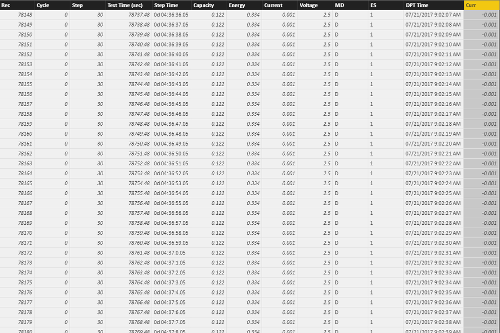
My data looks like this:
Fields, test time (sec), current, voltage have been converted to "Decimal number" in Power BI.
The graph that I want to see is simply:
The X-axis has the test-time (sec) and Y-axis has Voltage, both are indivuidual values in separated columns in the same table.
- Mark as New
- Bookmark
- Subscribe
- Mute
- Subscribe to RSS Feed
- Permalink
- Report Inappropriate Content
I have some battery cycling data. Of interest is the current and voltage value wrt time. These are three separate columns in my table. I want to plot Current vs Time and Voltage vs Time.
I tried the "Scatter Chart" option and "Line Chart" option, however, it shows me the "Count of Current" instead of "Current". I tried adding the "Current" and "Time" to "Axis" and "Value" tabs without success.
This used to be very simple in Excel. The reason I am using Power BI is because I have many rows (millions).
Thanks
Chintan Pathak
- Mark as New
- Bookmark
- Subscribe
- Mute
- Subscribe to RSS Feed
- Permalink
- Report Inappropriate Content
Hi Chintan Pathak,
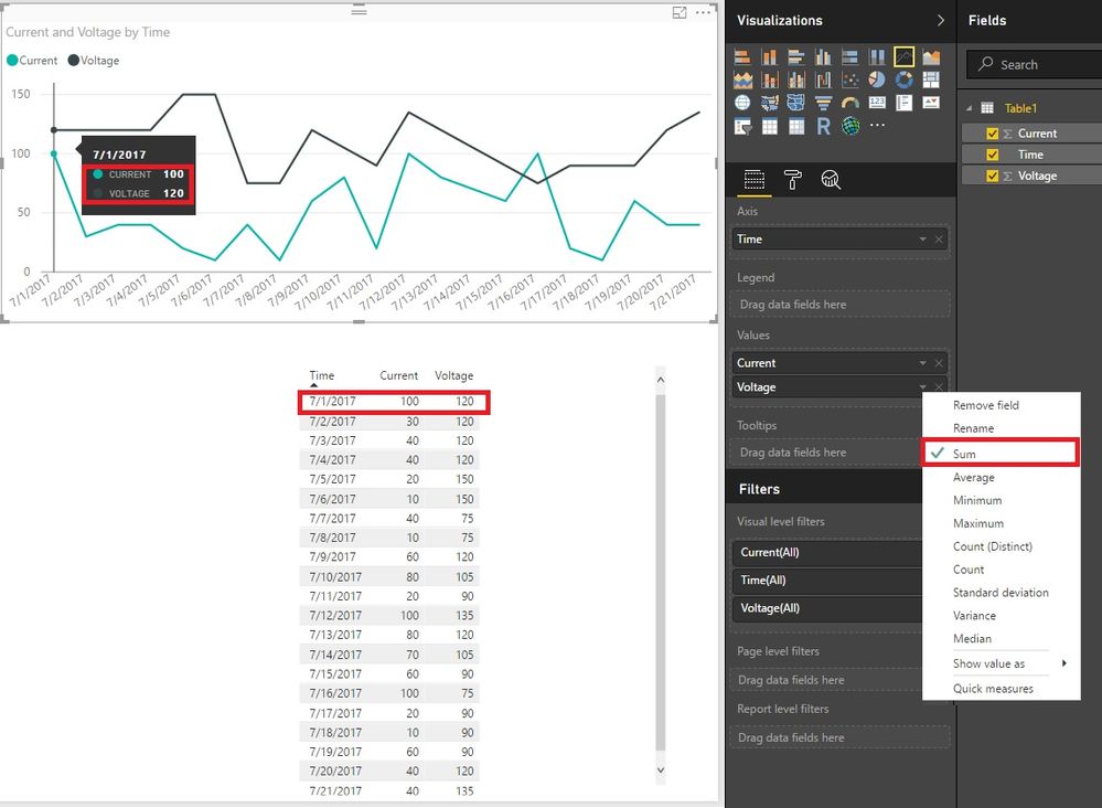
Would you like it as the picture showed? You can use "Sum" if there is no duplicates in "Time".
Best Regards!
Dale
If this post helps, then please consider Accept it as the solution to help the other members find it more quickly.
- Mark as New
- Bookmark
- Subscribe
- Mute
- Subscribe to RSS Feed
- Permalink
- Report Inappropriate Content
Nope, not 50 or 100 or Sum() on the Y-axis. I need the voltage value, i.e "somewhere between 2.5 volts" and keeps repeating, so like a periodic process.
I don't think I can explain it any better. Maybe Power Bi is not a tool for scientific research.
- Mark as New
- Bookmark
- Subscribe
- Mute
- Subscribe to RSS Feed
- Permalink
- Report Inappropriate Content
Hi @chintanp,
Could you please mark the proper answer as solution or share the solution if it's convenient for you? That will be a help to the others.
Best Regards!
Dale
If this post helps, then please consider Accept it as the solution to help the other members find it more quickly.
- Mark as New
- Bookmark
- Subscribe
- Mute
- Subscribe to RSS Feed
- Permalink
- Report Inappropriate Content
Hi @chintanp,
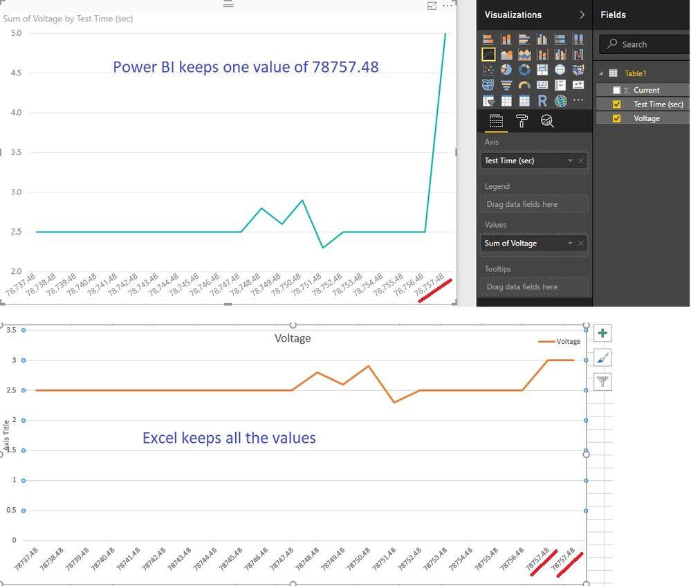
You have explained very clear. I found the difference of handling duplicates between Excel and Power BI. Excel keeps all the records. (at least in the line chart). While Power BI remove duplicates. I think you could try line chart in Power BI.
Best Regards!
Dale
If this post helps, then please consider Accept it as the solution to help the other members find it more quickly.
Helpful resources

Microsoft Fabric Learn Together
Covering the world! 9:00-10:30 AM Sydney, 4:00-5:30 PM CET (Paris/Berlin), 7:00-8:30 PM Mexico City

Power BI Monthly Update - April 2024
Check out the April 2024 Power BI update to learn about new features.

| User | Count |
|---|---|
| 114 | |
| 99 | |
| 83 | |
| 70 | |
| 60 |
| User | Count |
|---|---|
| 150 | |
| 115 | |
| 104 | |
| 89 | |
| 65 |


