- Power BI forums
- Updates
- News & Announcements
- Get Help with Power BI
- Desktop
- Service
- Report Server
- Power Query
- Mobile Apps
- Developer
- DAX Commands and Tips
- Custom Visuals Development Discussion
- Health and Life Sciences
- Power BI Spanish forums
- Translated Spanish Desktop
- Power Platform Integration - Better Together!
- Power Platform Integrations (Read-only)
- Power Platform and Dynamics 365 Integrations (Read-only)
- Training and Consulting
- Instructor Led Training
- Dashboard in a Day for Women, by Women
- Galleries
- Community Connections & How-To Videos
- COVID-19 Data Stories Gallery
- Themes Gallery
- Data Stories Gallery
- R Script Showcase
- Webinars and Video Gallery
- Quick Measures Gallery
- 2021 MSBizAppsSummit Gallery
- 2020 MSBizAppsSummit Gallery
- 2019 MSBizAppsSummit Gallery
- Events
- Ideas
- Custom Visuals Ideas
- Issues
- Issues
- Events
- Upcoming Events
- Community Blog
- Power BI Community Blog
- Custom Visuals Community Blog
- Community Support
- Community Accounts & Registration
- Using the Community
- Community Feedback
Register now to learn Fabric in free live sessions led by the best Microsoft experts. From Apr 16 to May 9, in English and Spanish.
- Power BI forums
- Forums
- Get Help with Power BI
- Desktop
- Re: Plot a filtered value compared to an average a...
- Subscribe to RSS Feed
- Mark Topic as New
- Mark Topic as Read
- Float this Topic for Current User
- Bookmark
- Subscribe
- Printer Friendly Page
- Mark as New
- Bookmark
- Subscribe
- Mute
- Subscribe to RSS Feed
- Permalink
- Report Inappropriate Content
Plot a filtered value compared to an average across unfiltered values
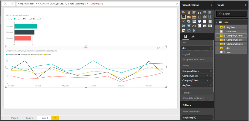
Let's say I have monthy sales data for a few companies over one year. I want to plot the average sales across all companies. Easy right! Then I want to add one companies sales to the same plot to allow a comparison to the average. How do I do that?
Here's a picture of what I have now:
I want to show the average line (second line graph) on the first line graph. When I click on CompanyA in the histogram I would like to have a line graph showing just CompanyA data AND the average across all companies.
Is that doable?
Thanks
Solved! Go to Solution.
- Mark as New
- Bookmark
- Subscribe
- Mute
- Subscribe to RSS Feed
- Permalink
- Report Inappropriate Content
Here's how I solved it. Instead of separate measures for each company I just created one measure that's the result of the highlighted company:
SalesSelected = CALCULATE(AVERAGE([sales]), ALLSELECTED(sales[company]))
The average line is the same as @chrisu suggested:
AvgSales = CALCULATE(AVERAGE([sales]), ALL(sales[company]))
Thanks @chrisu for puting me on the right track.
- Mark as New
- Bookmark
- Subscribe
- Mute
- Subscribe to RSS Feed
- Permalink
- Report Inappropriate Content
There's probably a better solution than this, but this has worked for me:
1. Because you can either have a legend OR multiple measures on a line chart, you will have to define a measure for each company, like this:
CompanyASales = CALCULATE(SUM([sales]), [company] = "CompanyA")
CompanyBSales = CALCULATE(SUM([sales]), [company] = "CompanyB")
etc.
2. Then create an average sales measure using ALL to override any filters on company:
AverageSales = CALCULATE(AVERAGE([sales]), ALL([company]))
3. Add all of those measures to the values area of the line chart (you will have to remove company from the legend first).
- Mark as New
- Bookmark
- Subscribe
- Mute
- Subscribe to RSS Feed
- Permalink
- Report Inappropriate Content
Hi @chrisu, thanks for responding - I was excited when I saw your post as I thought "Yes, that's going to work!". But I don't think it quite does what I wanted. It gets me lines for each company on the chart plus a line for the average across all companies on the same chart which is great and a step further that I'd gotten before (kudos!). I was hoping though that when I filter by CompanyA by clicking on the histogram then ONLY CompanyA AND the average line would remain on the plot, allowing the user to focus on just the difference between the company of interest and the average. Any ideas if this is possible? Here's a pic of where I'm at now.
- Mark as New
- Bookmark
- Subscribe
- Mute
- Subscribe to RSS Feed
- Permalink
- Report Inappropriate Content
Here's how I solved it. Instead of separate measures for each company I just created one measure that's the result of the highlighted company:
SalesSelected = CALCULATE(AVERAGE([sales]), ALLSELECTED(sales[company]))
The average line is the same as @chrisu suggested:
AvgSales = CALCULATE(AVERAGE([sales]), ALL(sales[company]))
Thanks @chrisu for puting me on the right track.
Helpful resources

Microsoft Fabric Learn Together
Covering the world! 9:00-10:30 AM Sydney, 4:00-5:30 PM CET (Paris/Berlin), 7:00-8:30 PM Mexico City

Power BI Monthly Update - April 2024
Check out the April 2024 Power BI update to learn about new features.

| User | Count |
|---|---|
| 109 | |
| 99 | |
| 77 | |
| 66 | |
| 54 |
| User | Count |
|---|---|
| 144 | |
| 104 | |
| 102 | |
| 87 | |
| 64 |


