- Power BI forums
- Updates
- News & Announcements
- Get Help with Power BI
- Desktop
- Service
- Report Server
- Power Query
- Mobile Apps
- Developer
- DAX Commands and Tips
- Custom Visuals Development Discussion
- Health and Life Sciences
- Power BI Spanish forums
- Translated Spanish Desktop
- Power Platform Integration - Better Together!
- Power Platform Integrations (Read-only)
- Power Platform and Dynamics 365 Integrations (Read-only)
- Training and Consulting
- Instructor Led Training
- Dashboard in a Day for Women, by Women
- Galleries
- Community Connections & How-To Videos
- COVID-19 Data Stories Gallery
- Themes Gallery
- Data Stories Gallery
- R Script Showcase
- Webinars and Video Gallery
- Quick Measures Gallery
- 2021 MSBizAppsSummit Gallery
- 2020 MSBizAppsSummit Gallery
- 2019 MSBizAppsSummit Gallery
- Events
- Ideas
- Custom Visuals Ideas
- Issues
- Issues
- Events
- Upcoming Events
- Community Blog
- Power BI Community Blog
- Custom Visuals Community Blog
- Community Support
- Community Accounts & Registration
- Using the Community
- Community Feedback
Register now to learn Fabric in free live sessions led by the best Microsoft experts. From Apr 16 to May 9, in English and Spanish.
- Power BI forums
- Forums
- Get Help with Power BI
- Desktop
- Re: Please Advise - I want Single Line for Actual ...
- Subscribe to RSS Feed
- Mark Topic as New
- Mark Topic as Read
- Float this Topic for Current User
- Bookmark
- Subscribe
- Printer Friendly Page
- Mark as New
- Bookmark
- Subscribe
- Mute
- Subscribe to RSS Feed
- Permalink
- Report Inappropriate Content
Please Advise - I want Single Line for Actual and Predicted data and Multiple Icons in a LineChart
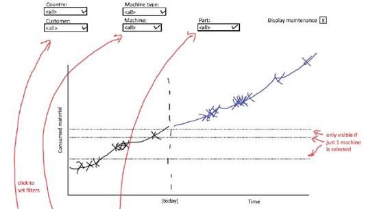
I need a Line chart as below that is filtered by Country->Customers->MachineType->MachineModel->Parts.
The Chart represents Consumed Material (In Tons) of Machines in Y-Axis and X-Axis is over time (Year-Months-Day).
My data is coming from a ML model that stores value for past 3 months and next 365 days.
1. How can I show the actual and predicted value in the same line with different colors? I can't use two lines to represent this.
2. How can I display multiple (around 100) icons ( Represented as Xs in below Picture) on the same line to represent another field value maintenance dates of Parts.
Solved! Go to Solution.
- Mark as New
- Bookmark
- Subscribe
- Mute
- Subscribe to RSS Feed
- Permalink
- Report Inappropriate Content
Hi @Rohit7005 ,
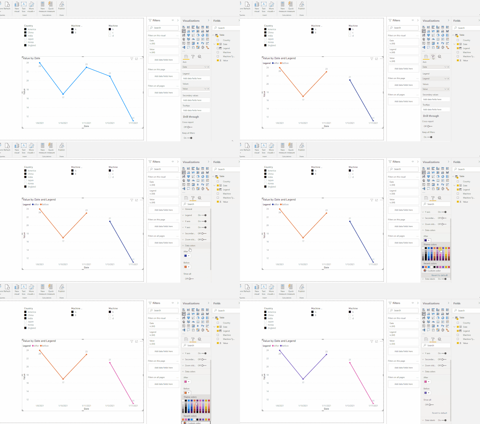
According to my understanding, you want to set two colors based on before and after Today,right?
I did it in two ways. Please take a look at the pbix file here.
1.Use the following formula to add a column settins as legend:
Legend =
IF ( [Date] >= TODAY (), "After", "Before" )
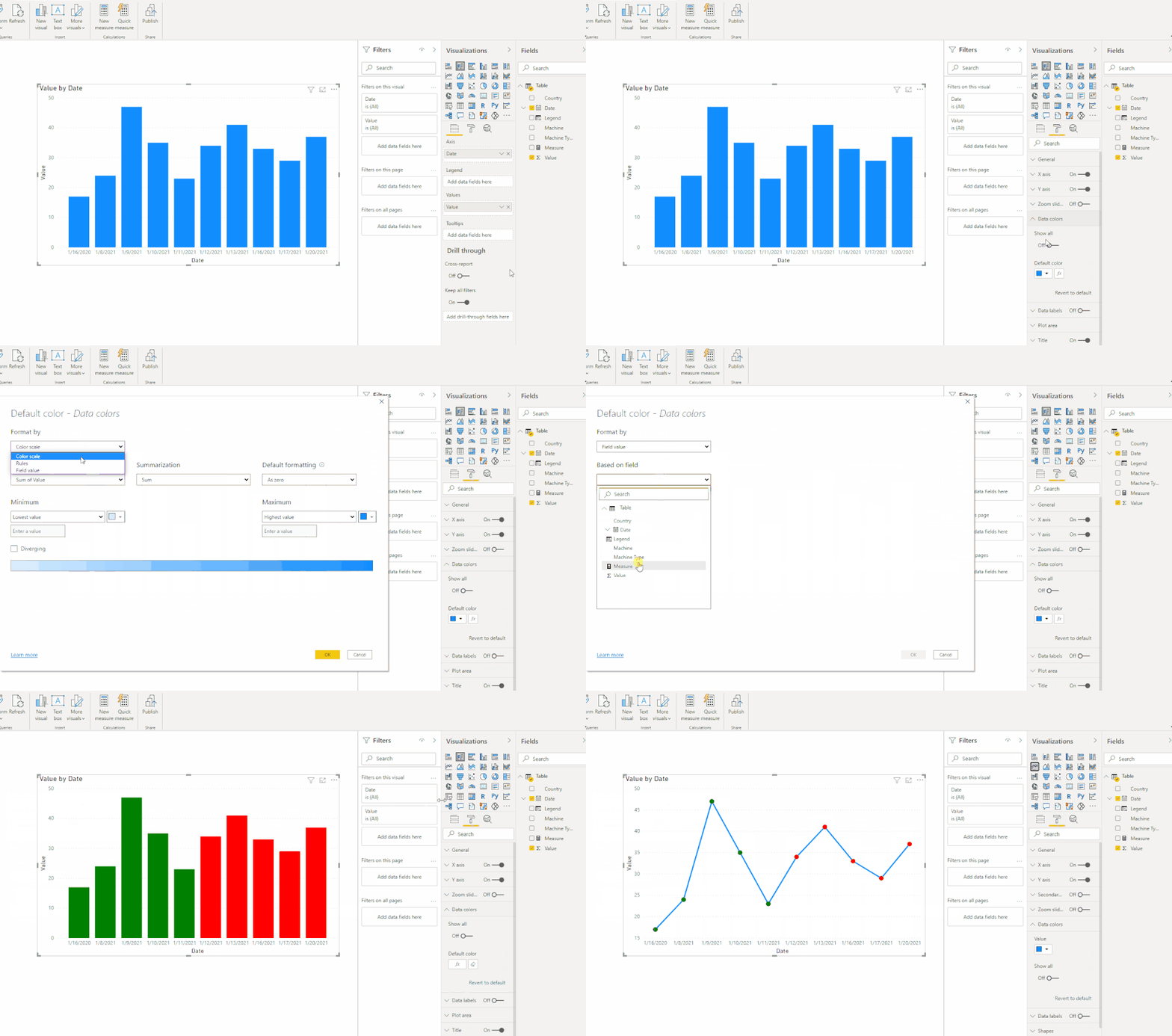
2.Create a color measure, apply it to Data color
Measure =
IF ( MAX ( 'Table'[Date] ) >= TODAY (), "Red", "Green" )
Then create a column chart first, and switch it to line chart like this:
In addition, to my knowledge, Power BI Desktop doesn't directly support Conditional Formatting feature in Line chart, but this is at idea/feedback level alone. May be , hopes Power Bi will implement this in nearby future.
If you also want this in power bi, let the power bi community to know this things and give your votes at power bi site's feedback -
https://ideas.powerbi.com/ideas/idea/?ideaid=59734f89-363d-41e8-be27-f123765dfd2f
Best Regards,
Eyelyn Qin
If this post helps, then please consider Accept it as the solution to help the other members find it more quickly.
- Mark as New
- Bookmark
- Subscribe
- Mute
- Subscribe to RSS Feed
- Permalink
- Report Inappropriate Content
Hi @Rohit7005
First question...try these measures. I assume that you already have measures for actual and forecast...
Switch Between Measures =
IF(
	MAX([Date]) <= TODAY(),
	[Measure 1],
	[Measure 2]
)

Switch Between Colors =
IF(
	MAX([Date]) <= TODAY(),
	"Green",
	"Purple"
)
The second measure you'll want to plug into conditional formatting for the line chart. Choose whichever colors you like or you can substitute hex codes for the colors.
I'm not sure what you mean for the second question...but if means what I think you're asking I don't think that's possible. Maybe someone else can help with that part of it.
- Mark as New
- Bookmark
- Subscribe
- Mute
- Subscribe to RSS Feed
- Permalink
- Report Inappropriate Content
Hi @littlemojopuppy ,
Thanks for your reply, I did create the two measures for actual and forecast. Based on your input I created the 'Switch Between Measure'. But I don't find the conditional formatting options available to plug in the 'Switch Between Colors' Measure. Please check the picture below.
Thanks in Advance!
Helpful resources

Microsoft Fabric Learn Together
Covering the world! 9:00-10:30 AM Sydney, 4:00-5:30 PM CET (Paris/Berlin), 7:00-8:30 PM Mexico City

Power BI Monthly Update - April 2024
Check out the April 2024 Power BI update to learn about new features.

| User | Count |
|---|---|
| 113 | |
| 97 | |
| 85 | |
| 70 | |
| 61 |
| User | Count |
|---|---|
| 151 | |
| 121 | |
| 104 | |
| 87 | |
| 67 |


