- Power BI forums
- Updates
- News & Announcements
- Get Help with Power BI
- Desktop
- Service
- Report Server
- Power Query
- Mobile Apps
- Developer
- DAX Commands and Tips
- Custom Visuals Development Discussion
- Health and Life Sciences
- Power BI Spanish forums
- Translated Spanish Desktop
- Power Platform Integration - Better Together!
- Power Platform Integrations (Read-only)
- Power Platform and Dynamics 365 Integrations (Read-only)
- Training and Consulting
- Instructor Led Training
- Dashboard in a Day for Women, by Women
- Galleries
- Community Connections & How-To Videos
- COVID-19 Data Stories Gallery
- Themes Gallery
- Data Stories Gallery
- R Script Showcase
- Webinars and Video Gallery
- Quick Measures Gallery
- 2021 MSBizAppsSummit Gallery
- 2020 MSBizAppsSummit Gallery
- 2019 MSBizAppsSummit Gallery
- Events
- Ideas
- Custom Visuals Ideas
- Issues
- Issues
- Events
- Upcoming Events
- Community Blog
- Power BI Community Blog
- Custom Visuals Community Blog
- Community Support
- Community Accounts & Registration
- Using the Community
- Community Feedback
Register now to learn Fabric in free live sessions led by the best Microsoft experts. From Apr 16 to May 9, in English and Spanish.
- Power BI forums
- Forums
- Get Help with Power BI
- Desktop
- Pie chart - filter Table
- Subscribe to RSS Feed
- Mark Topic as New
- Mark Topic as Read
- Float this Topic for Current User
- Bookmark
- Subscribe
- Printer Friendly Page
- Mark as New
- Bookmark
- Subscribe
- Mute
- Subscribe to RSS Feed
- Permalink
- Report Inappropriate Content
Pie chart - filter Table
Hi,
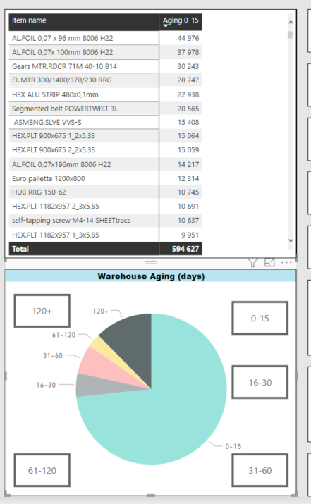
I have Pie chart and table as below.
I want to filter my table by every piece of pie chart.
My problem is that pie chart contains only measures -> that cannot be change.
I think that bookmarks can be workaround, but I don't know exactly how(I create buttons provisionally)
Alternatively, maybe other visuals can be helpful?
- Mark as New
- Bookmark
- Subscribe
- Mute
- Subscribe to RSS Feed
- Permalink
- Report Inappropriate Content
Hi @pawelj795 ,
You can use the DAX expression below to convert several measures to one.
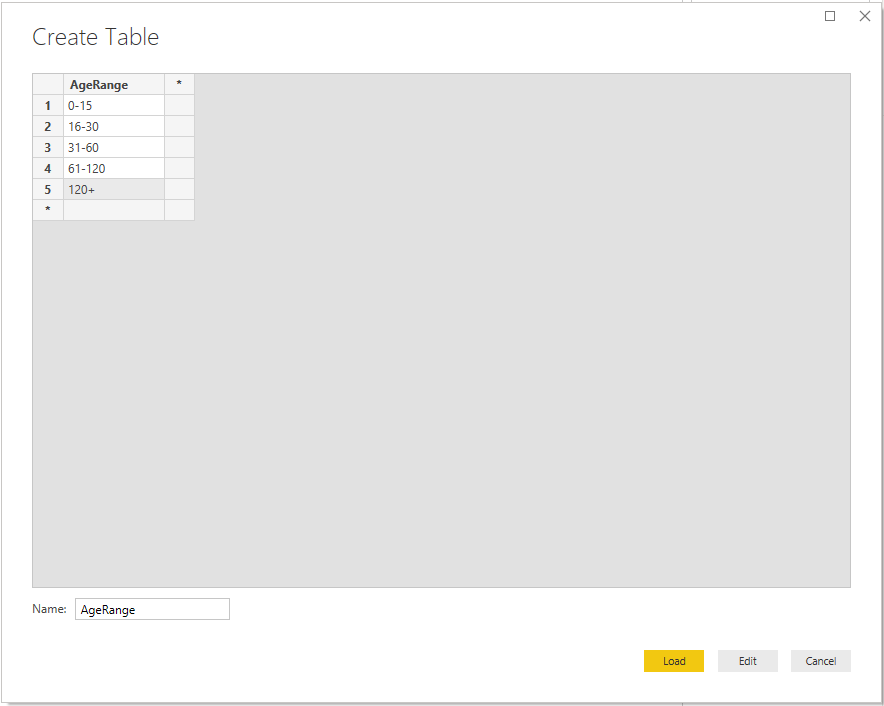
1. Enter a AgeRange table without any relationship among other tables.
2. Create a measure.
Measure =
SWITCH (
    TRUE (),
    SELECTEDVALUE ( 'AgeRange'[AgeRange] ) = "0-15", [0-15],
    SELECTEDVALUE ( 'AgeRange'[AgeRange] ) = "16-30", [16-30],
    SELECTEDVALUE ( 'AgeRange'[AgeRange] ) = "31-60", [31-60],
    SELECTEDVALUE ( 'AgeRange'[AgeRange] ) = "61-120", [61-120],
    SELECTEDVALUE ( 'AgeRange'[AgeRange] ) = "120+", [120+]
)
3. Put 'AgeRange'[AgeRange] on Legend and [Measure] on Values of chart.
Hope this could help you. If it doesn't work, please share me a dummy PBIX file without real data or sensitive information. And tell me your requirements.
Best Regards,
Icey
If this post helps, then please consider Accept it as the solution to help the other members find it more quickly.
- Mark as New
- Bookmark
- Subscribe
- Mute
- Subscribe to RSS Feed
- Permalink
- Report Inappropriate Content
Hello @pawelj795,
You can create a calculated column with the values of your Aging Buckets and create the measure accordingly.
If you can provide the sample data, I can help you in a better way.
- Mark as New
- Bookmark
- Subscribe
- Mute
- Subscribe to RSS Feed
- Permalink
- Report Inappropriate Content
@rajulshah
It's a bit complicated, but I cannot create columns, it must be only measures.
I think bookmarks could be only solution, but I dont know how to creative create them, that they would fit with pie chart.
(every bookmark are different table with same column of index number and one measure of aging)
In meantime, I try to provide you some sample data.
- Mark as New
- Bookmark
- Subscribe
- Mute
- Subscribe to RSS Feed
- Permalink
- Report Inappropriate Content
What I understood from your scenario is that You want something like Drill down Pie chart? Means If you click on any bucket lets say 0-15 so corresponding data will get populated? Let me know if I sensed something wrong.
If Above said is your requirement so I suggest you to use Custom Visuals like "Advanced Donut Visual" from Market Place.
Please don't forget to hit THUMBS UP and Accept this as a solution if it helps you!
Please take a quick glance at newly created dashboards : Restaurant Management Dashboard , HR Analytics Report , Hotel Management Report, Sales Analysis Report , Fortune 500 Companies Analysis , Revenue Tracking Dashboard
- Mark as New
- Bookmark
- Subscribe
- Mute
- Subscribe to RSS Feed
- Permalink
- Report Inappropriate Content
- Mark as New
- Bookmark
- Subscribe
- Mute
- Subscribe to RSS Feed
- Permalink
- Report Inappropriate Content
@Tahreem24
Are there instruction/introduction to mentioned custom visual?
It seems very advanced on first sight.
- Mark as New
- Bookmark
- Subscribe
- Mute
- Subscribe to RSS Feed
- Permalink
- Report Inappropriate Content
Yeah you're going right. Use Advaned Donut Visual Light/Full which even you want. Try both the visuals and then decide which one is look good for your requirement.
Please don't forget to hit THUMBS UP and Accept this as a solution if it helps you!
Please take a quick glance at newly created dashboards : Restaurant Management Dashboard , HR Analytics Report , Hotel Management Report, Sales Analysis Report , Fortune 500 Companies Analysis , Revenue Tracking Dashboard
- Mark as New
- Bookmark
- Subscribe
- Mute
- Subscribe to RSS Feed
- Permalink
- Report Inappropriate Content
@Tahreem24
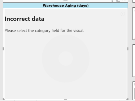
The first issue is below
The second issue are "values" in this visual.
I can only add one measure, but I need more, like in pie chart.
- Mark as New
- Bookmark
- Subscribe
- Mute
- Subscribe to RSS Feed
- Permalink
- Report Inappropriate Content
For your reference take a look at attached screen shot.
In the Category property, you can enter different drill down fields let's Year,Month, Day etc. and in Values property you can put one measure or numeric value.
Please don't forget to hit THUMBS UP and Accept this as a solution if it helps you!
Please take a quick glance at newly created dashboards : Restaurant Management Dashboard , HR Analytics Report , Hotel Management Report, Sales Analysis Report , Fortune 500 Companies Analysis , Revenue Tracking Dashboard
- Mark as New
- Bookmark
- Subscribe
- Mute
- Subscribe to RSS Feed
- Permalink
- Report Inappropriate Content
@Icey
@Tahreem24
It's working exactly like your description
Now, my question is, how to edit interactions in Advanced Donut Chart between visuals to work somehow like bookmark ?
I want to switching main table by clicking one piece of my pie chart.
For example, I click on 0-15 on pie chart, the table with index number shows only indexes with 0-15 aging etc.
It results with 5 almost same tables only differs for different measures.
- Mark as New
- Bookmark
- Subscribe
- Mute
- Subscribe to RSS Feed
- Permalink
- Report Inappropriate Content
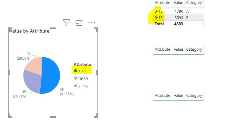
You want something like below:
Please don't forget to hit THUMBS UP and Accept this as a solution if it helps you!
Please take a quick glance at newly created dashboards : Restaurant Management Dashboard , HR Analytics Report , Hotel Management Report, Sales Analysis Report , Fortune 500 Companies Analysis , Revenue Tracking Dashboard
- Mark as New
- Bookmark
- Subscribe
- Mute
- Subscribe to RSS Feed
- Permalink
- Report Inappropriate Content
Exactly!
Maybe it's not important, but small adjustment that the same index cannot appear in two different Aging categories.
- Mark as New
- Bookmark
- Subscribe
- Mute
- Subscribe to RSS Feed
- Permalink
- Report Inappropriate Content
Simple follow my Post for unpivoting the all bucket columns then Take Table and Pie chart and it will automatically interacting with each other.
Please don't forget to hit THUMBS UP and Accept this as a solution if it helps you!
Please take a quick glance at newly created dashboards : Restaurant Management Dashboard , HR Analytics Report , Hotel Management Report, Sales Analysis Report , Fortune 500 Companies Analysis , Revenue Tracking Dashboard
- Mark as New
- Bookmark
- Subscribe
- Mute
- Subscribe to RSS Feed
- Permalink
- Report Inappropriate Content
@Tahreem24
Your solution with unpivoting columns are not gonna work.
You have every tape of aging group in columns, I have this calculation include in measure.
That's why I think that I need bookmarks.
Only I want to know, if it possible to make every piece of pie chart (or any other visual) to be button to switch between tables.
- Mark as New
- Bookmark
- Subscribe
- Mute
- Subscribe to RSS Feed
- Permalink
- Report Inappropriate Content
@pawelj795 Give Thumbs up for Support And mark it as a solution.
Please take a quick glance at newly created dashboards : Restaurant Management Dashboard , HR Analytics Report , Hotel Management Report, Sales Analysis Report , Fortune 500 Companies Analysis , Revenue Tracking Dashboard
- Mark as New
- Bookmark
- Subscribe
- Mute
- Subscribe to RSS Feed
- Permalink
- Report Inappropriate Content
@Tahreem24
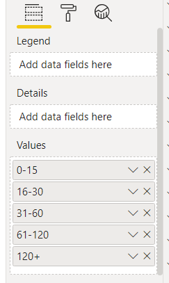
That's my pie chart.
I need only measures in values, nothing more.
Problem is, that I cannot figure out how somehow change interactions between table and chart, because pie chart contains only measures.
- Mark as New
- Bookmark
- Subscribe
- Mute
- Subscribe to RSS Feed
- Permalink
- Report Inappropriate Content
@Tahreem24
To sum up, I think that only solution are bookmarks.
But how to create them in approachable way?
- Mark as New
- Bookmark
- Subscribe
- Mute
- Subscribe to RSS Feed
- Permalink
- Report Inappropriate Content
Here you go.
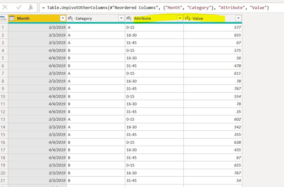
Step 1: My sample data is look like below:
Step 2: Select your different bucket like I have selected in below screen shot. And then click on Unpivot Column.
Step 3: Then you'll get two column Attribute and Values.
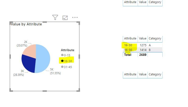
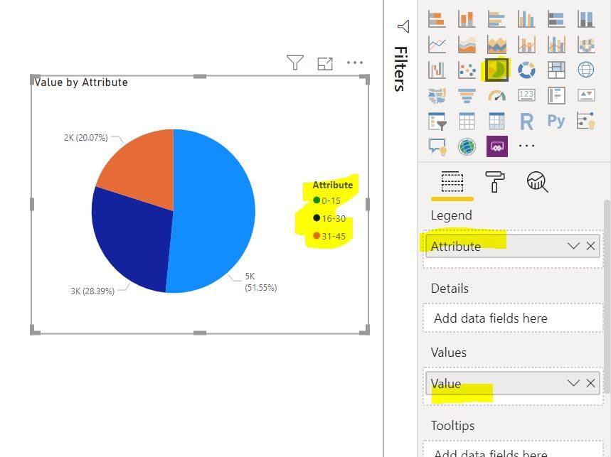
Step 4: Then create a pie chart like below:
Finally, You'll get your expected output. Cause creating bookmark is tedious.
Please don't forget to hit THUMBS UP and Accept this as a solution if it helps you!
Please take a quick glance at newly created dashboards : Restaurant Management Dashboard , HR Analytics Report , Hotel Management Report, Sales Analysis Report , Fortune 500 Companies Analysis , Revenue Tracking Dashboard
- Mark as New
- Bookmark
- Subscribe
- Mute
- Subscribe to RSS Feed
- Permalink
- Report Inappropriate Content
@Tahreem24
Unfortunately, your idea are not gonna work.
You see, for valid calculation of aging I have very complicated measures -> it's not possible to change this.
In your solution you are using columns.
That's the main problem.
- Mark as New
- Bookmark
- Subscribe
- Mute
- Subscribe to RSS Feed
- Permalink
- Report Inappropriate Content
You can unpivot your different bucket and create pie chart accordingly. GIve me some moments I am posting deets on it.
Please don't forget to hit THUMBS UP and Accept this as a solution if it helps you!
Please take a quick glance at newly created dashboards : Restaurant Management Dashboard , HR Analytics Report , Hotel Management Report, Sales Analysis Report , Fortune 500 Companies Analysis , Revenue Tracking Dashboard
Helpful resources

Microsoft Fabric Learn Together
Covering the world! 9:00-10:30 AM Sydney, 4:00-5:30 PM CET (Paris/Berlin), 7:00-8:30 PM Mexico City

Power BI Monthly Update - April 2024
Check out the April 2024 Power BI update to learn about new features.

| User | Count |
|---|---|
| 113 | |
| 97 | |
| 85 | |
| 70 | |
| 61 |
| User | Count |
|---|---|
| 151 | |
| 121 | |
| 104 | |
| 87 | |
| 67 |
