- Power BI forums
- Updates
- News & Announcements
- Get Help with Power BI
- Desktop
- Service
- Report Server
- Power Query
- Mobile Apps
- Developer
- DAX Commands and Tips
- Custom Visuals Development Discussion
- Health and Life Sciences
- Power BI Spanish forums
- Translated Spanish Desktop
- Power Platform Integration - Better Together!
- Power Platform Integrations (Read-only)
- Power Platform and Dynamics 365 Integrations (Read-only)
- Training and Consulting
- Instructor Led Training
- Dashboard in a Day for Women, by Women
- Galleries
- Community Connections & How-To Videos
- COVID-19 Data Stories Gallery
- Themes Gallery
- Data Stories Gallery
- R Script Showcase
- Webinars and Video Gallery
- Quick Measures Gallery
- 2021 MSBizAppsSummit Gallery
- 2020 MSBizAppsSummit Gallery
- 2019 MSBizAppsSummit Gallery
- Events
- Ideas
- Custom Visuals Ideas
- Issues
- Issues
- Events
- Upcoming Events
- Community Blog
- Power BI Community Blog
- Custom Visuals Community Blog
- Community Support
- Community Accounts & Registration
- Using the Community
- Community Feedback
Register now to learn Fabric in free live sessions led by the best Microsoft experts. From Apr 16 to May 9, in English and Spanish.
- Power BI forums
- Forums
- Get Help with Power BI
- Desktop
- Re: Pie Chart to Show Data Properly
- Subscribe to RSS Feed
- Mark Topic as New
- Mark Topic as Read
- Float this Topic for Current User
- Bookmark
- Subscribe
- Printer Friendly Page
- Mark as New
- Bookmark
- Subscribe
- Mute
- Subscribe to RSS Feed
- Permalink
- Report Inappropriate Content
Pie Chart to Show Data Properly
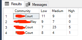
I have the following data:
I have then imported this into PBI but it's not allowing me to show the data how I would like. Ideally, I would like the top level of the donut to show the total number of Low, Medium and High across all communities within the location, and drill-downs to show the L, M and H for the four separate communities. Is this possible?
Of course, I could create four donut visualisations to show each community in more detail, but I am trying to use the report as a template for other locations, changing just one or two parameters to avoid over-duplication, and other locations do not have the same number of communities within them.
Any tips or ideas would be appreciated...
Thanks
Solved! Go to Solution.
- Mark as New
- Bookmark
- Subscribe
- Mute
- Subscribe to RSS Feed
- Permalink
- Report Inappropriate Content
At first I was thinking of a sunburst visualization. Check these out and play with them a bit to see if you can get your expected result. They're an interesting visual.
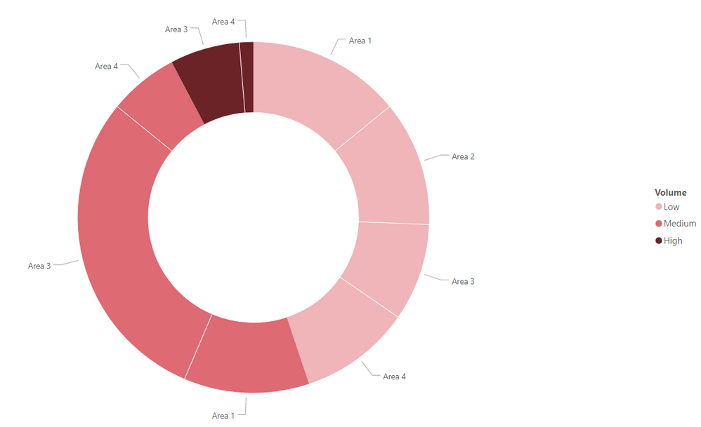
However - I rearranged your table a bit and got to this point let me know if this is what you're looking for.
- Mark as New
- Bookmark
- Subscribe
- Mute
- Subscribe to RSS Feed
- Permalink
- Report Inappropriate Content
You can download the custom visuals like Sunburst, Donut chart by ZoomChart pro Edition etc.
Please take a quick glance at newly created dashboards : Restaurant Management Dashboard , HR Analytics Report , Hotel Management Report, Sales Analysis Report , Fortune 500 Companies Analysis , Revenue Tracking Dashboard
- Mark as New
- Bookmark
- Subscribe
- Mute
- Subscribe to RSS Feed
- Permalink
- Report Inappropriate Content
@valleyman , The information you have provided is not making the problem clear to me. Can you please explain with an example.
I think you might have to unpivot the column and do it
https://radacad.com/pivot-and-unpivot-with-power-bi
Transpose : https://yodalearning.com/tutorials/power-query-helps-transposing-data/
Appreciate your Kudos.
Microsoft Power BI Learning Resources, 2023 !!
Learn Power BI - Full Course with Dec-2022, with Window, Index, Offset, 100+ Topics !!
Did I answer your question? Mark my post as a solution! Appreciate your Kudos !! Proud to be a Super User! !!
- Mark as New
- Bookmark
- Subscribe
- Mute
- Subscribe to RSS Feed
- Permalink
- Report Inappropriate Content
OK, let me explain a little better.
The chart above shows the Low, Medium and High values for each of the 'communities' within a 'location'. I have several other locations that I wish to use the same, basic pbix template for, save for altering some parameters in each.
I would like the donut to show me, at the top level, the total number of Low, Medium and High for ALL communities combined. For the example above, that would be Low = 35, Medium = 43, and High = 6. Upon drilling down one level, for it to show me the total Low, Medium and High for each of the four communities present. So C1 = 11, 9 and 0. C2 = 9, 7 and 0. C3 = 7, 23 and 5. C4 = 8, 4 and 1.
Is THIS possible?
Helpful resources

Microsoft Fabric Learn Together
Covering the world! 9:00-10:30 AM Sydney, 4:00-5:30 PM CET (Paris/Berlin), 7:00-8:30 PM Mexico City

Power BI Monthly Update - April 2024
Check out the April 2024 Power BI update to learn about new features.

| User | Count |
|---|---|
| 107 | |
| 93 | |
| 77 | |
| 65 | |
| 53 |
| User | Count |
|---|---|
| 147 | |
| 106 | |
| 104 | |
| 87 | |
| 61 |


