- Power BI forums
- Updates
- News & Announcements
- Get Help with Power BI
- Desktop
- Service
- Report Server
- Power Query
- Mobile Apps
- Developer
- DAX Commands and Tips
- Custom Visuals Development Discussion
- Health and Life Sciences
- Power BI Spanish forums
- Translated Spanish Desktop
- Power Platform Integration - Better Together!
- Power Platform Integrations (Read-only)
- Power Platform and Dynamics 365 Integrations (Read-only)
- Training and Consulting
- Instructor Led Training
- Dashboard in a Day for Women, by Women
- Galleries
- Community Connections & How-To Videos
- COVID-19 Data Stories Gallery
- Themes Gallery
- Data Stories Gallery
- R Script Showcase
- Webinars and Video Gallery
- Quick Measures Gallery
- 2021 MSBizAppsSummit Gallery
- 2020 MSBizAppsSummit Gallery
- 2019 MSBizAppsSummit Gallery
- Events
- Ideas
- Custom Visuals Ideas
- Issues
- Issues
- Events
- Upcoming Events
- Community Blog
- Power BI Community Blog
- Custom Visuals Community Blog
- Community Support
- Community Accounts & Registration
- Using the Community
- Community Feedback
Register now to learn Fabric in free live sessions led by the best Microsoft experts. From Apr 16 to May 9, in English and Spanish.
- Power BI forums
- Forums
- Get Help with Power BI
- Desktop
- Pie Chart Grouped By Ranking
- Subscribe to RSS Feed
- Mark Topic as New
- Mark Topic as Read
- Float this Topic for Current User
- Bookmark
- Subscribe
- Printer Friendly Page
- Mark as New
- Bookmark
- Subscribe
- Mute
- Subscribe to RSS Feed
- Permalink
- Report Inappropriate Content
Pie Chart Grouped By Ranking
Hello to everyone,
I am trying to group a pie chart of many courier company sales considering the following aspects:
- Company X, Company Y and Company Z, which are top 2, 4 and 5 respectively, must have their own independent slice
- Group top 5 companies in another slice, this slice does not include Company X, Y and Z as each of them should have their own slice. Label it "Other Couriers Top 5"
- Group the other companies in another slice under the label "Others"
Therefore, I would have 5 different slices in my pie chart and every month that I update my database, the pie chart will also update the top 5 couriers according to their sales.
I will be extremely grateful for your help, I have been stuck in this issue for a while.
Best,
Jalv
Solved! Go to Solution.
- Mark as New
- Bookmark
- Subscribe
- Mute
- Subscribe to RSS Feed
- Permalink
- Report Inappropriate Content
Hi @Andvil ,
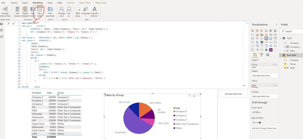
Actually, what that user created is calculated table not measure or calculated column. If you used his provided formula with calculated table, it works well. Please check the below screen shot.
In addition, there is another method: create 5 different measure to display the summarized sales of these 5 five partitions.
You can refer the details of both methods in this link.
Best Regards
Rena
If this post helps, then please consider Accept it as the solution to help the other members find it more quickly.
- Mark as New
- Bookmark
- Subscribe
- Mute
- Subscribe to RSS Feed
- Permalink
- Report Inappropriate Content
Hi @Andvil ,
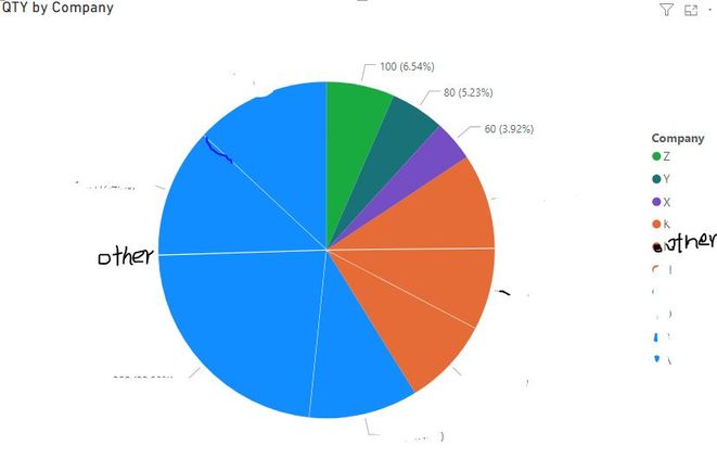
As checked the formula which you created in your report file, it is CORRECT. And why those specific 3 companies didn't display in Pie Chart besides others and top 5 companies, it is due to companies "ENTREGAS ESPECIALES ESPENTREGAS S.A.", "DHL EXPRESS ECUADOR S.A." and "LAARCOURIER EXPRESS S.A." with very small proportion as compared with others and top 5 companies group. So they cannot be displayed on Pie Chart. Maybe you can use other visual(for example: clustered column chart etc. ) to represent the proportion just like below screen shot.
Best Regards
Rena
If this post helps, then please consider Accept it as the solution to help the other members find it more quickly.
- Mark as New
- Bookmark
- Subscribe
- Mute
- Subscribe to RSS Feed
- Permalink
- Report Inappropriate Content
Hi @Andvil ,
Could you please provide some sample data? The pie chart will be divided into 5 parts with these values just like below screen shot? Whether the following screen shot is your expected result?
1. Company X
2. Company Y
3. Company Z
4. Top 5 companies except company X,Y and Z
5. The left companies
Best Regards
Rena
If this post helps, then please consider Accept it as the solution to help the other members find it more quickly.
- Mark as New
- Bookmark
- Subscribe
- Mute
- Subscribe to RSS Feed
- Permalink
- Report Inappropriate Content
Hello @v-yiruan-msft
Another user helped me with this formula, but when using it in the original report, I receive the error "The expression refers to multiple columns. Multiple columns cannot be converted to a scalar value"
Rank table =
VAR tab =
    FILTER (
        SUMMARIZE ( 'Table', 'Table'[Company], "Sales", SUM ( 'Table'[Sales] ) ),
        NOT ( [Company] IN { "Company X", "Company Y", "Company Z" } )
    )
VAR newtab =
    ADDCOLUMNS ( tab, "Rank", RANKX ( tab, [Sales] ) )
VAR _table =
    SUMMARIZE (
        'Table',
        'Table'[Company],
        "Sales", SUM ( 'Table'[Sales] ),
        "Group",
        VAR _company = [Company]
        RETURN
            IF (
                _company IN { "Company Z", "Company Y", "Company X" },
                [Company],
                VAR x =
                    SUMX ( FILTER ( newtab, [Company] = _company ), [Rank] )
                RETURN
                    IF ( x >= 1 && x <= 5, "Ohter Top 5 Countries", "Others" )
            )
    )
RETURN
    _table
Furthermore, the next thing I would like to do is filter according 2 different categories. For example, I want to have the pie chart where I can filter according to "documents" or "packages". If I select the filter "documents", the pie chart calculates the top 5 companies with more sales in the category Documents, and if I want to display the market share regarding only packages, then I filter packages and the pie chart updates with the top 5 regarding packages.
It would be the same excercise but adding the option to separate or filter between two categories.
Thank you very much for your help.
Best,
Jose Lopez
- Mark as New
- Bookmark
- Subscribe
- Mute
- Subscribe to RSS Feed
- Permalink
- Report Inappropriate Content
Hello @jlopezentregas ,
Actually, what that user created is the calculatedtab, the column is not measured or calculated. If you used your formula provided with calculated table, it works well. Please check the following screenshot.
In addition, there is another method: create 5 different measures to show the summarized sales of these 5 five partitions.
You can see the details of both methods in this link.
Best regards
Rena
If this post helps, then please consider Accept it as the solution to help the other members find it more quickly.
- Mark as New
- Bookmark
- Subscribe
- Mute
- Subscribe to RSS Feed
- Permalink
- Report Inappropriate Content
Hi @Andvil ,
Actually, what that user created is calculated table not measure or calculated column. If you used his provided formula with calculated table, it works well. Please check the below screen shot.
In addition, there is another method: create 5 different measure to display the summarized sales of these 5 five partitions.
You can refer the details of both methods in this link.
Best Regards
Rena
If this post helps, then please consider Accept it as the solution to help the other members find it more quickly.
- Mark as New
- Bookmark
- Subscribe
- Mute
- Subscribe to RSS Feed
- Permalink
- Report Inappropriate Content
Hi @v-yiruan-msft ,
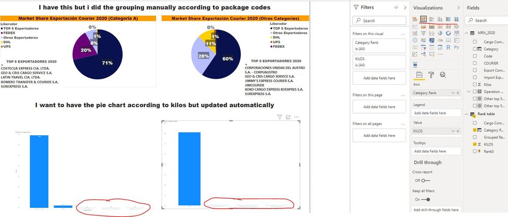
Thank you for your answer! Now I was able to create the calculated table, thank you for the advice. But, when I create the pie chart it does not show the 5 slices. It only shows the "other" group.
Thank you very much for all the comments and help provided.
Best,
Jose L
- Mark as New
- Bookmark
- Subscribe
- Mute
- Subscribe to RSS Feed
- Permalink
- Report Inappropriate Content
Hi @Andvil ,
As checked the formula which you created in your report file, it is CORRECT. And why those specific 3 companies didn't display in Pie Chart besides others and top 5 companies, it is due to companies "ENTREGAS ESPECIALES ESPENTREGAS S.A.", "DHL EXPRESS ECUADOR S.A." and "LAARCOURIER EXPRESS S.A." with very small proportion as compared with others and top 5 companies group. So they cannot be displayed on Pie Chart. Maybe you can use other visual(for example: clustered column chart etc. ) to represent the proportion just like below screen shot.
Best Regards
Rena
If this post helps, then please consider Accept it as the solution to help the other members find it more quickly.
- Mark as New
- Bookmark
- Subscribe
- Mute
- Subscribe to RSS Feed
- Permalink
- Report Inappropriate Content
@Andvil ,
Refer if this can help :https://www.daxpatterns.com/dynamic-segmentation/
https://www.daxpatterns.com/static-segmentation/
Microsoft Power BI Learning Resources, 2023 !!
Learn Power BI - Full Course with Dec-2022, with Window, Index, Offset, 100+ Topics !!
Did I answer your question? Mark my post as a solution! Appreciate your Kudos !! Proud to be a Super User! !!
Helpful resources

Microsoft Fabric Learn Together
Covering the world! 9:00-10:30 AM Sydney, 4:00-5:30 PM CET (Paris/Berlin), 7:00-8:30 PM Mexico City

Power BI Monthly Update - April 2024
Check out the April 2024 Power BI update to learn about new features.

| User | Count |
|---|---|
| 109 | |
| 98 | |
| 77 | |
| 66 | |
| 54 |
| User | Count |
|---|---|
| 144 | |
| 104 | |
| 101 | |
| 86 | |
| 64 |


