- Power BI forums
- Updates
- News & Announcements
- Get Help with Power BI
- Desktop
- Service
- Report Server
- Power Query
- Mobile Apps
- Developer
- DAX Commands and Tips
- Custom Visuals Development Discussion
- Health and Life Sciences
- Power BI Spanish forums
- Translated Spanish Desktop
- Power Platform Integration - Better Together!
- Power Platform Integrations (Read-only)
- Power Platform and Dynamics 365 Integrations (Read-only)
- Training and Consulting
- Instructor Led Training
- Dashboard in a Day for Women, by Women
- Galleries
- Community Connections & How-To Videos
- COVID-19 Data Stories Gallery
- Themes Gallery
- Data Stories Gallery
- R Script Showcase
- Webinars and Video Gallery
- Quick Measures Gallery
- 2021 MSBizAppsSummit Gallery
- 2020 MSBizAppsSummit Gallery
- 2019 MSBizAppsSummit Gallery
- Events
- Ideas
- Custom Visuals Ideas
- Issues
- Issues
- Events
- Upcoming Events
- Community Blog
- Power BI Community Blog
- Custom Visuals Community Blog
- Community Support
- Community Accounts & Registration
- Using the Community
- Community Feedback
Register now to learn Fabric in free live sessions led by the best Microsoft experts. From Apr 16 to May 9, in English and Spanish.
- Power BI forums
- Forums
- Get Help with Power BI
- Desktop
- Re: Pie Chart Data
- Subscribe to RSS Feed
- Mark Topic as New
- Mark Topic as Read
- Float this Topic for Current User
- Bookmark
- Subscribe
- Printer Friendly Page
- Mark as New
- Bookmark
- Subscribe
- Mute
- Subscribe to RSS Feed
- Permalink
- Report Inappropriate Content
Pie Chart Data
Hi Team,
With the recent upgrade, I do see that the Data labels in the Pie chart could be customized to show Percentages alongwith the Category.
Currently, my Pie chart displays Labels in Category and Percentage format, like this - "ABCD 28.06%".
I'm looking to round the Percentage (near the Category) to the nearest whole number.
Any ideas/suggestions on how we can achieve this? Is there any work around?
Thanks!
Ranjani
- Mark as New
- Bookmark
- Subscribe
- Mute
- Subscribe to RSS Feed
- Permalink
- Report Inappropriate Content
Hi @Ranjani_m,
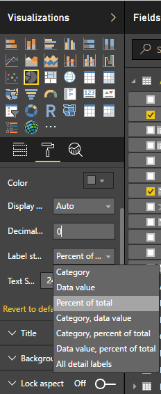
I understood your problem. You have used below setting to simply convert your values to show as percentage.
Well, you cannot round this percentage as of now.
I would suggest you to create a measure and calculate percentage and then round it how @vanessafvg mentioned.
Then use that measure in Values section of the Pi Chart.
Thanks !!!
- Mark as New
- Bookmark
- Subscribe
- Mute
- Subscribe to RSS Feed
- Permalink
- Report Inappropriate Content
Hi,
Thanks for your response. I tried various work arounds using Measuress- those codes work very well as a standalone (can use in a KPI card/Bar Graph) but once I use the Percentage measure on a Pie chart, it doesn’t work since Pie chart again does a percentage calculation automatically. Thereby, a percentage breakdown of an existing percentage happens, leading to wrong values.
Thanks!
- Mark as New
- Bookmark
- Subscribe
- Mute
- Subscribe to RSS Feed
- Permalink
- Report Inappropriate Content
Hi @Ranjani_m,
I think after crearting %Measure, you are choosing Percent Of Total to be shown in Pi Chart.
Just choose Data values as Data labels to be shown. It will show your calculated Measure as breakup of PiChart.
Thanks !!!
- Mark as New
- Bookmark
- Subscribe
- Mute
- Subscribe to RSS Feed
- Permalink
- Report Inappropriate Content
cant you just remove the decimal points from your % ie. change it to 0
If I took the time to answer your question and I came up with a solution, please mark my post as a solution and /or give kudos freely for the effort 🙂 Thank you!
Proud to be a Super User!
- Mark as New
- Bookmark
- Subscribe
- Mute
- Subscribe to RSS Feed
- Permalink
- Report Inappropriate Content
It wouldn't allow me to do that, since am trying to customize the percentage in a Pie chart and not on a specific column.
The decimal formatting (that you have in the screenshot) works/shows up only when we click on a specific column/field from the table and not on the visual.
Thanks!
Ranjani
- Mark as New
- Bookmark
- Subscribe
- Mute
- Subscribe to RSS Feed
- Permalink
- Report Inappropriate Content
ok well as far as i know that is where the formatting of the measure is handled, if you dont want your measure to be formatted like that, maybe create a copy of the measure without the decimals and use that in the chart? out of curiosity is it a % measure or are you converting it to that in the pie?
If I took the time to answer your question and I came up with a solution, please mark my post as a solution and /or give kudos freely for the effort 🙂 Thank you!
Proud to be a Super User!
Helpful resources

Microsoft Fabric Learn Together
Covering the world! 9:00-10:30 AM Sydney, 4:00-5:30 PM CET (Paris/Berlin), 7:00-8:30 PM Mexico City

Power BI Monthly Update - April 2024
Check out the April 2024 Power BI update to learn about new features.

| User | Count |
|---|---|
| 109 | |
| 98 | |
| 77 | |
| 66 | |
| 54 |
| User | Count |
|---|---|
| 144 | |
| 104 | |
| 100 | |
| 86 | |
| 64 |


