- Power BI forums
- Updates
- News & Announcements
- Get Help with Power BI
- Desktop
- Service
- Report Server
- Power Query
- Mobile Apps
- Developer
- DAX Commands and Tips
- Custom Visuals Development Discussion
- Health and Life Sciences
- Power BI Spanish forums
- Translated Spanish Desktop
- Power Platform Integration - Better Together!
- Power Platform Integrations (Read-only)
- Power Platform and Dynamics 365 Integrations (Read-only)
- Training and Consulting
- Instructor Led Training
- Dashboard in a Day for Women, by Women
- Galleries
- Community Connections & How-To Videos
- COVID-19 Data Stories Gallery
- Themes Gallery
- Data Stories Gallery
- R Script Showcase
- Webinars and Video Gallery
- Quick Measures Gallery
- 2021 MSBizAppsSummit Gallery
- 2020 MSBizAppsSummit Gallery
- 2019 MSBizAppsSummit Gallery
- Events
- Ideas
- Custom Visuals Ideas
- Issues
- Issues
- Events
- Upcoming Events
- Community Blog
- Power BI Community Blog
- Custom Visuals Community Blog
- Community Support
- Community Accounts & Registration
- Using the Community
- Community Feedback
Register now to learn Fabric in free live sessions led by the best Microsoft experts. From Apr 16 to May 9, in English and Spanish.
- Power BI forums
- Forums
- Get Help with Power BI
- Desktop
- Re: Percentages
- Subscribe to RSS Feed
- Mark Topic as New
- Mark Topic as Read
- Float this Topic for Current User
- Bookmark
- Subscribe
- Printer Friendly Page
- Mark as New
- Bookmark
- Subscribe
- Mute
- Subscribe to RSS Feed
- Permalink
- Report Inappropriate Content
Percentages
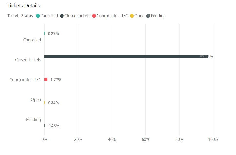
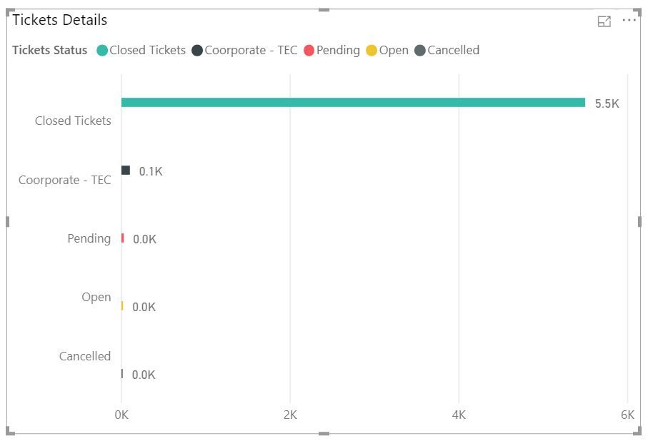
Hello, I wonder if you can help me: I am trying to create a bar chart with percentages. The only value in my data is a New Measure I created that counts the rows on the table.
This works well for everything, except when I try to show percentages.
Also, is there a way to make these bard wider? Many thanks for your help!!
Here is what I have (counting rows):
Solved! Go to Solution.
- Mark as New
- Bookmark
- Subscribe
- Mute
- Subscribe to RSS Feed
- Permalink
- Report Inappropriate Content
Instead of relying on quick measures, build the measure you want. You have:
Tickets = COUNTROWS(WHD_Tickets)
Build one to show % Grand Total:
%Grand Total =
VAR AllWhdTickets = CALCULATE([Tickets], ALL(Table[Status]))
Return
DIVIDE([Tickets], AllWhdTickets)
Please keep in mind that I do not know what your table is named or the column for your descriptions, you will need to put the correct data into the variable.
Did I answer your question? Mark my post as a solution!
Proud to be a Super User!
- Mark as New
- Bookmark
- Subscribe
- Mute
- Subscribe to RSS Feed
- Permalink
- Report Inappropriate Content
Hello,
I'm also trying to plot percentages on a bar chart. I alredy have the perentage as a deceimal but I can't see anyway to plot them as percentages. Can anyone help?
- Mark as New
- Bookmark
- Subscribe
- Mute
- Subscribe to RSS Feed
- Permalink
- Report Inappropriate Content
HI @202001AB ,
Choose the measure or column and format it as % on menu bar.
Regards
Miguel Félix
Did I answer your question? Mark my post as a solution!
Proud to be a Super User!
Check out my blog: Power BI em Português- Mark as New
- Bookmark
- Subscribe
- Mute
- Subscribe to RSS Feed
- Permalink
- Report Inappropriate Content
Dear calebmfoster
Thank you for your answer but I do not have a % to grand total measure, how do I do this?
- Mark as New
- Bookmark
- Subscribe
- Mute
- Subscribe to RSS Feed
- Permalink
- Report Inappropriate Content
Remember the other reply I made and told you to drag your measure into values and hit the drop down menu? Do that but drag it to tool tip instead
- Mark as New
- Bookmark
- Subscribe
- Mute
- Subscribe to RSS Feed
- Permalink
- Report Inappropriate Content
Instead of relying on quick measures, build the measure you want. You have:
Tickets = COUNTROWS(WHD_Tickets)
Build one to show % Grand Total:
%Grand Total =
VAR AllWhdTickets = CALCULATE([Tickets], ALL(Table[Status]))
Return
DIVIDE([Tickets], AllWhdTickets)
Please keep in mind that I do not know what your table is named or the column for your descriptions, you will need to put the correct data into the variable.
Did I answer your question? Mark my post as a solution!
Proud to be a Super User!
- Mark as New
- Bookmark
- Subscribe
- Mute
- Subscribe to RSS Feed
- Permalink
- Report Inappropriate Content
Many thanks! It worked
- Mark as New
- Bookmark
- Subscribe
- Mute
- Subscribe to RSS Feed
- Permalink
- Report Inappropriate Content
No problem, be sure to select a comment as a solution so the thread gets closed.
- Mark as New
- Bookmark
- Subscribe
- Mute
- Subscribe to RSS Feed
- Permalink
- Report Inappropriate Content
hi @imy
Without knowing exactly what measure you are using. I would assume you could click on the measure in the field pane, then click the Modeling tab on the tool bar. Next select percentage under the format drop down list.
As far as the bar width goes, @MFelix is right on the money.
Hope this helps!
- Mark as New
- Bookmark
- Subscribe
- Mute
- Subscribe to RSS Feed
- Permalink
- Report Inappropriate Content
I use this measure for many other visualizations, where I don't need them as a percentage.
On this particular chart, I need each bar to show the percentage of the total count.
Does this explain it better?
Imy
- Mark as New
- Bookmark
- Subscribe
- Mute
- Subscribe to RSS Feed
- Permalink
- Report Inappropriate Content
Ah, in that case, create your bar chart, then drag your measure to the value slot. Then click the little arrow on the side of the measure and select show value as... percent of grand total. It should break out each employee/building/part/whatever's percentage of the total tickets
- Mark as New
- Bookmark
- Subscribe
- Mute
- Subscribe to RSS Feed
- Permalink
- Report Inappropriate Content
Hi,
I just realise my x-axis its also in percentages. Ideally, I would like to have them in numbers and the bars in percentages. Its this possible?

- Mark as New
- Bookmark
- Subscribe
- Mute
- Subscribe to RSS Feed
- Permalink
- Report Inappropriate Content
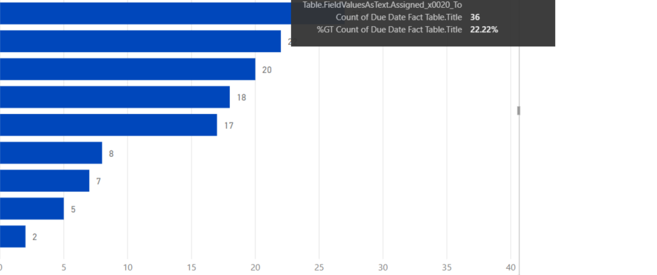
Off of the top my head, the quickest thing you could do is drag the % of grand total measure to the tool tip section, then drag the original measure from the fields pane to the value section. It will give you an outcome similar to this:
- Mark as New
- Bookmark
- Subscribe
- Mute
- Subscribe to RSS Feed
- Permalink
- Report Inappropriate Content
That Simple! Thank you very much! Is there any way to make the bars wider and to format the % decimals?
- Mark as New
- Bookmark
- Subscribe
- Mute
- Subscribe to RSS Feed
- Permalink
- Report Inappropriate Content
No problem, for the decimals, go to the chart formatting menu, then click data labels>click the value decimal places and type "0".
For the bar width, try what @MFelix suggested.
- Mark as New
- Bookmark
- Subscribe
- Mute
- Subscribe to RSS Feed
- Permalink
- Report Inappropriate Content
Hi @imy ,
You can format the decimals on the options of the chart - values format and define the number of decimals you want to have.
Rgards,
MFelix
Regards
Miguel Félix
Did I answer your question? Mark my post as a solution!
Proud to be a Super User!
Check out my blog: Power BI em Português- Mark as New
- Bookmark
- Subscribe
- Mute
- Subscribe to RSS Feed
- Permalink
- Report Inappropriate Content
Hi, sorry I should have mentioned this, my only value is the following measure:
- Mark as New
- Bookmark
- Subscribe
- Mute
- Subscribe to RSS Feed
- Permalink
- Report Inappropriate Content
Hi @imy ,
What is the percentage you want to make? can you share how your measure is calculated?
Regarding the size of the bar if you go to the Y-axis options you can play around with the inner padding and the category width.
Regards,
MFelix
Regards
Miguel Félix
Did I answer your question? Mark my post as a solution!
Proud to be a Super User!
Check out my blog: Power BI em Português- Mark as New
- Bookmark
- Subscribe
- Mute
- Subscribe to RSS Feed
- Permalink
- Report Inappropriate Content
Hi my only measure in this
- Mark as New
- Bookmark
- Subscribe
- Mute
- Subscribe to RSS Feed
- Permalink
- Report Inappropriate Content
drag that measure to both the value slot and the tooltip slot. Select the drop down arrow on the side of the measure in the tool tip slot and click show value as>% grand total.
Helpful resources

Microsoft Fabric Learn Together
Covering the world! 9:00-10:30 AM Sydney, 4:00-5:30 PM CET (Paris/Berlin), 7:00-8:30 PM Mexico City

Power BI Monthly Update - April 2024
Check out the April 2024 Power BI update to learn about new features.

| User | Count |
|---|---|
| 109 | |
| 98 | |
| 77 | |
| 66 | |
| 54 |
| User | Count |
|---|---|
| 144 | |
| 104 | |
| 100 | |
| 86 | |
| 64 |


