- Power BI forums
- Updates
- News & Announcements
- Get Help with Power BI
- Desktop
- Service
- Report Server
- Power Query
- Mobile Apps
- Developer
- DAX Commands and Tips
- Custom Visuals Development Discussion
- Health and Life Sciences
- Power BI Spanish forums
- Translated Spanish Desktop
- Power Platform Integration - Better Together!
- Power Platform Integrations (Read-only)
- Power Platform and Dynamics 365 Integrations (Read-only)
- Training and Consulting
- Instructor Led Training
- Dashboard in a Day for Women, by Women
- Galleries
- Community Connections & How-To Videos
- COVID-19 Data Stories Gallery
- Themes Gallery
- Data Stories Gallery
- R Script Showcase
- Webinars and Video Gallery
- Quick Measures Gallery
- 2021 MSBizAppsSummit Gallery
- 2020 MSBizAppsSummit Gallery
- 2019 MSBizAppsSummit Gallery
- Events
- Ideas
- Custom Visuals Ideas
- Issues
- Issues
- Events
- Upcoming Events
- Community Blog
- Power BI Community Blog
- Custom Visuals Community Blog
- Community Support
- Community Accounts & Registration
- Using the Community
- Community Feedback
Register now to learn Fabric in free live sessions led by the best Microsoft experts. From Apr 16 to May 9, in English and Spanish.
- Power BI forums
- Forums
- Get Help with Power BI
- Desktop
- Percentage passed SLA
- Subscribe to RSS Feed
- Mark Topic as New
- Mark Topic as Read
- Float this Topic for Current User
- Bookmark
- Subscribe
- Printer Friendly Page
- Mark as New
- Bookmark
- Subscribe
- Mute
- Subscribe to RSS Feed
- Permalink
- Report Inappropriate Content
Percentage passed SLA
Hi all,
Thanks in advance for your help on this, I'm a BI noob and it's taken me a few days to get this far!
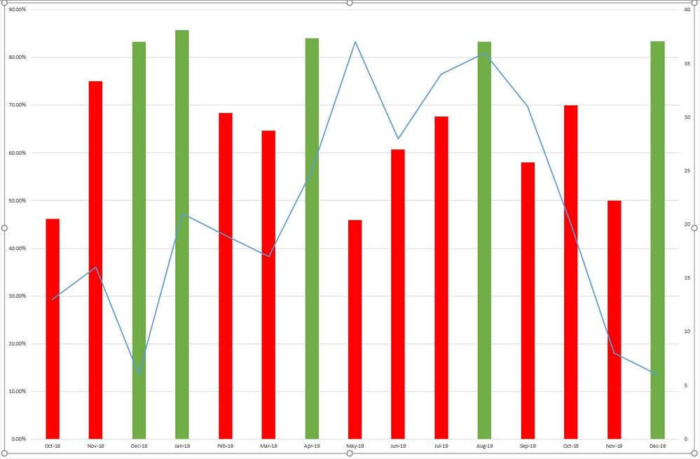
So through Excel and our CRM, there is a bar and line chart that shows the volume of contact with a customer per month.
There is an SLA to file this contact within 5 days and the bars need to show the % passed SLA. I've managed to create a new column that shows whether it passed or failed but I can't seem to get this information in BI.
Solved! Go to Solution.
- Mark as New
- Bookmark
- Subscribe
- Mute
- Subscribe to RSS Feed
- Permalink
- Report Inappropriate Content
I'm assuming that the values displayed in the last image is the "Passing" percentage. In that case create a measure like this:
Measure =
DIVIDE(
CALCULATE( COUNTROWS(ContactReport) ; ContactReport[Pass/Fail] = "Pass") ;
COUNTROWS(ContactReport) ;
BLANK()
)
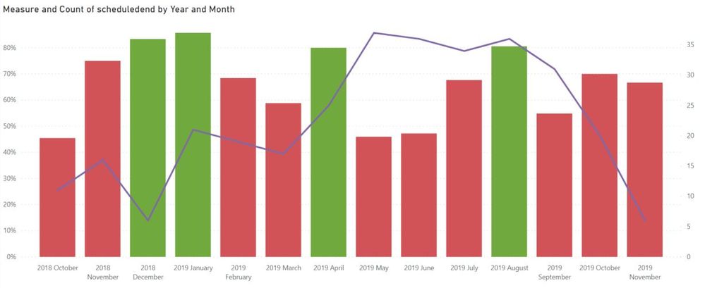
Format the measure as % and then place it in your chart and remove the legend. There should only be the measure and the date dimension.
If you dont get the correct result post a picture and we'll take another look 🙂
Br,
J
Connect on LinkedIn
- Mark as New
- Bookmark
- Subscribe
- Mute
- Subscribe to RSS Feed
- Permalink
- Report Inappropriate Content
It's very difficult to provide help with the information provided. Pictures of current progress and expected outcome would help a lot.
Am i understanding you correctly that you have managed to display passed/failed SLA's in a barchart in PowerBI?
Now you want to display it by % in a line chart and a bar chart?
Br,
J
Connect on LinkedIn
- Mark as New
- Bookmark
- Subscribe
- Mute
- Subscribe to RSS Feed
- Permalink
- Report Inappropriate Content
@tex628 I did submit photos but there was an invalid HTML?
Basically, I would like to know the % pass rate for each month.
This is what I've set up so far (in case the screenshot fails again):
| Duration | Pass | Month | Fail | Pass/Fail |
| 1.5642 | Pass | Jul-2018 | Pass | |
| 57.0657 | Jun-2018 | Fail | Fail | |
| 0.564 | Pass | Jun-2018 | Pass |
I did try:
if([MONTH]="Jul-2018"CALCULATE(COUNTROWS(ContactReport);ContactReport[Pass] = "Pass",0) or something similar but I realised that I would miss out those that failed so I added a pass/fail column. Plus it didn't work anyway, there was a problem somewhere with the syntax.
I tried to create a new table to duplicate what is in the old Excel file with the columns: Date/Yes/No/Percentage but I couldn't work out the formula
I also tried to add a measure rather than a column but the issue with the syntax was solved online by changing from a measure to a column which didn't work for me.
Thanks,
Bec
- Mark as New
- Bookmark
- Subscribe
- Mute
- Subscribe to RSS Feed
- Permalink
- Report Inappropriate Content
Hi @bilogin ,
You could calculate the count of Pass or FAIL and divide it with total count.
Here is my test file for your reference.
If this post helps, then please consider Accept it as the solution to help the other members find it.
- Mark as New
- Bookmark
- Subscribe
- Mute
- Subscribe to RSS Feed
- Permalink
- Report Inappropriate Content
- Mark as New
- Bookmark
- Subscribe
- Mute
- Subscribe to RSS Feed
- Permalink
- Report Inappropriate Content
Alright,
Create a "100% stacked column chart" and then add the following:
Axis: [Month]
Legend: [Pass/Fail]
Value: Count of [Pass/Fail]
This should show you the exact percentage of fails/passes related to each month.
Br,
J
Connect on LinkedIn
- Mark as New
- Bookmark
- Subscribe
- Mute
- Subscribe to RSS Feed
- Permalink
- Report Inappropriate Content
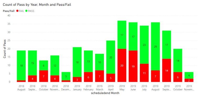
Hi @tex628, thanks for your help. It is looking slightly better.
I followed your steps but it isn't showing the percentage.
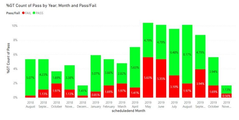
If I change either the Count of Pass/Fail in value to show as %GT, the percentage is too low, I don't think it is taking the month into account but rather the total count of entries for the table.
For example, 17 passed and 19 failed in June 2019, if I change to %GT, the percentages change to 4.79% and 5.35% respectively.
Also the second axis - I still need to display the volume of quotes as well as % passed SLA.
I think I personally need to get away from the graphs looking exactly the same, as long as I can show the % passed and volume for each month, it doesn't matter that it doesn't look like the usual graph.
Thanks,
Bec
- Mark as New
- Bookmark
- Subscribe
- Mute
- Subscribe to RSS Feed
- Permalink
- Report Inappropriate Content
Hi,
The "100% stacked column chart" should display the values in % if you turn on the datalabels.
If you post a picture of your current chart it might be easier to see whats wrong!
Br,
J
Connect on LinkedIn
- Mark as New
- Bookmark
- Subscribe
- Mute
- Subscribe to RSS Feed
- Permalink
- Report Inappropriate Content
- Mark as New
- Bookmark
- Subscribe
- Mute
- Subscribe to RSS Feed
- Permalink
- Report Inappropriate Content
This is how I want it to look:
Thanks,
Bec
- Mark as New
- Bookmark
- Subscribe
- Mute
- Subscribe to RSS Feed
- Permalink
- Report Inappropriate Content
I'm assuming that the values displayed in the last image is the "Passing" percentage. In that case create a measure like this:
Measure =
DIVIDE(
CALCULATE( COUNTROWS(ContactReport) ; ContactReport[Pass/Fail] = "Pass") ;
COUNTROWS(ContactReport) ;
BLANK()
)
Format the measure as % and then place it in your chart and remove the legend. There should only be the measure and the date dimension.
If you dont get the correct result post a picture and we'll take another look 🙂
Br,
J
Connect on LinkedIn
- Mark as New
- Bookmark
- Subscribe
- Mute
- Subscribe to RSS Feed
- Permalink
- Report Inappropriate Content
- Mark as New
- Bookmark
- Subscribe
- Mute
- Subscribe to RSS Feed
- Permalink
- Report Inappropriate Content
- Mark as New
- Bookmark
- Subscribe
- Mute
- Subscribe to RSS Feed
- Permalink
- Report Inappropriate Content
@tex628 I did try to upload photographs but I'll try again.
So here is what I've added into BI so far (in case I have to remove the screenshot):
| Duration | Pass | Month | Fail |
| 1.533954 | PASS | Jul-2018 | |
| 24.53 | Jul-2018 | FAIL | |
| 54.06 | Jun-2018 | FAIL | |
| 0.28 | PASS | Aug-2018 | |
| 144.13373 | Mar-2018 | FAIL |
I should be able to put the information into the graph, it's just the formula I'm having difficulty with.
I've created another column with the formula:
Helpful resources

Microsoft Fabric Learn Together
Covering the world! 9:00-10:30 AM Sydney, 4:00-5:30 PM CET (Paris/Berlin), 7:00-8:30 PM Mexico City

Power BI Monthly Update - April 2024
Check out the April 2024 Power BI update to learn about new features.

| User | Count |
|---|---|
| 110 | |
| 95 | |
| 76 | |
| 65 | |
| 51 |
| User | Count |
|---|---|
| 146 | |
| 109 | |
| 106 | |
| 88 | |
| 61 |


