- Power BI forums
- Updates
- News & Announcements
- Get Help with Power BI
- Desktop
- Service
- Report Server
- Power Query
- Mobile Apps
- Developer
- DAX Commands and Tips
- Custom Visuals Development Discussion
- Health and Life Sciences
- Power BI Spanish forums
- Translated Spanish Desktop
- Power Platform Integration - Better Together!
- Power Platform Integrations (Read-only)
- Power Platform and Dynamics 365 Integrations (Read-only)
- Training and Consulting
- Instructor Led Training
- Dashboard in a Day for Women, by Women
- Galleries
- Community Connections & How-To Videos
- COVID-19 Data Stories Gallery
- Themes Gallery
- Data Stories Gallery
- R Script Showcase
- Webinars and Video Gallery
- Quick Measures Gallery
- 2021 MSBizAppsSummit Gallery
- 2020 MSBizAppsSummit Gallery
- 2019 MSBizAppsSummit Gallery
- Events
- Ideas
- Custom Visuals Ideas
- Issues
- Issues
- Events
- Upcoming Events
- Community Blog
- Power BI Community Blog
- Custom Visuals Community Blog
- Community Support
- Community Accounts & Registration
- Using the Community
- Community Feedback
Register now to learn Fabric in free live sessions led by the best Microsoft experts. From Apr 16 to May 9, in English and Spanish.
- Power BI forums
- Forums
- Get Help with Power BI
- Desktop
- Re: Peak througput (count per second)
- Subscribe to RSS Feed
- Mark Topic as New
- Mark Topic as Read
- Float this Topic for Current User
- Bookmark
- Subscribe
- Printer Friendly Page
- Mark as New
- Bookmark
- Subscribe
- Mute
- Subscribe to RSS Feed
- Permalink
- Report Inappropriate Content
Peak througput (count per second)
Hi!
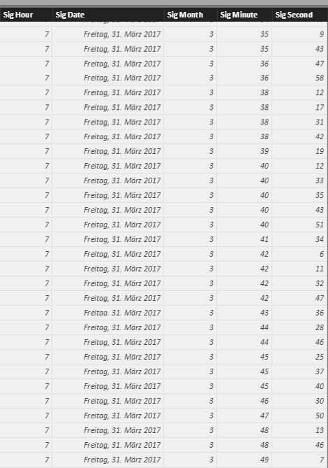
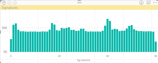
I have table that contains the date/time of a signature done by a user since a couple of months. I have duplicated the "Sig Date" column in order to have a dedicated column for the Hour/Minute/Second. That way I can see the SUM of signatures per Hour/Minute/Second.
However, it shows the SUM over the full time period of the table.
What I would like to do next is a line chart that shows the throughput (signatures per second). Y-Axis contains a measure signature per second and X-Axis contains the timeline (ideally this can be drilled down from year down to a day).
The goal is to see the throuput (how many signatures per second) that can be drilled down to a day, showing the signatures per second over a particular day. It should then be possible to identify the peak month or day and drill it down to get the peak hour or even minute where the highest througput was reached. That would also help to understand the peak load that was processed (instead of some sum or averages values).
How could this be achieved? Any hints?
Solved! Go to Solution.
- Mark as New
- Bookmark
- Subscribe
- Mute
- Subscribe to RSS Feed
- Permalink
- Report Inappropriate Content
Hi,
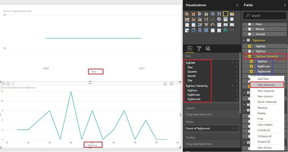
You have done a good job. The structure of the table is good for hierarchy. We just need create a custom hierarchy.
- Right click on “SigHour”, choose “New hierarchy”;
- Add “SigMinute”, “SigSecond” to “SigHour Hierarchy”;
- Create visual as the picture showed. You can drill down to second now.
Best Regards!
Dale
If this post helps, then please consider Accept it as the solution to help the other members find it more quickly.
- Mark as New
- Bookmark
- Subscribe
- Mute
- Subscribe to RSS Feed
- Permalink
- Report Inappropriate Content
Hi @heli
Could you please tell me if the solution worked? Please mark it as answer if it worked.
Best Regards!
Dale
If this post helps, then please consider Accept it as the solution to help the other members find it more quickly.
- Mark as New
- Bookmark
- Subscribe
- Mute
- Subscribe to RSS Feed
- Permalink
- Report Inappropriate Content
Hi,
You have done a good job. The structure of the table is good for hierarchy. We just need create a custom hierarchy.
- Right click on “SigHour”, choose “New hierarchy”;
- Add “SigMinute”, “SigSecond” to “SigHour Hierarchy”;
- Create visual as the picture showed. You can drill down to second now.
Best Regards!
Dale
If this post helps, then please consider Accept it as the solution to help the other members find it more quickly.
- Mark as New
- Bookmark
- Subscribe
- Mute
- Subscribe to RSS Feed
- Permalink
- Report Inappropriate Content
have you created a separate date table?
i would separate out the dates into a different table. I.e
1. create a date table
2. create a relationship between your sign date and the date in the date table
from the little information you have given that might solve the issue, to create a date table see here
https://www.mattmasson.com/2014/02/creating-a-date-dimension-with-a-power-query-script/
If I took the time to answer your question and I came up with a solution, please mark my post as a solution and /or give kudos freely for the effort 🙂 Thank you!
Proud to be a Super User!
Helpful resources

Microsoft Fabric Learn Together
Covering the world! 9:00-10:30 AM Sydney, 4:00-5:30 PM CET (Paris/Berlin), 7:00-8:30 PM Mexico City

Power BI Monthly Update - April 2024
Check out the April 2024 Power BI update to learn about new features.

| User | Count |
|---|---|
| 113 | |
| 100 | |
| 78 | |
| 75 | |
| 51 |
| User | Count |
|---|---|
| 144 | |
| 109 | |
| 108 | |
| 88 | |
| 61 |


