- Power BI forums
- Updates
- News & Announcements
- Get Help with Power BI
- Desktop
- Service
- Report Server
- Power Query
- Mobile Apps
- Developer
- DAX Commands and Tips
- Custom Visuals Development Discussion
- Health and Life Sciences
- Power BI Spanish forums
- Translated Spanish Desktop
- Power Platform Integration - Better Together!
- Power Platform Integrations (Read-only)
- Power Platform and Dynamics 365 Integrations (Read-only)
- Training and Consulting
- Instructor Led Training
- Dashboard in a Day for Women, by Women
- Galleries
- Community Connections & How-To Videos
- COVID-19 Data Stories Gallery
- Themes Gallery
- Data Stories Gallery
- R Script Showcase
- Webinars and Video Gallery
- Quick Measures Gallery
- 2021 MSBizAppsSummit Gallery
- 2020 MSBizAppsSummit Gallery
- 2019 MSBizAppsSummit Gallery
- Events
- Ideas
- Custom Visuals Ideas
- Issues
- Issues
- Events
- Upcoming Events
- Community Blog
- Power BI Community Blog
- Custom Visuals Community Blog
- Community Support
- Community Accounts & Registration
- Using the Community
- Community Feedback
Register now to learn Fabric in free live sessions led by the best Microsoft experts. From Apr 16 to May 9, in English and Spanish.
- Power BI forums
- Forums
- Get Help with Power BI
- Desktop
- Re: Passing selection to R visual
- Subscribe to RSS Feed
- Mark Topic as New
- Mark Topic as Read
- Float this Topic for Current User
- Bookmark
- Subscribe
- Printer Friendly Page
- Mark as New
- Bookmark
- Subscribe
- Mute
- Subscribe to RSS Feed
- Permalink
- Report Inappropriate Content
Passing selection to R visual
I want to know the value of a selection made in a table, so I can use this in an R script visual.
The end result I'm looking for is to recreate "Highlight" rather than filter. My thinking is that when a user selects a name, I can pass that name to the "col" variable in ggplot, to highlight that data amongst everything else rather than filter to only show that data.
I've played around with SELECTEDVALUE but can't get the logic right. Any ideas?
- Mark as New
- Bookmark
- Subscribe
- Mute
- Subscribe to RSS Feed
- Permalink
- Report Inappropriate Content
I'm interested in this exact topic - were you able to find a solution @CheesePlease ?
- Mark as New
- Bookmark
- Subscribe
- Mute
- Subscribe to RSS Feed
- Permalink
- Report Inappropriate Content
Hey @CheesePlease ,
unfortunately I don't really understand what you mean by highlight instead of filtering (I'm aware of the functional differenced inside Power BI) and passing selections made to the R script visual.
For this I just can provide a some general guidance, but maybe you already know that as well. The values well of the R script visual passes a table to the R script, this means that just one parameter will be passed to the R script - this parameter will be a data.frame. Basically this table needs to contain all the information to "draw" your visual. I often use measures to combine multiple selections from slicers using the DAX function CONCATENATEX(...). And decompose the string inside the R script.
Regards,
Tom
Did I answer your question? Mark my post as a solution, this will help others!
Proud to be a Super User!
I accept Kudos 😉
Hamburg, Germany
- Mark as New
- Bookmark
- Subscribe
- Mute
- Subscribe to RSS Feed
- Permalink
- Report Inappropriate Content
Hi @TomMartens,
Thanks for your help.
So assume I have data like this:
| person | xdata | ydata |
Tom | 2 | 3 |
| Ben | 5 | 2 |
| Bob | 3 | 4 |
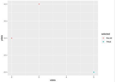
On a "person" table visual, I select Ben. I can get this so that it filters the R visual to only show Ben data, but what I want is to feed to the visual that Ben has been selected, so that I can highlight him in a scatterplot, while keeping the other data.
In this example I've added a third column called "selected" with values F, T, F. I want PowerBi to do something like this automatically when a user clicks on Ben.
dataset = data.frame(person = c("Tom", "Ben", "Bob"),
                  xdata = c(2,5,3),
                  ydata = c(3,2,4),
                  selected = c(F, T, F))

ggplot(dataset) +
  geom_point(aes(x = xdata, y = ydata, col = selected))
Helpful resources

Microsoft Fabric Learn Together
Covering the world! 9:00-10:30 AM Sydney, 4:00-5:30 PM CET (Paris/Berlin), 7:00-8:30 PM Mexico City

Power BI Monthly Update - April 2024
Check out the April 2024 Power BI update to learn about new features.

| User | Count |
|---|---|
| 111 | |
| 95 | |
| 77 | |
| 69 | |
| 52 |
| User | Count |
|---|---|
| 146 | |
| 109 | |
| 106 | |
| 88 | |
| 61 |

