- Power BI forums
- Updates
- News & Announcements
- Get Help with Power BI
- Desktop
- Service
- Report Server
- Power Query
- Mobile Apps
- Developer
- DAX Commands and Tips
- Custom Visuals Development Discussion
- Health and Life Sciences
- Power BI Spanish forums
- Translated Spanish Desktop
- Power Platform Integration - Better Together!
- Power Platform Integrations (Read-only)
- Power Platform and Dynamics 365 Integrations (Read-only)
- Training and Consulting
- Instructor Led Training
- Dashboard in a Day for Women, by Women
- Galleries
- Community Connections & How-To Videos
- COVID-19 Data Stories Gallery
- Themes Gallery
- Data Stories Gallery
- R Script Showcase
- Webinars and Video Gallery
- Quick Measures Gallery
- 2021 MSBizAppsSummit Gallery
- 2020 MSBizAppsSummit Gallery
- 2019 MSBizAppsSummit Gallery
- Events
- Ideas
- Custom Visuals Ideas
- Issues
- Issues
- Events
- Upcoming Events
- Community Blog
- Power BI Community Blog
- Custom Visuals Community Blog
- Community Support
- Community Accounts & Registration
- Using the Community
- Community Feedback
Register now to learn Fabric in free live sessions led by the best Microsoft experts. From Apr 16 to May 9, in English and Spanish.
- Power BI forums
- Forums
- Get Help with Power BI
- Desktop
- Re: Paginated Report Builder - Chart does not full...
- Subscribe to RSS Feed
- Mark Topic as New
- Mark Topic as Read
- Float this Topic for Current User
- Bookmark
- Subscribe
- Printer Friendly Page
- Mark as New
- Bookmark
- Subscribe
- Mute
- Subscribe to RSS Feed
- Permalink
- Report Inappropriate Content
Paginated Report Builder - Chart does not fully generate within the designated Chart Area
Hi All,
I would like to ask some help about the Power BI Paginated Report Builder.
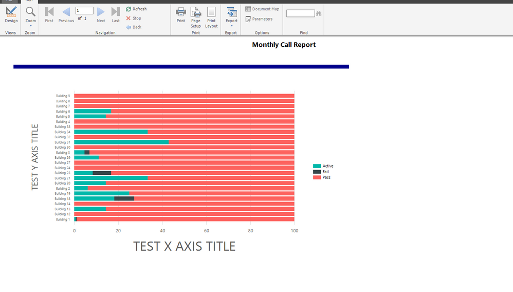
Image to share: https://ibb.co/MZ6LbVp [Some areas are blacked out due to data protection]
I highlighted some of the areas on the screenshot, however I have a few queries:
- On the left side there is a huge blank area. I looked for Paddings or Margins but there is nothing like it under the properties
- On the right side the chart should go until a 100, because the chart is a 100% Column Chart. It stops about 80%.
- On the top the legend is not aligned to the middle of the chart area.
- On the bottom I added the X asis, however it is not visible. Without that some of the column charts wouldn't be visible.
Please can someone advise which chart properties should I check, and are there any Microsoft Documentation about it?
Before advising me to google it I tried without any luck.
Thank you.
- Mark as New
- Bookmark
- Subscribe
- Mute
- Subscribe to RSS Feed
- Permalink
- Report Inappropriate Content
Hi experts,
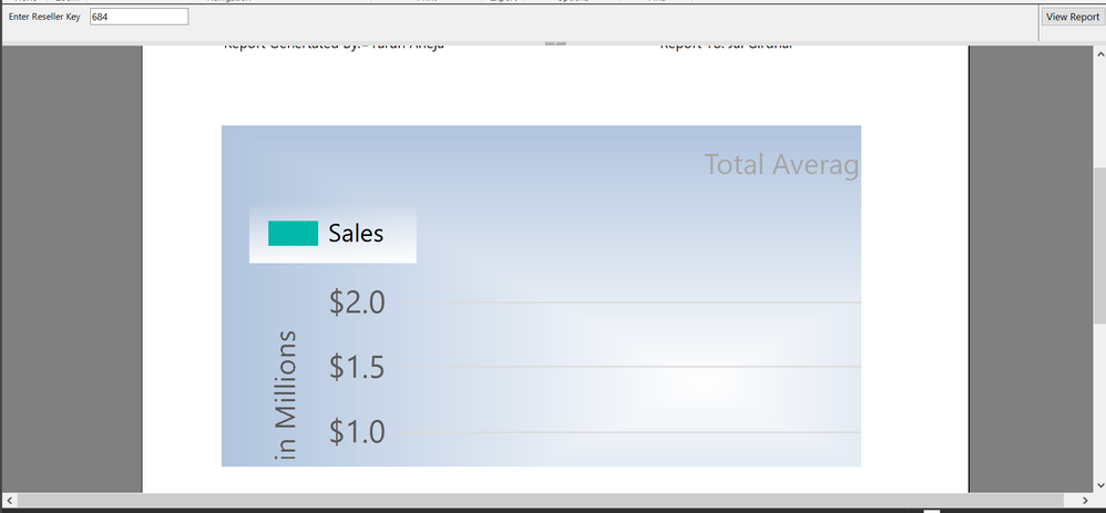
I tried to generate a paginated report, all things were going well. But whenever I tried to add chart in the report it doesn't fully visible in the design and print layout view. Only some part (around 25% is visible ).
I have attached the screenshot please have a look.
any response would be highly appreciated.
Thanks
- Mark as New
- Bookmark
- Subscribe
- Mute
- Subscribe to RSS Feed
- Permalink
- Report Inappropriate Content
Hi @Anonymous ,
It looks like you are use print layout instead of preview, right?
On the left side there is a huge blank area. I looked for Paddings or Margins but there is nothing like it under the properties
You need to check whether you put chart close to left border of design pane?
On the right side the chart should go until a 100, because the chart is a 100% Column Chart. It stops about 80%.
According to your chart, I think a line will be 100%, you could view it in chart, all value in a line is 100%, so it will show 80% in last line(20% is Active)
On the top the legend is not aligned to the middle of the chart area
You need to make sure the chart area whether include Y-axis
On the bottom I added the X asis, however it is not visible. Without that some of the column charts wouldn't be visible.
I could view it in your chart, did you mean that this part can't view in your chart?
By the way, if possible, could you please upload your rdl file(create this report with virtual data instead of real data) and some sample file ? Then I will try to check and modify it in my environment.
Best Regards,
Zoe Zhi
If this post helps, then please consider Accept it as the solution to help the other members find it more quickly.
- Mark as New
- Bookmark
- Subscribe
- Mute
- Subscribe to RSS Feed
- Permalink
- Report Inappropriate Content
Hi Zoe,
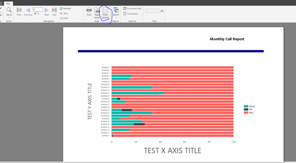
Yes, I am using the print view. In the preview it shows correctly, but the issue is with the print view. It is causing a problem when I try to make a print of it.
I added some cleared manual data and I removed the confidential one. The other difference is that I didn’t add a manual colouring to the chart and legend so Passed tasks shows red instead of green. I shared the report at the end of this message.
Left side blank area:
I checked the sizes and everything is within the page size. The page is an A4 landscape (29.7x21cm with 1cm margins) and the body width is 27cm. I tried to resize the chart, but the issue is still the same on the print view. The preview is OK.
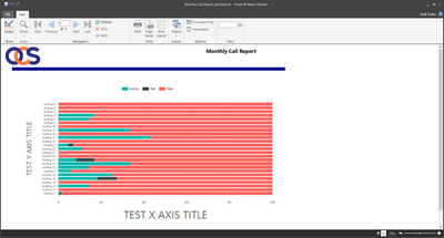
Missing area between 80% and 100%
Preview shows okay with no issue:
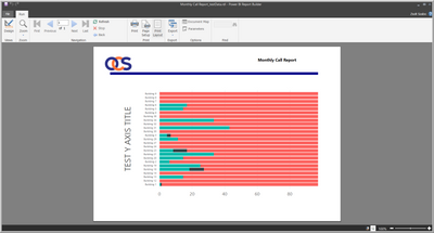
On the print preview the chart seems to have a left and top margin causing the X axis title and the end of the chart disappear. I am starting to think about an inherited value from somewhere, but from where...
On this one I changed the alignment of the legend to the right. As you can see it disappeared, however the end of the chart is pushed back a bit. (print view)
Top Legend not aligned
In print view it seems that the left and top margin pushes the legend to the right a bit.
Bottom X axis
Apologies, I meant X axis title. The X axis is visible.
Report File
Please find the link for it below:
https://drive.google.com/file/d/1dTv77hrpduppoLrKlqmfUZds7JXM40OT/view?usp=sharing
Thank you for your help.
Zsolt
- Mark as New
- Bookmark
- Subscribe
- Mute
- Subscribe to RSS Feed
- Permalink
- Report Inappropriate Content
Hi @Anonymous ,
It seems that you send a correct sample to me, I open this in my environment, I find which works well. I don't modify it
Best Regards,
Zoe Zhi
If this post helps, then please consider Accept it as the solution to help the other members find it more quickly.
- Mark as New
- Bookmark
- Subscribe
- Mute
- Subscribe to RSS Feed
- Permalink
- Report Inappropriate Content
Hi Zoe,
On my end the Preview and Print view are still shows a different versions.
If I try to print the visuals still not showing on the correct place, however if I publish it to the BI Service it has the correct alignment.
It seems I need to trust in the Preview and work with the BI Services.
I raised a call with Microsoft to advise on my Desktop Report Builder, I will share their insight.
I uninstalled, reinstalled, repaired the desktop version, the issue is the same.
Zsolt
- Mark as New
- Bookmark
- Subscribe
- Mute
- Subscribe to RSS Feed
- Permalink
- Report Inappropriate Content
Solution:
After raising a ticket with Microsoft they were able to reproduce the problem.
The problem came from the inherited value of Scalie and Layout under the display settings.
I had the scaling value set for 150%. After changing it to 100% the Printing layout and Preview shows the same output, no issue with the Axis Titles or the Legend not showing.
Thank you all for your help.
- Mark as New
- Bookmark
- Subscribe
- Mute
- Subscribe to RSS Feed
- Permalink
- Report Inappropriate Content
You just resolved a 3-day very painful troubleshoot for me. Thank you very much!
(Worth mentioning that I changed the Windows display settings for 1 screen to 100%, while I left the other on 150% as before, and it still behaved as expected.)
- Mark as New
- Bookmark
- Subscribe
- Mute
- Subscribe to RSS Feed
- Permalink
- Report Inappropriate Content
This was the solution to the X axis disappearing off the bottom of the chart in print preview
- Mark as New
- Bookmark
- Subscribe
- Mute
- Subscribe to RSS Feed
- Permalink
- Report Inappropriate Content
unable to find the layout and scaling option on desktop as well as web version. plz help
- Mark as New
- Bookmark
- Subscribe
- Mute
- Subscribe to RSS Feed
- Permalink
- Report Inappropriate Content
This is a setting for your computer, not in Power BI Report Builder. You can get to it by searching "display settings" in your start menu.
Note that you'll need to resart the program for the scaling setting to be updated.
- Mark as New
- Bookmark
- Subscribe
- Mute
- Subscribe to RSS Feed
- Permalink
- Report Inappropriate Content
- On the left side there is a huge blank area. I looked for Paddings or Margins but there is nothing like it under the properties
Have you accidently left a shape there?. Check your margin settings?
Did I answer your question? Mark my post as a solution!
Proud to be a Super User!
- Mark as New
- Bookmark
- Subscribe
- Mute
- Subscribe to RSS Feed
- Permalink
- Report Inappropriate Content
With regards to the Legend, select it and right click on it, then go to Legend Properties, this should allow you to select the Legend position you want.
Did I answer your question? Mark my post as a solution!
Proud to be a Super User!
- Mark as New
- Bookmark
- Subscribe
- Mute
- Subscribe to RSS Feed
- Permalink
- Report Inappropriate Content
Hey @Anonymous
Paginated Reports can throw up things like this, I've recently started using them and had a few issues when I've not set my page up correctly.
The Power BI Paginated content list below is great, as is the Power BI Paginated Reports in a Day video series on YouTube
I can't check out your image just now as the link is blocked on my company network, will try to check it later.
Did I answer your question? Mark my post as a solution!
Proud to be a Super User!
- Mark as New
- Bookmark
- Subscribe
- Mute
- Subscribe to RSS Feed
- Permalink
- Report Inappropriate Content
Hi Daviejoe,
Thank you for the quick reply. I done the online 1 day paginated report training, but they are not mentioning this kind of issue.
It is really strange to be honest, if I would have the right properties then I would be able to easily amend the objects.
There might be a different approach, if someone knows how to deal with it would mean a lot 🙂
- Mark as New
- Bookmark
- Subscribe
- Mute
- Subscribe to RSS Feed
- Permalink
- Report Inappropriate Content
I think the 100% stacked bar chart is working, it does seem to be adding up to 100%.
Did I answer your question? Mark my post as a solution!
Proud to be a Super User!
- Mark as New
- Bookmark
- Subscribe
- Mute
- Subscribe to RSS Feed
- Permalink
- Report Inappropriate Content
Hi Daviejoe,
I will summarize my answer:
- 100% stack chart not shows: if you see closely the screenshot I highlithed at the bottom that the chart from 80% to 100% is missing. It does not shows on the X axis.
- Legend: the issue is not how to move it to the right side, the issue is that even if I move it to the right side it won't show up, however the chart area will at least show until the 100%. Some cases when I amended the size of the Chart area the legend showed, but only the coloring, or the first 2 letter of the legend.
- White space on the left side: I checked for the alighment on the Y axis and on the chart area, but it there is no property for it and on the top side it is grayed out when I click on these elements. It only usable when I click on a text area such as the Axis titles.
checked for margin, but there is not available for the Chart, I could only found a martin property when I clicked on the Y Axis categoricals. The margin offered me 3 options - True, False, Auto. I tried all of them and it didn't do any major thing, the issue remained the same.
- X axis title not visible - This is still an issue as it seems that the chart is generating on the wrong areas of the report.
Helpful resources

Microsoft Fabric Learn Together
Covering the world! 9:00-10:30 AM Sydney, 4:00-5:30 PM CET (Paris/Berlin), 7:00-8:30 PM Mexico City

Power BI Monthly Update - April 2024
Check out the April 2024 Power BI update to learn about new features.

| User | Count |
|---|---|
| 117 | |
| 107 | |
| 70 | |
| 70 | |
| 43 |
| User | Count |
|---|---|
| 148 | |
| 106 | |
| 104 | |
| 89 | |
| 65 |

