- Power BI forums
- Updates
- News & Announcements
- Get Help with Power BI
- Desktop
- Service
- Report Server
- Power Query
- Mobile Apps
- Developer
- DAX Commands and Tips
- Custom Visuals Development Discussion
- Health and Life Sciences
- Power BI Spanish forums
- Translated Spanish Desktop
- Power Platform Integration - Better Together!
- Power Platform Integrations (Read-only)
- Power Platform and Dynamics 365 Integrations (Read-only)
- Training and Consulting
- Instructor Led Training
- Dashboard in a Day for Women, by Women
- Galleries
- Community Connections & How-To Videos
- COVID-19 Data Stories Gallery
- Themes Gallery
- Data Stories Gallery
- R Script Showcase
- Webinars and Video Gallery
- Quick Measures Gallery
- 2021 MSBizAppsSummit Gallery
- 2020 MSBizAppsSummit Gallery
- 2019 MSBizAppsSummit Gallery
- Events
- Ideas
- Custom Visuals Ideas
- Issues
- Issues
- Events
- Upcoming Events
- Community Blog
- Power BI Community Blog
- Custom Visuals Community Blog
- Community Support
- Community Accounts & Registration
- Using the Community
- Community Feedback
Register now to learn Fabric in free live sessions led by the best Microsoft experts. From Apr 16 to May 9, in English and Spanish.
- Power BI forums
- Forums
- Get Help with Power BI
- Desktop
- PLEASE HELP
- Subscribe to RSS Feed
- Mark Topic as New
- Mark Topic as Read
- Float this Topic for Current User
- Bookmark
- Subscribe
- Printer Friendly Page
- Mark as New
- Bookmark
- Subscribe
- Mute
- Subscribe to RSS Feed
- Permalink
- Report Inappropriate Content
PLEASE HELP
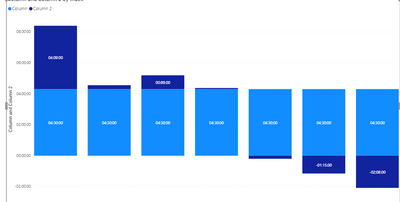
Hey guys, I have Time values in the whole format displayed in the histogram with index. There is 4:30:00 constant that should not be exceeded by the actual time value, if it does I need to display it as a seperate value in the same column. Like in the stacked column chart, if the drive time like in the first column is 08:39 hours, the first column should consist of first value 4:30:00 and then above should be the value for the overtime. I am so struggling with this, any ideas? I have attached my pbix file.
I dont have an option to upload the pbix file here, so here is the link to my pbix:
https://gofile.io/d/pUGv0g
This is the general idea how I want to do it :
Solved! Go to Solution.
- Mark as New
- Bookmark
- Subscribe
- Mute
- Subscribe to RSS Feed
- Permalink
- Report Inappropriate Content
@Anonymous
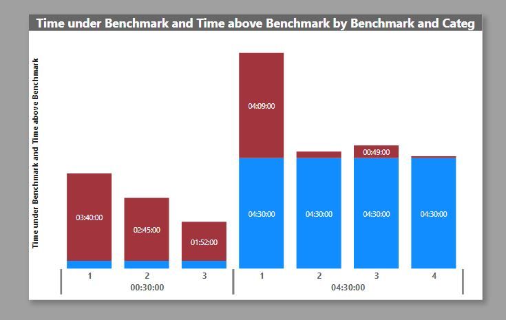
I'm not sure if this is excatly what you are after, but if you wish to include different benchmarks in the same chart, you can do so by creating a Dimension table for the benchmarks and categories, and use them as a hierarchy in the stacked column chart. Something along the lines of this (I've had to alter the data so ignore the detail):
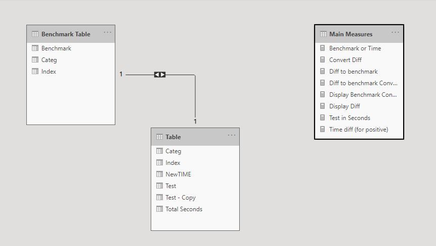
The model is set up like this:
I've attached the PBIX file for reference.
Do let me know if this is not what you are after
Did I answer your question? Mark my post as a solution!
In doing so, you are also helping me. Thank you!
Proud to be a Super User!
Paul on Linkedin.
- Mark as New
- Bookmark
- Subscribe
- Mute
- Subscribe to RSS Feed
- Permalink
- Report Inappropriate Content
Any ideas?
- Mark as New
- Bookmark
- Subscribe
- Mute
- Subscribe to RSS Feed
- Permalink
- Report Inappropriate Content
@Anonymous
I'm not sure if this is excatly what you are after, but if you wish to include different benchmarks in the same chart, you can do so by creating a Dimension table for the benchmarks and categories, and use them as a hierarchy in the stacked column chart. Something along the lines of this (I've had to alter the data so ignore the detail):
The model is set up like this:
I've attached the PBIX file for reference.
Do let me know if this is not what you are after
Did I answer your question? Mark my post as a solution!
In doing so, you are also helping me. Thank you!
Proud to be a Super User!
Paul on Linkedin.
- Mark as New
- Bookmark
- Subscribe
- Mute
- Subscribe to RSS Feed
- Permalink
- Report Inappropriate Content
@PaulDBrown Hi buddy, Can you show me a bit more how you did this dimension table? I would need it to be generated automatically.
- Mark as New
- Bookmark
- Subscribe
- Mute
- Subscribe to RSS Feed
- Permalink
- Report Inappropriate Content
@Anonymous
Hi there,
From what I see, the dimension table is created by referencing a new query to the source table in Power Query, removing unnecessary columns and adding an index column (you can follow the steps by dowloading the sample PBIX file I attched to my previous message).
Did I answer your question? Mark my post as a solution!
In doing so, you are also helping me. Thank you!
Proud to be a Super User!
Paul on Linkedin.
- Mark as New
- Bookmark
- Subscribe
- Mute
- Subscribe to RSS Feed
- Permalink
- Report Inappropriate Content
@PaulDBrown Hi man, I've got my new file here in the link below, woudl you be able to have a look at it? I basically need to do the same thing you did there, but it needs to be certain names. The column that says TR1 or TR2 are the train numbers that needs to be displayed in the same groups.
https://gofile.io/d/gn0LKg
- Mark as New
- Bookmark
- Subscribe
- Mute
- Subscribe to RSS Feed
- Permalink
- Report Inappropriate Content
@PaulDBrown Hi man, that is exactly what I needed, just instead of a benchmark I need to put the text in like : New York - LA for instance.
- Mark as New
- Bookmark
- Subscribe
- Mute
- Subscribe to RSS Feed
- Permalink
- Report Inappropriate Content
@Anonymous
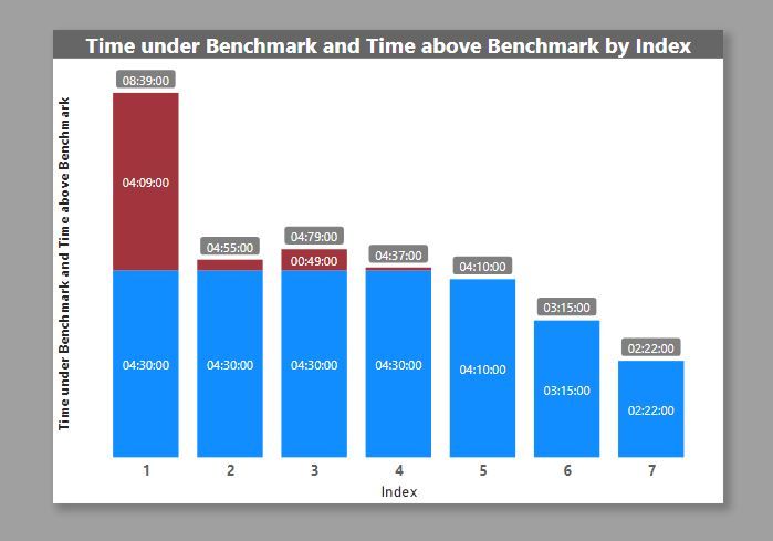
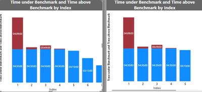
See if this works for you:
The totals for each bar are generated automatically (new feature in September 20) so beware of the values above 60 mins intervals (see index 3)
I've attached the PBIX file for you.
Did I answer your question? Mark my post as a solution!
In doing so, you are also helping me. Thank you!
Proud to be a Super User!
Paul on Linkedin.
- Mark as New
- Bookmark
- Subscribe
- Mute
- Subscribe to RSS Feed
- Permalink
- Report Inappropriate Content
Please guys, I really need help with this one.
- Mark as New
- Bookmark
- Subscribe
- Mute
- Subscribe to RSS Feed
- Permalink
- Report Inappropriate Content
You have to use the Stacked Column Chart not Clustered Column Chart.
You'll have to stop thinking about the Time datatype. Powerbi won't let you add 2pm to 4.30pm.
You've got the right idea with the NewTime column.
Create a column = 43000. I think you have to use a whole number datatype but format it as 00:00:00.
Add that to the Values (with NewTime already there) of the chart. If it displays correctly, you can proceed.
You'll have to make a column by subtracting the 43000 column from NewTime. (Make sure datatype is whole number and format is 00:00:00) If that works, replace NewTime in the chart with this new column.
Good luck
- Mark as New
- Bookmark
- Subscribe
- Mute
- Subscribe to RSS Feed
- Permalink
- Report Inappropriate Content
@HotChilli Your solution does work and makes sense, the only thing is that everything that happens to be below 4:30 is shown as a minus and and I would like it to be just actual value then, let's say if the last column in the picture below is 4:19 i would display 4:19 without that minus.
- Mark as New
- Bookmark
- Subscribe
- Mute
- Subscribe to RSS Feed
- Permalink
- Report Inappropriate Content
@PaulDBrown Dude, you are lifesaver, that does work perfectly. Now I made two of the same graphs, cause i need to do few of them like that, but would like to connect them into one if possible like shown below, any way to go around it?
Regards,
Gediminas
- Mark as New
- Bookmark
- Subscribe
- Mute
- Subscribe to RSS Feed
- Permalink
- Report Inappropriate Content
@Anonymous
I'm glad it helped. Can you please confirm what you want to achieve? I'm interpreting you want two benchmarks in the same visual? (04:30:00 and 00:20:00)
if possible, include a depiction of the final visual you are after. (A drawing like you did in the original post)
Also beware that if you have a considerable number of benchmarks, the visual might appear bloated.
Did I answer your question? Mark my post as a solution!
In doing so, you are also helping me. Thank you!
Proud to be a Super User!
Paul on Linkedin.
- Mark as New
- Bookmark
- Subscribe
- Mute
- Subscribe to RSS Feed
- Permalink
- Report Inappropriate Content
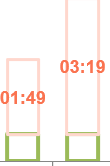
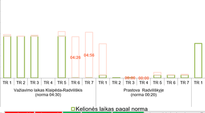
@PaulDBrown so I've got two different categories like below, I want to do the same in powerBI. Ideally, there would be index 1 2 3 up to the 7 from the same two graphs.
this is the link to the pbix file im doing right now. So in short, I got two different units of the same graph and I need to connect them into one so I could display it like below(I mean the axis, eveything else is sorted right now)
- Mark as New
- Bookmark
- Subscribe
- Mute
- Subscribe to RSS Feed
- Permalink
- Report Inappropriate Content
What about editing the y-axis start in the Format section? Set it to 0 or something.
Maybe Paul has solved it in his post above.
Helpful resources

Microsoft Fabric Learn Together
Covering the world! 9:00-10:30 AM Sydney, 4:00-5:30 PM CET (Paris/Berlin), 7:00-8:30 PM Mexico City

Power BI Monthly Update - April 2024
Check out the April 2024 Power BI update to learn about new features.

| User | Count |
|---|---|
| 114 | |
| 99 | |
| 83 | |
| 70 | |
| 61 |
| User | Count |
|---|---|
| 149 | |
| 114 | |
| 107 | |
| 89 | |
| 67 |

