- Power BI forums
- Updates
- News & Announcements
- Get Help with Power BI
- Desktop
- Service
- Report Server
- Power Query
- Mobile Apps
- Developer
- DAX Commands and Tips
- Custom Visuals Development Discussion
- Health and Life Sciences
- Power BI Spanish forums
- Translated Spanish Desktop
- Power Platform Integration - Better Together!
- Power Platform Integrations (Read-only)
- Power Platform and Dynamics 365 Integrations (Read-only)
- Training and Consulting
- Instructor Led Training
- Dashboard in a Day for Women, by Women
- Galleries
- Community Connections & How-To Videos
- COVID-19 Data Stories Gallery
- Themes Gallery
- Data Stories Gallery
- R Script Showcase
- Webinars and Video Gallery
- Quick Measures Gallery
- 2021 MSBizAppsSummit Gallery
- 2020 MSBizAppsSummit Gallery
- 2019 MSBizAppsSummit Gallery
- Events
- Ideas
- Custom Visuals Ideas
- Issues
- Issues
- Events
- Upcoming Events
- Community Blog
- Power BI Community Blog
- Custom Visuals Community Blog
- Community Support
- Community Accounts & Registration
- Using the Community
- Community Feedback
Register now to learn Fabric in free live sessions led by the best Microsoft experts. From Apr 16 to May 9, in English and Spanish.
- Power BI forums
- Forums
- Get Help with Power BI
- Desktop
- Overlay/Combine Line Charts
- Subscribe to RSS Feed
- Mark Topic as New
- Mark Topic as Read
- Float this Topic for Current User
- Bookmark
- Subscribe
- Printer Friendly Page
- Mark as New
- Bookmark
- Subscribe
- Mute
- Subscribe to RSS Feed
- Permalink
- Report Inappropriate Content
Overlay/Combine Line Charts
I am trying to achieve a visualization of multiple lines graph to show:
- salesman's monthly average selling rate (ASR)
- company's overall monthly average selling rate
Objective is to compare the performance of the salesman vs company's average.
My dataset are in this order
Transaction Month ASR SalesmanName
Sales001 JAN18 $100 AA
Sales002 JAN18 $90 BB
Sales003 FEB18 $105 AA
Sales004 FEB18 $99 AA
Sales005 FEB18 $120 BB
Sales006 MAR18 $100 AA
Sales007 MAR18 $80 BB
Sales008 MAR18 $80 BB
Sales009 APR18 $90 AA
So after calculation with tabulation, I want to present in line chart
Month JAN18 FEB18 MAR18 APR18
Company $95 $108 $86.67 $90 (simple averaging calculation, eg. JAN18 is $100+$90/2)
AA $100 $102 $100 $90
BB $90 $120 $80
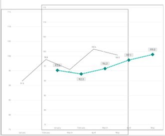
So I have created 2 line charts (figures in picture are for reference only):
1-->(the one with fine line) Axis=Month; Values=ASR; Legend=SalesmanName
2-->(the one with green dotted line) Axis=Month; Values=ASR; Legend=NONE
I think the source of my problem is here, I am trying to display the same measure twice.
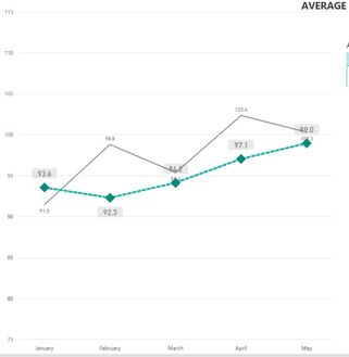
However, when I carefully put the 2 together, I would get this nice chart for comparison between the company average(green dotted) and the salesman's (grey) trend line performance:
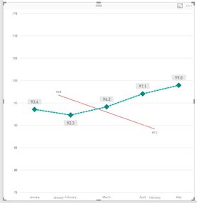
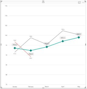
But, in the case of Salesman BB where he has no sales number in APR18, the graph will resize and both charts will not overlay properly. See the months are not overlaying accurately on top of each other.
However, I currently had a dumb solution to it by selecting more than 1 salesman where the other supporting salesman has the full data every month
Can anybody please help to give any solution to use only 1 graph instead of overlaying 2 graphs? How should I manipulate my dataset?
Solved! Go to Solution.
- Mark as New
- Bookmark
- Subscribe
- Mute
- Subscribe to RSS Feed
- Permalink
- Report Inappropriate Content
Hi @gelseytanse,
I would suggest you add them all in one visual. Please check out the demo in the attachment.
AA =
CALCULATE ( AVERAGE ( Table1[ASR] ), 'Table1'[SalesmanName] = "AA" )
BB =
CALCULATE ( AVERAGE ( Table1[ASR] ), Table1[SalesmanName] = "BB" )
Company = AVERAGE(Table1[ASR])
Best Regards,
Dale
If this post helps, then please consider Accept it as the solution to help the other members find it more quickly.
- Mark as New
- Bookmark
- Subscribe
- Mute
- Subscribe to RSS Feed
- Permalink
- Report Inappropriate Content
Hi @gelseytanse,
Could you please mark the proper answers as solutions?
Best Regards,
Dale
If this post helps, then please consider Accept it as the solution to help the other members find it more quickly.
- Mark as New
- Bookmark
- Subscribe
- Mute
- Subscribe to RSS Feed
- Permalink
- Report Inappropriate Content
Hi Dale,
Thanks for the solution!
Gelsey
- Mark as New
- Bookmark
- Subscribe
- Mute
- Subscribe to RSS Feed
- Permalink
- Report Inappropriate Content
Hi @gelseytanse,
I would suggest you add them all in one visual. Please check out the demo in the attachment.
AA =
CALCULATE ( AVERAGE ( Table1[ASR] ), 'Table1'[SalesmanName] = "AA" )
BB =
CALCULATE ( AVERAGE ( Table1[ASR] ), Table1[SalesmanName] = "BB" )
Company = AVERAGE(Table1[ASR])
Best Regards,
Dale
If this post helps, then please consider Accept it as the solution to help the other members find it more quickly.
Helpful resources

Microsoft Fabric Learn Together
Covering the world! 9:00-10:30 AM Sydney, 4:00-5:30 PM CET (Paris/Berlin), 7:00-8:30 PM Mexico City

Power BI Monthly Update - April 2024
Check out the April 2024 Power BI update to learn about new features.

| User | Count |
|---|---|
| 114 | |
| 99 | |
| 83 | |
| 70 | |
| 61 |
| User | Count |
|---|---|
| 149 | |
| 114 | |
| 107 | |
| 89 | |
| 67 |


