- Power BI forums
- Updates
- News & Announcements
- Get Help with Power BI
- Desktop
- Service
- Report Server
- Power Query
- Mobile Apps
- Developer
- DAX Commands and Tips
- Custom Visuals Development Discussion
- Health and Life Sciences
- Power BI Spanish forums
- Translated Spanish Desktop
- Power Platform Integration - Better Together!
- Power Platform Integrations (Read-only)
- Power Platform and Dynamics 365 Integrations (Read-only)
- Training and Consulting
- Instructor Led Training
- Dashboard in a Day for Women, by Women
- Galleries
- Community Connections & How-To Videos
- COVID-19 Data Stories Gallery
- Themes Gallery
- Data Stories Gallery
- R Script Showcase
- Webinars and Video Gallery
- Quick Measures Gallery
- 2021 MSBizAppsSummit Gallery
- 2020 MSBizAppsSummit Gallery
- 2019 MSBizAppsSummit Gallery
- Events
- Ideas
- Custom Visuals Ideas
- Issues
- Issues
- Events
- Upcoming Events
- Community Blog
- Power BI Community Blog
- Custom Visuals Community Blog
- Community Support
- Community Accounts & Registration
- Using the Community
- Community Feedback
Register now to learn Fabric in free live sessions led by the best Microsoft experts. From Apr 16 to May 9, in English and Spanish.
- Power BI forums
- Forums
- Get Help with Power BI
- Desktop
- Re: Overlay Charts w/ Different Dates
- Subscribe to RSS Feed
- Mark Topic as New
- Mark Topic as Read
- Float this Topic for Current User
- Bookmark
- Subscribe
- Printer Friendly Page
- Mark as New
- Bookmark
- Subscribe
- Mute
- Subscribe to RSS Feed
- Permalink
- Report Inappropriate Content
Overlay Charts w/ Different Dates
Hello,
I have 7 Line Charts that I want to overlay on eachother to find patterns. The Values are all the same between charts but the Dates on the Axis are different.
I need to be able to overlay different Dates.
Example:
- Event 1: 6/10/18
- Values: Temp. , Humidity, Dew Point, etc.
- Event 2: 7/14/18
- Values: Temp. , Humidity, Dew Point, etc.
- Event N:
- Values: Same as above
How can I overlay these graphs when each has s different Date?
Thank you!
- Mark as New
- Bookmark
- Subscribe
- Mute
- Subscribe to RSS Feed
- Permalink
- Report Inappropriate Content
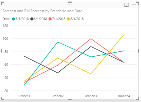
If the relationship, on a single date, between the various measurements is not important, you can have a chart of each type of measurement (temp, humidity, etc), using the date as the "legend". Kind of like this, but you'd likely use "time" as your axis:
Hope this helps
David
- Mark as New
- Bookmark
- Subscribe
- Mute
- Subscribe to RSS Feed
- Permalink
- Report Inappropriate Content
Thanks for the idea @dedelman_clng. I'm not able to get your example working.
Here's what I have:
- All data combined in a single table (weather data and event data)
- There are two date columns in this table
- WeatherDate: weather observations; recorded hourly
- EventDate: "events" that occurred; one-time per day
- The goal is to find weather patterns that occurred leading up to, during, and after an "event".
- Line Chart visual
- Legend set to EventDate (each event)
- Values set to Temperature
- Unfortunately, this gives me SUM of all Temperatures for each Event
- I reaaaallly dislike this issue. It happens to me all the time in Power BI and I don't understand why values are SUMMED.
- Why isn't there an option for "apply no calculation" in this case?
- Unfortunately, this gives me SUM of all Temperatures for each Event
- Also, there is only one "slot" in Values. I want to compare multiple things (Temp, Humidity, etc.)
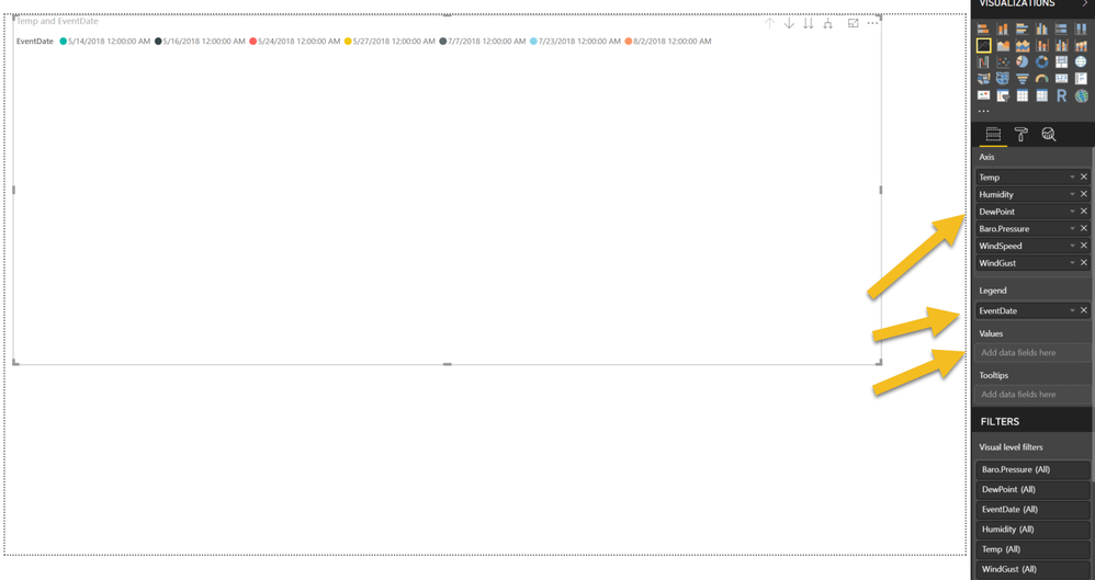
- Removed Temperature from Values and added it to Axis along with Humidity, etc.
- But now, without anything in Values, my Line Chart is just blank
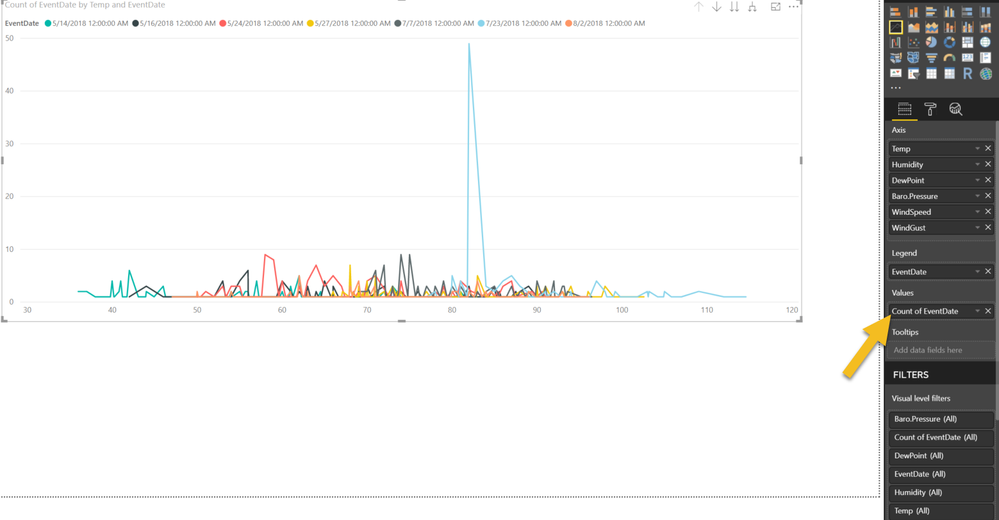
- Adding either EventDate or WeatherDate to Values results in a very strange chart that I can't make heads nor tails of.
- Here you can see Power BI auto COUNT the Value.
- I don't know why this happens either and its another source of frustration.
- Why does Power BI apply a COUNT to the number of dates here?
Can you see what I need to do differently here? Maybe a Scatter Chart instead? (Though I've tried and have the same SUM and COUNT issues there)
Thank you!
- Mark as New
- Bookmark
- Subscribe
- Mute
- Subscribe to RSS Feed
- Permalink
- Report Inappropriate Content
What you describe sounds more like a data science project than pure analytics. What you want can be accomplished, but a lot of the heavy lifting will be preparation of the data. Transforming data like turning time values into hours/minutes before or after the event. Normalizing values for temperature, humidity, etc so that they are on the same relative scale if charting on the same graph.
As far as PowerBI goes, yes, there can be some frustrations, but here are some of the basics to remember:
- While you can use PowerBI and make amazing visuals without creating measures, creating measures is more powerful and scalable, even if it is just SUM(Value). PowerBI visuals are meant for measures, so visual charts that don't have some kind of aggregation don't make any sense to it (you can have unaggregated values in a table or matrix). However, if your data is properly prepared, you'll find that SUM(Value) = MAX(Value) = MIN(Value) = Value when the visual is properly built.
- On a line chart:
- "Axis" are the values shown on the X-axis. If you have multiple different columns here, they are assumed to be in a hierarchy (like Year -> Month -> Day)
- You can either put multiple columns/measures in "Values", or put a single measure/column in Values and put another single column/measure in as "Legend". In the former, the different columns/measures will manifest as different lines; in the latter case, the different values within the column/measure will show the different lines. Because of this, the multi-variate type of analysis you are looking to do (by time before/after event, per date and per measurement type) is going to be highly difficult in PowerBI. Data science languages like R or Python are more equipped for that (and still require a lot of data prep).
As far as my initial suggestion:
- Convert the time of day of the measurement (and event) into minutes/hour before/after the event (with the event itself being 0)
- Isolate the date part of the data (strip off the time)
- Create a line chart with the minutes before/after as "Axis", Temperature as "Value" and Date as "Legend". Repeat this for Humidity, Wind Speed, etc.
This should at least allow you to see patterns in a single measurement before and after an event. To go further you would probably need a data science type package.
If this still doesn't make sense, please share some sample data and I may be able to put together some examples for you.
Hope this helps
David
- Mark as New
- Bookmark
- Subscribe
- Mute
- Subscribe to RSS Feed
- Permalink
- Report Inappropriate Content
Thank you @dedelman_clng, its good for me to understand the capabilities of Power BI vs. other platforms. For now, I can live without the leading-up-to and post-event analysis. I feel like I'm very close to the during-event comparison I need to move forward.
With WeatherDate as Axis and Temp/Humidity/DewPoint/etc as Values, I able to get this chart which shows all events and their values. Is there not a way using Power BI that I can simply overlay each of these? I mean, they are right there on the graph, there's got to be a way to move them on top of eachother without going full data science mode.
- Mark as New
- Bookmark
- Subscribe
- Mute
- Subscribe to RSS Feed
- Permalink
- Report Inappropriate Content
Hi @ericOnline - Unfortunately I can't think of any way to do specifically what you're asking using PowerBI.
Helpful resources

Microsoft Fabric Learn Together
Covering the world! 9:00-10:30 AM Sydney, 4:00-5:30 PM CET (Paris/Berlin), 7:00-8:30 PM Mexico City

Power BI Monthly Update - April 2024
Check out the April 2024 Power BI update to learn about new features.

| User | Count |
|---|---|
| 109 | |
| 99 | |
| 77 | |
| 66 | |
| 54 |
| User | Count |
|---|---|
| 144 | |
| 104 | |
| 102 | |
| 87 | |
| 64 |


