- Power BI forums
- Updates
- News & Announcements
- Get Help with Power BI
- Desktop
- Service
- Report Server
- Power Query
- Mobile Apps
- Developer
- DAX Commands and Tips
- Custom Visuals Development Discussion
- Health and Life Sciences
- Power BI Spanish forums
- Translated Spanish Desktop
- Power Platform Integration - Better Together!
- Power Platform Integrations (Read-only)
- Power Platform and Dynamics 365 Integrations (Read-only)
- Training and Consulting
- Instructor Led Training
- Dashboard in a Day for Women, by Women
- Galleries
- Community Connections & How-To Videos
- COVID-19 Data Stories Gallery
- Themes Gallery
- Data Stories Gallery
- R Script Showcase
- Webinars and Video Gallery
- Quick Measures Gallery
- 2021 MSBizAppsSummit Gallery
- 2020 MSBizAppsSummit Gallery
- 2019 MSBizAppsSummit Gallery
- Events
- Ideas
- Custom Visuals Ideas
- Issues
- Issues
- Events
- Upcoming Events
- Community Blog
- Power BI Community Blog
- Custom Visuals Community Blog
- Community Support
- Community Accounts & Registration
- Using the Community
- Community Feedback
Register now to learn Fabric in free live sessions led by the best Microsoft experts. From Apr 16 to May 9, in English and Spanish.
- Power BI forums
- Forums
- Get Help with Power BI
- Desktop
- Re: Overlapping Chart or Venn diagram
- Subscribe to RSS Feed
- Mark Topic as New
- Mark Topic as Read
- Float this Topic for Current User
- Bookmark
- Subscribe
- Printer Friendly Page
- Mark as New
- Bookmark
- Subscribe
- Mute
- Subscribe to RSS Feed
- Permalink
- Report Inappropriate Content
Overlapping Chart or Venn diagram
Hello,
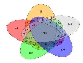
I have a requirement to create Overlapping Chart or Venn diagram, something similar to below visualization:
Sample data:
| Category 1 | Value | Category 2 |
| A | 1 | B |
| B | 2 | C |
| C | 3 | E |
| D | 4 | D |
| E | 5 | A |
| A | 6 | E |
| B | 7 | A |
| C | 8 | C |
| D | 9 | D |
| E | 10 | B |
| A | 11 | C |
| B | 12 | D |
| C | 13 | B |
| D | 14 | A |
| E | 15 | E |
| A | 16 | B |
| B | 17 | D |
| C | 18 | A |
| D | 19 | E |
| E | 20 | C |
Please suggest me any alternative visualization to represent the data similar to venn diagram.
Solved! Go to Solution.
- Mark as New
- Bookmark
- Subscribe
- Mute
- Subscribe to RSS Feed
- Permalink
- Report Inappropriate Content
Hi @v-easonf-msft many thanks for your effort and research. The screenshot attached at the beginning of the thread has done in R, it works fine, but there are some organizational restrictions to publish the report. Another visual called 'Ultimate Venn Diagram' works fine for my requirement, since this visual is not certified by Microsoft and also there is not option to purchase the licence, I need to drop the plan to use this visual. Thanks again.
- Mark as New
- Bookmark
- Subscribe
- Mute
- Subscribe to RSS Feed
- Permalink
- Report Inappropriate Content
HI @vin26
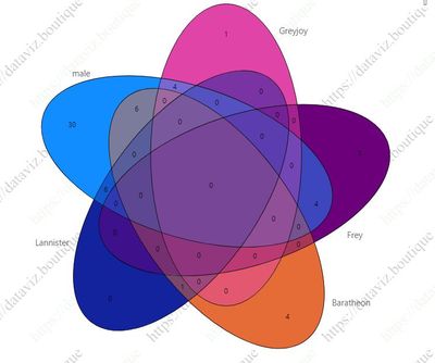
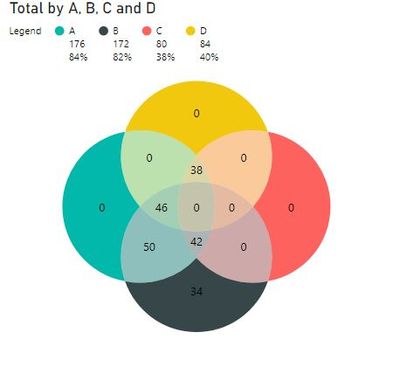
Use the below visual
Hope it resolves your issue? Did I answer your question? Mark my post as a solution! Appreciate your Kudos, Press the thumbs up button!! Linkedin Profile |
- Mark as New
- Bookmark
- Subscribe
- Mute
- Subscribe to RSS Feed
- Permalink
- Report Inappropriate Content
Hi @pranit828 thanks for the suggestions, both the visuals will not work for my requirements, 1st one allows on only 4 items in a category and each of the item in category 2 should be in each columns, my data format will not work here.
- Mark as New
- Bookmark
- Subscribe
- Mute
- Subscribe to RSS Feed
- Permalink
- Report Inappropriate Content
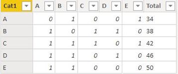
Try to change the structure your data, probably Pivot the data and @pranit828 's suggested custom visual should work.
- Mark as New
- Bookmark
- Subscribe
- Mute
- Subscribe to RSS Feed
- Permalink
- Report Inappropriate Content
- Mark as New
- Bookmark
- Subscribe
- Mute
- Subscribe to RSS Feed
- Permalink
- Report Inappropriate Content
Hi , @vin26
After researching, I can't find more custom visuals that meet your requirements in App Source. Most of these custom visuals cannot directly process the data template you provide, nor can they display so many categories.
Current visual "Venn Diagram by MAQ Software" allows up to 4 categories and can only show 13 possible combinations.
You can take a try to create a custom Venn chart by combining multiple pie charts.
Please check if this video help . _Power BI - Creating a Custom Venn Diagram
Certainly, if you have enough ability, you can also create custom visuals using R and Python.
Best Regards,
Community Support Team _ Eason
If this post helps, then please consider Accept it as the solution to help the other members find it more quickly.
- Mark as New
- Bookmark
- Subscribe
- Mute
- Subscribe to RSS Feed
- Permalink
- Report Inappropriate Content
Hi @v-easonf-msft many thanks for your effort and research. The screenshot attached at the beginning of the thread has done in R, it works fine, but there are some organizational restrictions to publish the report. Another visual called 'Ultimate Venn Diagram' works fine for my requirement, since this visual is not certified by Microsoft and also there is not option to purchase the licence, I need to drop the plan to use this visual. Thanks again.
Helpful resources

Microsoft Fabric Learn Together
Covering the world! 9:00-10:30 AM Sydney, 4:00-5:30 PM CET (Paris/Berlin), 7:00-8:30 PM Mexico City

Power BI Monthly Update - April 2024
Check out the April 2024 Power BI update to learn about new features.

| User | Count |
|---|---|
| 107 | |
| 93 | |
| 77 | |
| 65 | |
| 53 |
| User | Count |
|---|---|
| 147 | |
| 106 | |
| 104 | |
| 87 | |
| 61 |


