- Power BI forums
- Updates
- News & Announcements
- Get Help with Power BI
- Desktop
- Service
- Report Server
- Power Query
- Mobile Apps
- Developer
- DAX Commands and Tips
- Custom Visuals Development Discussion
- Health and Life Sciences
- Power BI Spanish forums
- Translated Spanish Desktop
- Power Platform Integration - Better Together!
- Power Platform Integrations (Read-only)
- Power Platform and Dynamics 365 Integrations (Read-only)
- Training and Consulting
- Instructor Led Training
- Dashboard in a Day for Women, by Women
- Galleries
- Community Connections & How-To Videos
- COVID-19 Data Stories Gallery
- Themes Gallery
- Data Stories Gallery
- R Script Showcase
- Webinars and Video Gallery
- Quick Measures Gallery
- 2021 MSBizAppsSummit Gallery
- 2020 MSBizAppsSummit Gallery
- 2019 MSBizAppsSummit Gallery
- Events
- Ideas
- Custom Visuals Ideas
- Issues
- Issues
- Events
- Upcoming Events
- Community Blog
- Power BI Community Blog
- Custom Visuals Community Blog
- Community Support
- Community Accounts & Registration
- Using the Community
- Community Feedback
Register now to learn Fabric in free live sessions led by the best Microsoft experts. From Apr 16 to May 9, in English and Spanish.
- Power BI forums
- Forums
- Get Help with Power BI
- Desktop
- Re: Our data has 1 factless fact table, lots of di...
- Subscribe to RSS Feed
- Mark Topic as New
- Mark Topic as Read
- Float this Topic for Current User
- Bookmark
- Subscribe
- Printer Friendly Page
- Mark as New
- Bookmark
- Subscribe
- Mute
- Subscribe to RSS Feed
- Permalink
- Report Inappropriate Content
Our data has 1 factless fact table, lots of dimensions, and I'm lost
Our data was created to be easy on the server and our desktops.
We have a single factless fact table, which contains ONLY key columns - one key for each dimension, prefixed CK (common key).
Then we have for example Dim_Customer, which only has two columns - CK_Customer and CustomerID.
Dim_Service has CK_Service and ServiceName
Dim_ServiceDetails has CK_ServiceDetals and ServiceID
Dim_Supplier has CK_Supplier, SupplierName, SupplierType, SupplierCategory
Dim_Date has CK_Date and a bunch of date columns (Date, year, yearMonth, etc...)
There are (so far) 8 dimensions total.
This is great. It creates a wonderful star schema with each dimension relating to the fact table (one to many) through it's respective CK. All arrows point inward towards the fact table.
I just can't do anything with the data (as far as my meager skills will allow). Since there's no connection from the dimensions to each other - I mean, it's dimension to fact, not the other way around, so there's no bridge between dimensions, even though the key is there.
I miss facts, big time.
I can't figure out how to write a Measure that will tell me how many customers received Service A in March 2017.
I can't figure out how to calculate the first date a customer received a service (based on ServiceID). Or the last date.
How many customers receive a service today?
If anyone can point me in the right direction, I'd be really grateful. I'll even bake cookies.
Solved! Go to Solution.
- Mark as New
- Bookmark
- Subscribe
- Mute
- Subscribe to RSS Feed
- Permalink
- Report Inappropriate Content
Definitely getting there!.
The only reason I hard-coded the sample measures was to illustrate how they are constructed (and also assuming these measures were not going to be sliced.
In Fact, if you are going to use slicers, life becomes MUCH easier, and you don`t have to hard-code anything (which is going to be sliced, of course)
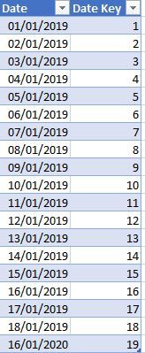
Before the examples, just let me apologise since I only showed you the Date dim table (as an example). Just to show you the full picture regarding the model, here is the Excel screenshot of the sample dim tables and fact table:
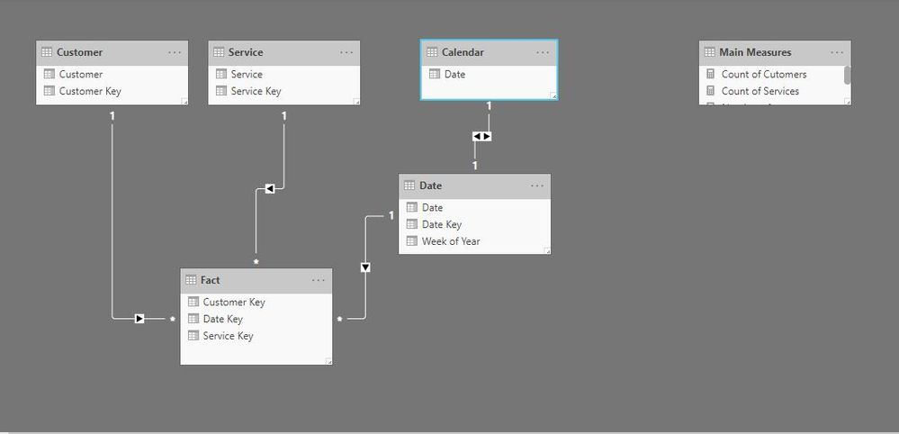
and the model is set up like this:
Ok, so now let's slice some data:
Firstly the basic measures needed:
Count of Cutomers = DISTINCTCOUNT('Fact'[Customer Key])

Count of Services = DISTINCTCOUNT('Fact'[Service Key])
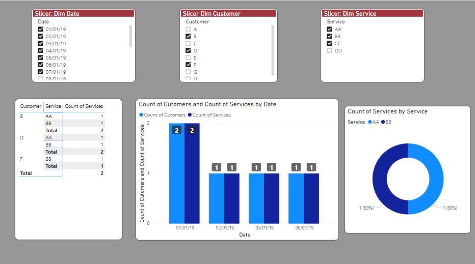
Now we can play around with date and service slicers from their respective Dim tables:
or even filter by selecting a point in one of the visuals (in this case date 6 Jan 2019 in the bar graph)
The only caveat, albeit a very important one, is that you should be using a date table (with coninuous dates and covering the whole period of you data). The way to solve this is to create a calendar table (you can try CALENDARAUTO function), populate it with the columns you need (Month name, month number, week of year, year etc). You then link this new Calendar table to your Date Dim table (using the date fields to establish the relationship) and then use this calendar table for you visuals and filtering expressions especially if you want to use time intelligence functions. You can get by using DAX without a Calendar Table but it is cumbersome and laborious. On the other hand, using a Calendar Table does have its shortfalls - very few and minor- for example if you use it in a slicer and select a date for which there are no "facts"). Regardless, using a Calendar table is an accepted "Best Practice".
The model with a calendar table:
I believe that this is how PBI is supposed to work and is more effecient (using Dim Tables etc)
Hope this helps
Did I answer your question? Mark my post as a solution!
In doing so, you are also helping me. Thank you!
Proud to be a Super User!
Paul on Linkedin.
- Mark as New
- Bookmark
- Subscribe
- Mute
- Subscribe to RSS Feed
- Permalink
- Report Inappropriate Content
What does your "factless" fact table look like? (love the expression btw!)
Does it follow a structure similar to this?
and just for an example, the corresponding date dim table I have is this:
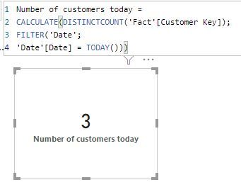
In this example, the number of customers today is:
and another example:
Did I answer your question? Mark my post as a solution!
In doing so, you are also helping me. Thank you!
Proud to be a Super User!
Paul on Linkedin.
- Mark as New
- Bookmark
- Subscribe
- Mute
- Subscribe to RSS Feed
- Permalink
- Report Inappropriate Content
Hey @PaulDBrown thanks for your reply!
That's more or less exactly how our fact table looks - aka nothing but keys.
All dimensions look like your date table - but some of them have several columns, other than the key.
I think I've got the "number of customers" measure down. But you know it's never that simple. It's the number of customers that began with us before 2009, grouped by which provider between these dates that live within a 500 mile radius etc.
And that's just the measures and custom columns. What about visualisations? Until now I'm putting all the keys in all my visualisations just to get some sort of link between the dimensions (the relations in the star schema aren't enough...).
And google isn't helping.
- Mark as New
- Bookmark
- Subscribe
- Mute
- Subscribe to RSS Feed
- Permalink
- Report Inappropriate Content
It's never that simple, I know...😊
However, the way to implement the measures in general is to use as many expressions based on your Dim Tables as is needed in your filter statements, and perform the corresponding calculations on the fact table columns. There shouldn't be a problem (I'm being simple, I know...!)
As per your visuals, same applies: use the dim tables as axes, rows ect (the Fiter part of the visual) and measures as values.
Come to think of it, the only (obvious) "Facts" that are missing in your Factless Fact Table are numeric values. So I guess you are constricted to counting, basically (and derivative measures thereof, variations per period etc).
Did I answer your question? Mark my post as a solution!
In doing so, you are also helping me. Thank you!
Proud to be a Super User!
Paul on Linkedin.
- Mark as New
- Bookmark
- Subscribe
- Mute
- Subscribe to RSS Feed
- Permalink
- Report Inappropriate Content
@PaulDBrown- we're getting closer, like really close 🙂
I understand what you're saying, and I understand it in theory.
The problem with using the Dim tables in my filter statements is that they become hardcoded. So I have to use a measure for every possible value that I might need to filter? I'd rather do that using slicers...
AKA my measures need to be (using your examples as a base)
Number of customers =
CALCULATE(DISTINCTCOUNT('Fact'CK_Customer);
FILTER('Date';
'Date'[Date] = SLICED_DATE))
andthe second example you show isn't really working for me, because you're only referring to the key for the Customer dimension - but that would mean there's no connection to the service dimension since there's no service key named?
Same problem for all measures that need data from two or more dimensions
I really hope I'm making sense...
- Mark as New
- Bookmark
- Subscribe
- Mute
- Subscribe to RSS Feed
- Permalink
- Report Inappropriate Content
Definitely getting there!.
The only reason I hard-coded the sample measures was to illustrate how they are constructed (and also assuming these measures were not going to be sliced.
In Fact, if you are going to use slicers, life becomes MUCH easier, and you don`t have to hard-code anything (which is going to be sliced, of course)
Before the examples, just let me apologise since I only showed you the Date dim table (as an example). Just to show you the full picture regarding the model, here is the Excel screenshot of the sample dim tables and fact table:
and the model is set up like this:
Ok, so now let's slice some data:
Firstly the basic measures needed:
Count of Cutomers = DISTINCTCOUNT('Fact'[Customer Key])

Count of Services = DISTINCTCOUNT('Fact'[Service Key])
Now we can play around with date and service slicers from their respective Dim tables:
or even filter by selecting a point in one of the visuals (in this case date 6 Jan 2019 in the bar graph)
The only caveat, albeit a very important one, is that you should be using a date table (with coninuous dates and covering the whole period of you data). The way to solve this is to create a calendar table (you can try CALENDARAUTO function), populate it with the columns you need (Month name, month number, week of year, year etc). You then link this new Calendar table to your Date Dim table (using the date fields to establish the relationship) and then use this calendar table for you visuals and filtering expressions especially if you want to use time intelligence functions. You can get by using DAX without a Calendar Table but it is cumbersome and laborious. On the other hand, using a Calendar Table does have its shortfalls - very few and minor- for example if you use it in a slicer and select a date for which there are no "facts"). Regardless, using a Calendar table is an accepted "Best Practice".
The model with a calendar table:
I believe that this is how PBI is supposed to work and is more effecient (using Dim Tables etc)
Hope this helps
Did I answer your question? Mark my post as a solution!
In doing so, you are also helping me. Thank you!
Proud to be a Super User!
Paul on Linkedin.
- Mark as New
- Bookmark
- Subscribe
- Mute
- Subscribe to RSS Feed
- Permalink
- Report Inappropriate Content
@PaulDBrownWe're so close I can feel it's gravity 🙂
I've made some visuals and I'm going to be careful with the verdict until I've validated the data a bit more. It's looking ok and I think this is definitely the right direction.
Something's not right though, and I'm not sure where its going wrong. There's something in the data I need to figure out - each 'DIM_Citizen'CitizenID has more than one CK_Citizen key.
So... I'll keep looking. In the meantime, I'll mark your last response as the right answer and keep trying. You might hear from me again soon if I start pulling out my hair again 🙂
- Mark as New
- Bookmark
- Subscribe
- Mute
- Subscribe to RSS Feed
- Permalink
- Report Inappropriate Content
Looking forward to those cookies!!!
Glad to hear things are working out. Do let us know if we can be of further help.
Best.
PS. Depending on what you need to count, you will need to use the function COUNTROWS.
Did I answer your question? Mark my post as a solution!
In doing so, you are also helping me. Thank you!
Proud to be a Super User!
Paul on Linkedin.
- Mark as New
- Bookmark
- Subscribe
- Mute
- Subscribe to RSS Feed
- Permalink
- Report Inappropriate Content
@PaulDBrown- so... I found a big bleah
Remember I said in the beginning that the fact table and dimensions contain a common key? Still true. But I learned something new since:
Dim_Customer doesn't just have customer ids - and that's creating several key values. One customer ID can actually have several, because there's a new key created if the customer got a new address - some of my customers have up to 25 keys.
An example would probably be best:
DIM_Customer

CK_Customer(key)	CustomerID		Date			Address			City
430					1				some_date		Rose Street		Rome
431					1				next_date		Tulip Ave.		Rome
432					1				next_date2		Blue Rd.		Milano
433					1				last_date		Cube Sq.		Milano
434					2				some_date		Mouse St.		Bologna
435					3				some_date		Tomato Ln.		Napoli
436					3				next_date		Almond Ave.		Napoli
So - in this dimension table, I have 3 distinct CustomerID, but 7 distinct CK_Customer.
And in my fact table, I only have CK_Customer, making a DISTINCTCOUNT completely useless. I can only imagine that this is going to be the case for most other key columns as well.
Did I make any sense, and do you have any ideas?
- Mark as New
- Bookmark
- Subscribe
- Mute
- Subscribe to RSS Feed
- Permalink
- Report Inappropriate Content
I can't figure out how to write a Measure that will tell me how many customers received Service A in March 2017.
calculate(count(fact[customer_id)),services[name]="A", date[Month-Year]="March 2017")
In my system I have sales and few dim
I can't figure out how to calculate the first date a customer received a service (based on ServiceID). Or the last date.
create a matrix table with customer, service with min and max dates from fact ot date table
How many customers receive a service today?
calculate(count(fact[customer_id)),date[date]=today())
Appreciate your Kudos. In case, this is the solution you are looking for, mark it as the Solution. In case it does not help, please provide additional information and mark me with @
Thanks. My Recent Blog -
Winner-Topper-on-Map-How-to-Color-States-on-a-Map-with-Winners , HR-Analytics-Active-Employee-Hire-and-Termination-trend
Power-BI-Working-with-Non-Standard-Time-Periods And Comparing-Data-Across-Date-Ranges
Connect on Linkedin
Microsoft Power BI Learning Resources, 2023 !!
Learn Power BI - Full Course with Dec-2022, with Window, Index, Offset, 100+ Topics !!
Did I answer your question? Mark my post as a solution! Appreciate your Kudos !! Proud to be a Super User! !!
- Mark as New
- Bookmark
- Subscribe
- Mute
- Subscribe to RSS Feed
- Permalink
- Report Inappropriate Content
Thanks for your quick response @amitchandak
First of all - the "I can't figure out" list was rhetorical, but let's take your examples.
calculate(count(fact[customer_id)),services[name]="A", date[Month-Year]="March 2017")I have no idea what this is couting. The result it's giving me is over 22.000 - and I know the number should be about 1.600. Also, I'd prefer the measure to take the values from what I'm slicing/showing in my visuals, instead of them being hardcoded into the DAX.
create a matrix table with customer, service with min and max dates from fact ot date tableIf I create it through the use of a matrix, then I won't be able to use the start/stop dates in other calculations. I need this functionality.
Also, doing it in the matrix table would mean that that start date would change if I filter the date range of the table. That means it won't be the correct start date.
And I still have the problem on how to visualise all this data when having to go through the factless fact table...
Helpful resources

Microsoft Fabric Learn Together
Covering the world! 9:00-10:30 AM Sydney, 4:00-5:30 PM CET (Paris/Berlin), 7:00-8:30 PM Mexico City

Power BI Monthly Update - April 2024
Check out the April 2024 Power BI update to learn about new features.

| User | Count |
|---|---|
| 113 | |
| 97 | |
| 85 | |
| 70 | |
| 61 |
| User | Count |
|---|---|
| 151 | |
| 121 | |
| 104 | |
| 87 | |
| 67 |


