- Power BI forums
- Updates
- News & Announcements
- Get Help with Power BI
- Desktop
- Service
- Report Server
- Power Query
- Mobile Apps
- Developer
- DAX Commands and Tips
- Custom Visuals Development Discussion
- Health and Life Sciences
- Power BI Spanish forums
- Translated Spanish Desktop
- Power Platform Integration - Better Together!
- Power Platform Integrations (Read-only)
- Power Platform and Dynamics 365 Integrations (Read-only)
- Training and Consulting
- Instructor Led Training
- Dashboard in a Day for Women, by Women
- Galleries
- Community Connections & How-To Videos
- COVID-19 Data Stories Gallery
- Themes Gallery
- Data Stories Gallery
- R Script Showcase
- Webinars and Video Gallery
- Quick Measures Gallery
- 2021 MSBizAppsSummit Gallery
- 2020 MSBizAppsSummit Gallery
- 2019 MSBizAppsSummit Gallery
- Events
- Ideas
- Custom Visuals Ideas
- Issues
- Issues
- Events
- Upcoming Events
- Community Blog
- Power BI Community Blog
- Custom Visuals Community Blog
- Community Support
- Community Accounts & Registration
- Using the Community
- Community Feedback
Register now to learn Fabric in free live sessions led by the best Microsoft experts. From Apr 16 to May 9, in English and Spanish.
- Power BI forums
- Forums
- Get Help with Power BI
- Desktop
- Numerical Ranges
- Subscribe to RSS Feed
- Mark Topic as New
- Mark Topic as Read
- Float this Topic for Current User
- Bookmark
- Subscribe
- Printer Friendly Page
- Mark as New
- Bookmark
- Subscribe
- Mute
- Subscribe to RSS Feed
- Permalink
- Report Inappropriate Content
Numerical Ranges
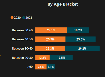
I have a practice dataset which has two tables. one for 2020 and one for 2021, they are just practice survey data for remote work. i am trying to create a visualization where i can show the number of people by an age range like no of people in 20-30,then 30-40 and so on. i have grouped the column and created bins but i am clueless about what i should do next. i was trying to replicate this kind of visualization.

can anyone suggest something?
Solved! Go to Solution.
- Mark as New
- Bookmark
- Subscribe
- Mute
- Subscribe to RSS Feed
- Permalink
- Report Inappropriate Content
Hi @Aryaja96 ,
It depends on your data and the model you are using, but if were you heading for something like this, I can show you how I did it 🙂
I used the following sample data:
YearAgeBin
| 2020 | 21 | Between 20-30 |
| 2020 | 27 | Between 20-30 |
| 2020 | 31 | Between 30-40 |
| 2020 | 22 | Between 20-30 |
| 2020 | 25 | Between 20-30 |
| 2020 | 39 | Between 30-40 |
| 2020 | 35 | Between 30-40 |
| 2020 | 42 | Between 40-50 |
| 2020 | 58 | Between 50-60 |
| 2021 | 61 | > 60 |
| 2021 | 67 | > 60 |
| 2021 | 62 | > 60 |
| 2021 | 80 | > 60 |
| 2021 | 22 | Between 20-30 |
| 2021 | 30 | Between 30-40 |
| 2021 | 31 | Between 30-40 |
| 2021 | 32 | Between 30-40 |
| 2021 | 25 | Between 20-30 |
| 2021 | 27 | Between 20-30 |
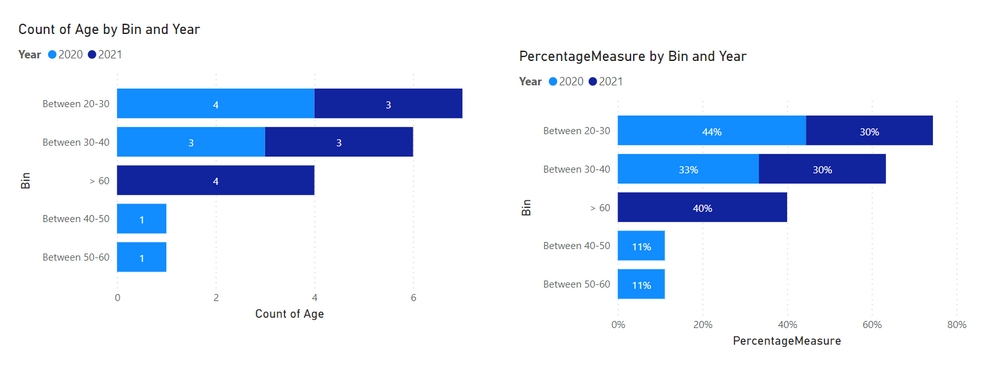
And then what I did was the following for the left graph:
And for the right graph, I created a separate measure called PercentageMeasure with the following DAX:
PercentageMeasure =
VAR _overallCountPerYear = CALCULATE ( COUNTROWS ( Table ), ALLEXCEPT (Table, Table[Year] ) )
RETURN
DIVIDE ( COUNTROWS ( Table ), _overallCountPerYear )
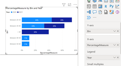
The graph had the following settings:
For both graphs I chose the stocked bar chart
Let me know if this helps 🙂
/Tom
https://www.tackytech.blog/
https://www.instagram.com/tackytechtom/
| Did I answer your question❓➡️ Please, mark my post as a solution ✔️ |
| Also happily accepting Kudos 🙂 |
| Feel free to connect with me on LinkedIn! | |
| #proudtobeasuperuser |  |
- Mark as New
- Bookmark
- Subscribe
- Mute
- Subscribe to RSS Feed
- Permalink
- Report Inappropriate Content
thank you for the reply, i am going to try it out and let you know if it helps! 🙂
- Mark as New
- Bookmark
- Subscribe
- Mute
- Subscribe to RSS Feed
- Permalink
- Report Inappropriate Content
Hi @Aryaja96 ,
It depends on your data and the model you are using, but if were you heading for something like this, I can show you how I did it 🙂
I used the following sample data:
YearAgeBin
| 2020 | 21 | Between 20-30 |
| 2020 | 27 | Between 20-30 |
| 2020 | 31 | Between 30-40 |
| 2020 | 22 | Between 20-30 |
| 2020 | 25 | Between 20-30 |
| 2020 | 39 | Between 30-40 |
| 2020 | 35 | Between 30-40 |
| 2020 | 42 | Between 40-50 |
| 2020 | 58 | Between 50-60 |
| 2021 | 61 | > 60 |
| 2021 | 67 | > 60 |
| 2021 | 62 | > 60 |
| 2021 | 80 | > 60 |
| 2021 | 22 | Between 20-30 |
| 2021 | 30 | Between 30-40 |
| 2021 | 31 | Between 30-40 |
| 2021 | 32 | Between 30-40 |
| 2021 | 25 | Between 20-30 |
| 2021 | 27 | Between 20-30 |
And then what I did was the following for the left graph:
And for the right graph, I created a separate measure called PercentageMeasure with the following DAX:
PercentageMeasure =
VAR _overallCountPerYear = CALCULATE ( COUNTROWS ( Table ), ALLEXCEPT (Table, Table[Year] ) )
RETURN
DIVIDE ( COUNTROWS ( Table ), _overallCountPerYear )
The graph had the following settings:
For both graphs I chose the stocked bar chart
Let me know if this helps 🙂
/Tom
https://www.tackytech.blog/
https://www.instagram.com/tackytechtom/
| Did I answer your question❓➡️ Please, mark my post as a solution ✔️ |
| Also happily accepting Kudos 🙂 |
| Feel free to connect with me on LinkedIn! | |
| #proudtobeasuperuser |  |
Helpful resources

Microsoft Fabric Learn Together
Covering the world! 9:00-10:30 AM Sydney, 4:00-5:30 PM CET (Paris/Berlin), 7:00-8:30 PM Mexico City

Power BI Monthly Update - April 2024
Check out the April 2024 Power BI update to learn about new features.

| User | Count |
|---|---|
| 107 | |
| 93 | |
| 77 | |
| 65 | |
| 53 |
| User | Count |
|---|---|
| 147 | |
| 106 | |
| 104 | |
| 87 | |
| 61 |


