- Power BI forums
- Updates
- News & Announcements
- Get Help with Power BI
- Desktop
- Service
- Report Server
- Power Query
- Mobile Apps
- Developer
- DAX Commands and Tips
- Custom Visuals Development Discussion
- Health and Life Sciences
- Power BI Spanish forums
- Translated Spanish Desktop
- Power Platform Integration - Better Together!
- Power Platform Integrations (Read-only)
- Power Platform and Dynamics 365 Integrations (Read-only)
- Training and Consulting
- Instructor Led Training
- Dashboard in a Day for Women, by Women
- Galleries
- Community Connections & How-To Videos
- COVID-19 Data Stories Gallery
- Themes Gallery
- Data Stories Gallery
- R Script Showcase
- Webinars and Video Gallery
- Quick Measures Gallery
- 2021 MSBizAppsSummit Gallery
- 2020 MSBizAppsSummit Gallery
- 2019 MSBizAppsSummit Gallery
- Events
- Ideas
- Custom Visuals Ideas
- Issues
- Issues
- Events
- Upcoming Events
- Community Blog
- Power BI Community Blog
- Custom Visuals Community Blog
- Community Support
- Community Accounts & Registration
- Using the Community
- Community Feedback
Register now to learn Fabric in free live sessions led by the best Microsoft experts. From Apr 16 to May 9, in English and Spanish.
- Power BI forums
- Forums
- Get Help with Power BI
- Desktop
- Re: Number Formatting on Card Visualization
- Subscribe to RSS Feed
- Mark Topic as New
- Mark Topic as Read
- Float this Topic for Current User
- Bookmark
- Subscribe
- Printer Friendly Page
- Mark as New
- Bookmark
- Subscribe
- Mute
- Subscribe to RSS Feed
- Permalink
- Report Inappropriate Content
Number Formatting on Card Visualization
I have a card visualization that totals the number of ticket scans for a tourist attraction. This is a direct query dataset, so it is essentially giving real time data, updated every minute. The number in the dataset is an int data type and I have set it as a comma seperated whole number in the Modelling tab, and the format is also set as a whole number. In the card format for Data Label Display units is set to None. The issue is that is displays properly as a comma seperated number up until it reaches 10,000, but then the display switches to 10.1 K instead of 10,100 (or 10,125) which is how I want it to display. The attraction manager wants it to show it as a comma seperated number no matter how high the number goes. Any help would be appreciated.
Solved! Go to Solution.
- Mark as New
- Bookmark
- Subscribe
- Mute
- Subscribe to RSS Feed
- Permalink
- Report Inappropriate Content
I managed to get this to display properly, using the following settings:
Data Modeling in PBI model
- Data Type - Whole Number
- Format - Whole Number
- Thousands Seperator - Enabled
- Decimal Places - 0
Visualization for Card
- Display Units - None
Thanks for everyone's input!
Herb
- Mark as New
- Bookmark
- Subscribe
- Mute
- Subscribe to RSS Feed
- Permalink
- Report Inappropriate Content
select the card visual > Format > Data label > Display unit.... In this way, we can format our display unit to auto, none, thousand, million, trillion, billion....
Thank you
🙂
- Mark as New
- Bookmark
- Subscribe
- Mute
- Subscribe to RSS Feed
- Permalink
- Report Inappropriate Content
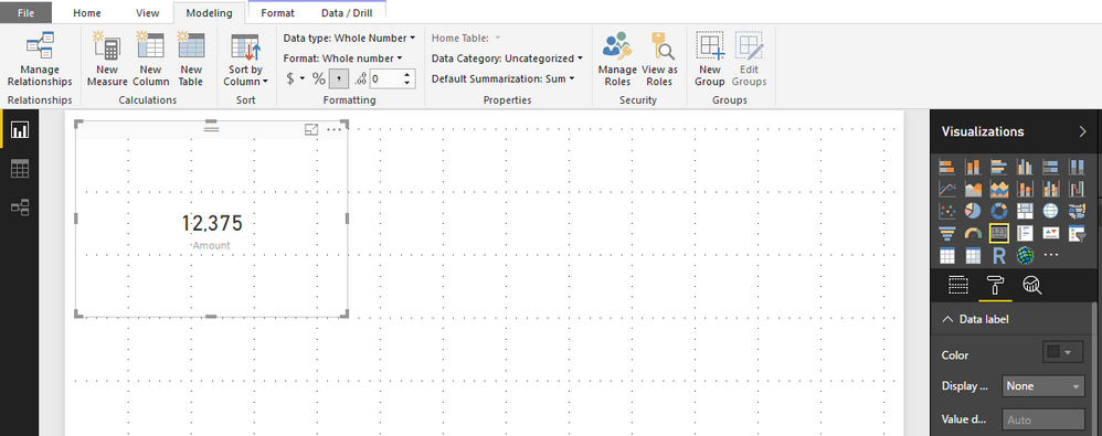
Hi @hhuddleston,
I import data in direct query mode, and add the date into a card, it also shows correctly, please see the following screenshot.
Best Regards,
Angelia
- Mark as New
- Bookmark
- Subscribe
- Mute
- Subscribe to RSS Feed
- Permalink
- Report Inappropriate Content
Hi @hhuddleston,
It is weird, I tried as you explained and I have this visual.
Can you please show us a sample in order to better understand your request.
Thank you,
- Mark as New
- Bookmark
- Subscribe
- Mute
- Subscribe to RSS Feed
- Permalink
- Report Inappropriate Content
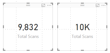
The card on the left is what I want to display - no matter how high the number goes.
The card on the right is what happens when it crosses the 10,000 mark.
- Mark as New
- Bookmark
- Subscribe
- Mute
- Subscribe to RSS Feed
- Permalink
- Report Inappropriate Content
Hi @hhuddleston,
Either you give us your sample in order to test it again, but I still have the right visual ( on the left) when I tested on my computer.
Perhaps another person can elaborate the issue ( if it is )....
Thank you
- Mark as New
- Bookmark
- Subscribe
- Mute
- Subscribe to RSS Feed
- Permalink
- Report Inappropriate Content
I managed to get this to display properly, using the following settings:
Data Modeling in PBI model
- Data Type - Whole Number
- Format - Whole Number
- Thousands Seperator - Enabled
- Decimal Places - 0
Visualization for Card
- Display Units - None
Thanks for everyone's input!
Herb
- Mark as New
- Bookmark
- Subscribe
- Mute
- Subscribe to RSS Feed
- Permalink
- Report Inappropriate Content
It works. Thank you!
- Mark as New
- Bookmark
- Subscribe
- Mute
- Subscribe to RSS Feed
- Permalink
- Report Inappropriate Content
Modeling Ribbon > New Column
Count = 1
Drag the Card Visual to the Report Canvas
Drag the new Count column from the Fields area to the Card Visual
Modeling Ribbon
- Data Type - Whole Number
- Format - Whole Number
- Thousands Seperator - Enabled
- Decimal Places - 0
Visualization for Card > Format Roller
- Display Units - None
Helpful resources

Microsoft Fabric Learn Together
Covering the world! 9:00-10:30 AM Sydney, 4:00-5:30 PM CET (Paris/Berlin), 7:00-8:30 PM Mexico City

Power BI Monthly Update - April 2024
Check out the April 2024 Power BI update to learn about new features.

| User | Count |
|---|---|
| 107 | |
| 93 | |
| 77 | |
| 65 | |
| 53 |
| User | Count |
|---|---|
| 147 | |
| 106 | |
| 104 | |
| 87 | |
| 61 |


