- Power BI forums
- Updates
- News & Announcements
- Get Help with Power BI
- Desktop
- Service
- Report Server
- Power Query
- Mobile Apps
- Developer
- DAX Commands and Tips
- Custom Visuals Development Discussion
- Health and Life Sciences
- Power BI Spanish forums
- Translated Spanish Desktop
- Power Platform Integration - Better Together!
- Power Platform Integrations (Read-only)
- Power Platform and Dynamics 365 Integrations (Read-only)
- Training and Consulting
- Instructor Led Training
- Dashboard in a Day for Women, by Women
- Galleries
- Community Connections & How-To Videos
- COVID-19 Data Stories Gallery
- Themes Gallery
- Data Stories Gallery
- R Script Showcase
- Webinars and Video Gallery
- Quick Measures Gallery
- 2021 MSBizAppsSummit Gallery
- 2020 MSBizAppsSummit Gallery
- 2019 MSBizAppsSummit Gallery
- Events
- Ideas
- Custom Visuals Ideas
- Issues
- Issues
- Events
- Upcoming Events
- Community Blog
- Power BI Community Blog
- Custom Visuals Community Blog
- Community Support
- Community Accounts & Registration
- Using the Community
- Community Feedback
Register now to learn Fabric in free live sessions led by the best Microsoft experts. From Apr 16 to May 9, in English and Spanish.
- Power BI forums
- Forums
- Get Help with Power BI
- Desktop
- Not to show Category labels in scatter plot
- Subscribe to RSS Feed
- Mark Topic as New
- Mark Topic as Read
- Float this Topic for Current User
- Bookmark
- Subscribe
- Printer Friendly Page
- Mark as New
- Bookmark
- Subscribe
- Mute
- Subscribe to RSS Feed
- Permalink
- Report Inappropriate Content
Not to show Category labels in scatter plot
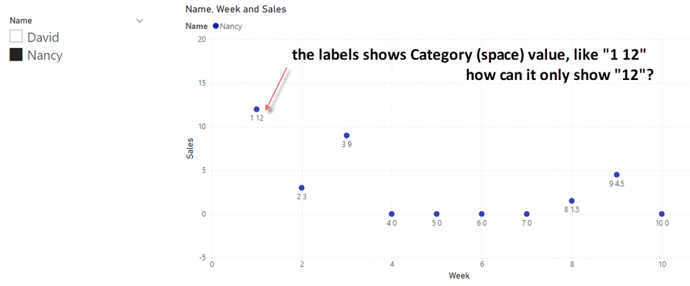
Data as below, I made a scatter plot with it and want to show the data labels of each scatter.
| Name | Week | Sales |
| David | 1 | 12 |
| David | 2 | 4.5 |
| David | 3 | 13.5 |
| David | 4 | 15 |
| David | 5 | 6 |
| David | 6 | 21 |
| David | 7 | 3 |
| David | 8 | 9 |
| David | 9 | 0 |
| David | 10 | 15 |
| David | 11 | 13.5 |
| Nancy | 1 | 12 |
| Nancy | 2 | 3 |
| Nancy | 3 | 9 |
| Nancy | 4 | 0 |
| Nancy | 5 | 0 |
| Nancy | 6 | 0 |
| Nancy | 7 | 0 |
| Nancy | 8 | 1.5 |
| Nancy | 9 | 4.5 |
| Nancy | 10 | 0 |
By ticking the "Category Labels", it shows the Category and the values of the scatter.
Is there a way to only show the values of the scatters, but no Category? like the first scatter "1 12" to "12"? Thank you.
(all scatters, not a specific scatter)
Solved! Go to Solution.
- Mark as New
- Bookmark
- Subscribe
- Mute
- Subscribe to RSS Feed
- Permalink
- Report Inappropriate Content
Hi @JohnnyK ,
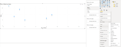
This has to do with the type of aggregation you make on the week, and sales.
If you select don't summarize on both you will have the scatter has you show, if you select and aggregation on the week you will only get the data label with the sales amount,
However all the values that are zero will only ne presented in the first time they appear:
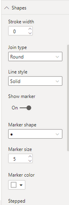
For this type of visualization would it not be better to use a line chart and hide the lines:
You just need to change the shapes settings:
Regards
Miguel Félix
Did I answer your question? Mark my post as a solution!
Proud to be a Super User!
Check out my blog: Power BI em Português- Mark as New
- Bookmark
- Subscribe
- Mute
- Subscribe to RSS Feed
- Permalink
- Report Inappropriate Content
@MFelix, marvelous! thank you for the teaching! excellent advice on the line chart!
Helpful resources

Microsoft Fabric Learn Together
Covering the world! 9:00-10:30 AM Sydney, 4:00-5:30 PM CET (Paris/Berlin), 7:00-8:30 PM Mexico City

Power BI Monthly Update - April 2024
Check out the April 2024 Power BI update to learn about new features.

| User | Count |
|---|---|
| 117 | |
| 107 | |
| 69 | |
| 68 | |
| 43 |
| User | Count |
|---|---|
| 148 | |
| 104 | |
| 102 | |
| 88 | |
| 66 |


