- Power BI forums
- Updates
- News & Announcements
- Get Help with Power BI
- Desktop
- Service
- Report Server
- Power Query
- Mobile Apps
- Developer
- DAX Commands and Tips
- Custom Visuals Development Discussion
- Health and Life Sciences
- Power BI Spanish forums
- Translated Spanish Desktop
- Power Platform Integration - Better Together!
- Power Platform Integrations (Read-only)
- Power Platform and Dynamics 365 Integrations (Read-only)
- Training and Consulting
- Instructor Led Training
- Dashboard in a Day for Women, by Women
- Galleries
- Community Connections & How-To Videos
- COVID-19 Data Stories Gallery
- Themes Gallery
- Data Stories Gallery
- R Script Showcase
- Webinars and Video Gallery
- Quick Measures Gallery
- 2021 MSBizAppsSummit Gallery
- 2020 MSBizAppsSummit Gallery
- 2019 MSBizAppsSummit Gallery
- Events
- Ideas
- Custom Visuals Ideas
- Issues
- Issues
- Events
- Upcoming Events
- Community Blog
- Power BI Community Blog
- Custom Visuals Community Blog
- Community Support
- Community Accounts & Registration
- Using the Community
- Community Feedback
Register now to learn Fabric in free live sessions led by the best Microsoft experts. From Apr 16 to May 9, in English and Spanish.
- Power BI forums
- Forums
- Get Help with Power BI
- Desktop
- Re: Normalize multiple values to show relative com...
- Subscribe to RSS Feed
- Mark Topic as New
- Mark Topic as Read
- Float this Topic for Current User
- Bookmark
- Subscribe
- Printer Friendly Page
- Mark as New
- Bookmark
- Subscribe
- Mute
- Subscribe to RSS Feed
- Permalink
- Report Inappropriate Content
Normalize multiple values to show relative comparison
I am analyzing bicycle trip data that categorizes each user as a casual rider or a member rider.
95% of the data I am working with is about the characteristics of member riders and 5% is about casual riders.
I am looking to create a relative comparison graph to show in which hour of the day bicycle riders start their trip, based on user type (casual vs member).
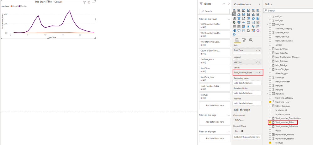
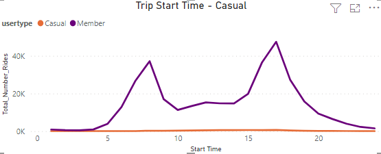
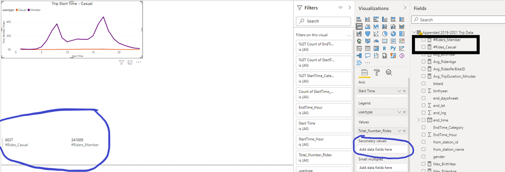
Given that the data that I am working with is heavily focused on member riders, if I use 'count number of rides' on a user type level, the Casual member ridership data just looks like a flat line because I don't have much data on casual riders.
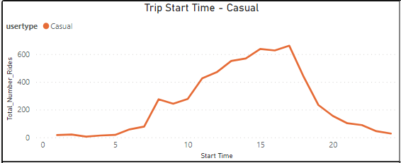
However, if I show just the casual rider's data, we see that it is definitely not a flat line:
How can I normalize the data for member & casual riders so that I can show a relative distribution of when riders are starting their trip?
Solved! Go to Solution.
- Mark as New
- Bookmark
- Subscribe
- Mute
- Subscribe to RSS Feed
- Permalink
- Report Inappropriate Content
Hi @JJH_ ,
Create 2 measures as below:
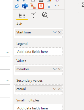
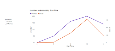
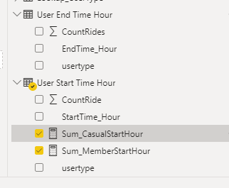
casual = CALCULATE(SUM('Table'[Total number]),FILTER('Table','Table'[usertype]="Casual"))member = CALCULATE(SUM('Table'[Total number]),FILTER('Table','Table'[usertype]="Member"))Then put them in the fields as below:
And you will see:
Thus they will have separate Y axis and will show actual line shape.
For the sample.pbix file,pls see attached.(In page 2,you will see the same visual as you tested before,you could make a comparison between the 2 pages)
Best Regards,
Kelly
Did I answer your question? Mark my reply as a solution!
- Mark as New
- Bookmark
- Subscribe
- Mute
- Subscribe to RSS Feed
- Permalink
- Report Inappropriate Content
Hi @JJH_ ,
An option would be to create two separate measures, one for the nr of rides for members and one for the nr of rides for casuals. Then you can add one of the measures in the values and the other one in the secondary values. In the visual options it is possible to create a secondary Y-axis. This will allow for both measures to show the distribution.
Hope this helps!
Jori
If I answered your question, please mark it as a solution to help other members find it more quickly.
Connect on Linkedin
- Mark as New
- Bookmark
- Subscribe
- Mute
- Subscribe to RSS Feed
- Permalink
- Report Inappropriate Content
Hi @jppv20
I tried creating 2 unique measures as you mentioned but I am not able to drag either values into the 'secondary value' field. Also, it sounds like your approach will lead to the same result if we are relying on 'count' as the aggregation function.
I think I need to create an aggregation is based on % of when riders are, for casual & member riders, then use the % of total ridership to 'normalize' the values for the graph.
- Mark as New
- Bookmark
- Subscribe
- Mute
- Subscribe to RSS Feed
- Permalink
- Report Inappropriate Content
Hi @JJH_ ,
Create 2 measures as below:
casual = CALCULATE(SUM('Table'[Total number]),FILTER('Table','Table'[usertype]="Casual"))member = CALCULATE(SUM('Table'[Total number]),FILTER('Table','Table'[usertype]="Member"))Then put them in the fields as below:
And you will see:
Thus they will have separate Y axis and will show actual line shape.
For the sample.pbix file,pls see attached.(In page 2,you will see the same visual as you tested before,you could make a comparison between the 2 pages)
Best Regards,
Kelly
Did I answer your question? Mark my reply as a solution!
- Mark as New
- Bookmark
- Subscribe
- Mute
- Subscribe to RSS Feed
- Permalink
- Report Inappropriate Content
Thanks Kelly.
I was trying to avoid having to create separate tables just to count # of trip start/end time but I followed your approach and was able to create the visualization.
Helpful resources

Microsoft Fabric Learn Together
Covering the world! 9:00-10:30 AM Sydney, 4:00-5:30 PM CET (Paris/Berlin), 7:00-8:30 PM Mexico City

Power BI Monthly Update - April 2024
Check out the April 2024 Power BI update to learn about new features.

| User | Count |
|---|---|
| 109 | |
| 98 | |
| 77 | |
| 66 | |
| 54 |
| User | Count |
|---|---|
| 144 | |
| 104 | |
| 100 | |
| 86 | |
| 64 |
