- Power BI forums
- Updates
- News & Announcements
- Get Help with Power BI
- Desktop
- Service
- Report Server
- Power Query
- Mobile Apps
- Developer
- DAX Commands and Tips
- Custom Visuals Development Discussion
- Health and Life Sciences
- Power BI Spanish forums
- Translated Spanish Desktop
- Power Platform Integration - Better Together!
- Power Platform Integrations (Read-only)
- Power Platform and Dynamics 365 Integrations (Read-only)
- Training and Consulting
- Instructor Led Training
- Dashboard in a Day for Women, by Women
- Galleries
- Community Connections & How-To Videos
- COVID-19 Data Stories Gallery
- Themes Gallery
- Data Stories Gallery
- R Script Showcase
- Webinars and Video Gallery
- Quick Measures Gallery
- 2021 MSBizAppsSummit Gallery
- 2020 MSBizAppsSummit Gallery
- 2019 MSBizAppsSummit Gallery
- Events
- Ideas
- Custom Visuals Ideas
- Issues
- Issues
- Events
- Upcoming Events
- Community Blog
- Power BI Community Blog
- Custom Visuals Community Blog
- Community Support
- Community Accounts & Registration
- Using the Community
- Community Feedback
Register now to learn Fabric in free live sessions led by the best Microsoft experts. From Apr 16 to May 9, in English and Spanish.
- Power BI forums
- Forums
- Get Help with Power BI
- Desktop
- Re: Non-Selected Item Colors - Turn off Color/Opac...
- Subscribe to RSS Feed
- Mark Topic as New
- Mark Topic as Read
- Float this Topic for Current User
- Bookmark
- Subscribe
- Printer Friendly Page
- Mark as New
- Bookmark
- Subscribe
- Mute
- Subscribe to RSS Feed
- Permalink
- Report Inappropriate Content
Non-Selected Item Colors - Turn off Color/Opacity/Transparency Changes When Item is Selected?
When you click on an item in a visual and it changes the color of non-selected items -- Is there a way to adjust the how much the colors get adjusted (e.g. with a theme element) or turn off that feature?
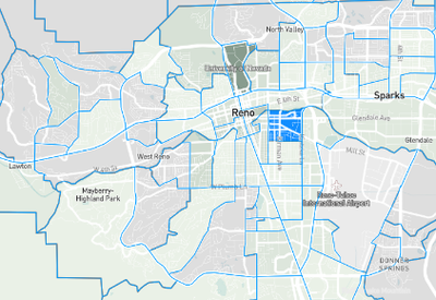
The issue here is in a Mapbox drilldown choropleth map, I am using a color range to denote different values. But, when I click on a shape (census tract) to select it, the census tract gets filled with the highlight color and all other colors are lightened out to the extent they're almost indistiguishable. This seems to inherit from Power BI which would grey out or fade non-selected items.
e.g. here:
With no census tract selected shades of green distinguishable from each other:
with census tract selected -- colors are much less distinguishable
- Mark as New
- Bookmark
- Subscribe
- Mute
- Subscribe to RSS Feed
- Permalink
- Report Inappropriate Content
Agreed. We'd like to be able to control the transparency of the non selected items. In the example above, we'd like to make everything that isn't Negative to be almost invisible, if not invisible.
- Mark as New
- Bookmark
- Subscribe
- Mute
- Subscribe to RSS Feed
- Permalink
- Report Inappropriate Content
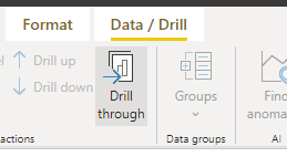
Try selecting the Drill Through in Data/Drill option for your map, it will disable the drill through to the data on selection.
- Mark as New
- Bookmark
- Subscribe
- Mute
- Subscribe to RSS Feed
- Permalink
- Report Inappropriate Content
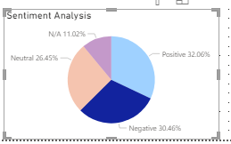
Thanks but I don't notice a change in coloration behavior. Users are still able to select a geographic area even though it doesn't drill through, and colors of non-selected items become muted. This is similar to behavior on other visuals. If you click on a slice of a pie chart, or bar of a bar chart, that color stays same and others go muted.
e.g.
click on 'negative':
This is the same muting of colors I'm seeing in my chart, so I am wondering if I can use a setting in the theme to minimize this, and would be especially good to minimize only on the map visual.
Helpful resources

Microsoft Fabric Learn Together
Covering the world! 9:00-10:30 AM Sydney, 4:00-5:30 PM CET (Paris/Berlin), 7:00-8:30 PM Mexico City

Power BI Monthly Update - April 2024
Check out the April 2024 Power BI update to learn about new features.

| User | Count |
|---|---|
| 109 | |
| 99 | |
| 77 | |
| 66 | |
| 54 |
| User | Count |
|---|---|
| 144 | |
| 104 | |
| 102 | |
| 87 | |
| 64 |


