- Power BI forums
- Updates
- News & Announcements
- Get Help with Power BI
- Desktop
- Service
- Report Server
- Power Query
- Mobile Apps
- Developer
- DAX Commands and Tips
- Custom Visuals Development Discussion
- Health and Life Sciences
- Power BI Spanish forums
- Translated Spanish Desktop
- Power Platform Integration - Better Together!
- Power Platform Integrations (Read-only)
- Power Platform and Dynamics 365 Integrations (Read-only)
- Training and Consulting
- Instructor Led Training
- Dashboard in a Day for Women, by Women
- Galleries
- Community Connections & How-To Videos
- COVID-19 Data Stories Gallery
- Themes Gallery
- Data Stories Gallery
- R Script Showcase
- Webinars and Video Gallery
- Quick Measures Gallery
- 2021 MSBizAppsSummit Gallery
- 2020 MSBizAppsSummit Gallery
- 2019 MSBizAppsSummit Gallery
- Events
- Ideas
- Custom Visuals Ideas
- Issues
- Issues
- Events
- Upcoming Events
- Community Blog
- Power BI Community Blog
- Custom Visuals Community Blog
- Community Support
- Community Accounts & Registration
- Using the Community
- Community Feedback
Register now to learn Fabric in free live sessions led by the best Microsoft experts. From Apr 16 to May 9, in English and Spanish.
- Power BI forums
- Forums
- Get Help with Power BI
- Desktop
- No spacing between bars in bar chart - separate ba...
- Subscribe to RSS Feed
- Mark Topic as New
- Mark Topic as Read
- Float this Topic for Current User
- Bookmark
- Subscribe
- Printer Friendly Page
- Mark as New
- Bookmark
- Subscribe
- Mute
- Subscribe to RSS Feed
- Permalink
- Report Inappropriate Content
No spacing between bars in bar chart - separate bars on x-axis
Hello, I have seen that some posts already exist regarding this topic but I could not find a solution that worked out for me.
Currently I'm not able to separate the bars in my bar chart on the x-axis (no inner padding). I think the problem is that they are treated as one category. The variables - which I want to display as separate bars of a bar chart - are columns in one single table (see screenshot). I would therefore need some additional variable which lets me spilt them on the x-axis.
I hope someone has a solution for my problem.
Best regards
Solved! Go to Solution.
- Mark as New
- Bookmark
- Subscribe
- Mute
- Subscribe to RSS Feed
- Permalink
- Report Inappropriate Content
heya, i can work with that 😉
Before we talk visuals i'd like to show you how to unpivot the data:
i used the following sample data (based on ur screenshot)
Since you are already in the report, press edit queries:
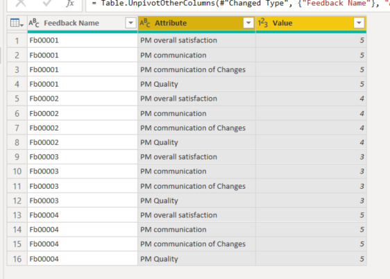
Then go to the transform tab and select all the PM columns. (dont select the feedback number column) and press unpivot columns.
The result looks like this. You can rename attribute and value as you like.
Now press close & Apply to work on your visuals.
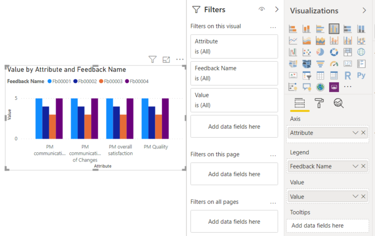
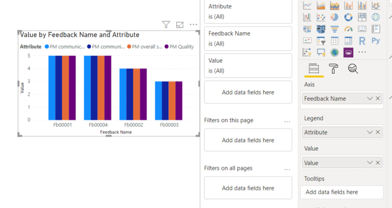
Im not entirely sure how you'd like to show it. In the example screenshot i see only one feedback number displayed. Will there allways be 1 displayed? As im unsure i made a couple examples. I will show the visual and the used filters/fields respectively.
i hope this helps. 🙂
Quality over Quantity
Did I answer your question? Mark my post as a solution!
- Mark as New
- Bookmark
- Subscribe
- Mute
- Subscribe to RSS Feed
- Permalink
- Report Inappropriate Content
If you (un)pivot the data it will do the trick 🙂 if you have sample data i can create a example pbix file for you.
Quality over Quantity
Did I answer your question? Mark my post as a solution!
- Mark as New
- Bookmark
- Subscribe
- Mute
- Subscribe to RSS Feed
- Permalink
- Report Inappropriate Content
I hope the table works for you. I don't know how to add files to this post.
- Mark as New
- Bookmark
- Subscribe
- Mute
- Subscribe to RSS Feed
- Permalink
- Report Inappropriate Content
| Feedback: Feedback Name | PM: Overall satisfaction | PM: Communication | PM: Communication of changes | PM: Quality | PM: Results | PM: Timing | PM end: Continous business | PM end: Fulfilment of needs | PM end: Pricing |
| Feedback-0000000208 | 5 | 5 | 5 | 5 | 5 | 5 | 5 | 5 | 5 |
| Feedback-0000000209 | 4 | 4 | 4 | 4 | 4 | 4 | 4 | 4 | 4 |
| Feedback-0000000210 | 3 | 3 | 3 | 3 | 3 | 3 | 3 | 3 | 3 |
| Feedback-0000000211 | 5 | 5 | 5 | 5 | 5 | 5 | 5 | 5 | 5 |
| Feedback-0000000212 | 2 | 2 | 2 | 2 | 2 | 2 | 2 | 2 | 2 |
| Feedback-0000000213 | 4 | 4 | 4 | 4 | 4 | 4 | 4 | 4 | 4 |
| Feedback-0000000214 | 4 | 4 | 4 | 4 | 4 | 4 | 4 | 4 | 4 |
| Feedback-0000000215 | 3 | 3 | 3 | 3 | 3 | 3 | 3 | 3 | 3 |
| Feedback-0000000216 | 1 | 1 | 1 | 1 | 1 | 1 | 1 | 1 | 1 |
| Feedback-0000000217 | 5 | 5 | 5 | 5 | 5 | 5 | 5 | 5 | 5 |
| Feedback-0000000218 | 4 | 4 | 4 | 4 | 4 | 4 | 4 | 4 | 4 |
| Feedback-0000000219 | 2 | 2 | 2 | 2 | 2 | 2 | 2 | 2 | 2 |
| Feedback-0000000220 | 1 | 1 | 1 | 1 | 1 | 1 | 1 | 1 | 1 |
- Mark as New
- Bookmark
- Subscribe
- Mute
- Subscribe to RSS Feed
- Permalink
- Report Inappropriate Content
heya, i can work with that 😉
Before we talk visuals i'd like to show you how to unpivot the data:
i used the following sample data (based on ur screenshot)
Since you are already in the report, press edit queries:
Then go to the transform tab and select all the PM columns. (dont select the feedback number column) and press unpivot columns.
The result looks like this. You can rename attribute and value as you like.
Now press close & Apply to work on your visuals.
Im not entirely sure how you'd like to show it. In the example screenshot i see only one feedback number displayed. Will there allways be 1 displayed? As im unsure i made a couple examples. I will show the visual and the used filters/fields respectively.
i hope this helps. 🙂
Quality over Quantity
Did I answer your question? Mark my post as a solution!
- Mark as New
- Bookmark
- Subscribe
- Mute
- Subscribe to RSS Feed
- Permalink
- Report Inappropriate Content
you're awesome, thank you so much! 🙂
Helpful resources

Microsoft Fabric Learn Together
Covering the world! 9:00-10:30 AM Sydney, 4:00-5:30 PM CET (Paris/Berlin), 7:00-8:30 PM Mexico City

Power BI Monthly Update - April 2024
Check out the April 2024 Power BI update to learn about new features.

| User | Count |
|---|---|
| 109 | |
| 99 | |
| 77 | |
| 66 | |
| 54 |
| User | Count |
|---|---|
| 144 | |
| 104 | |
| 101 | |
| 86 | |
| 64 |


