- Power BI forums
- Updates
- News & Announcements
- Get Help with Power BI
- Desktop
- Service
- Report Server
- Power Query
- Mobile Apps
- Developer
- DAX Commands and Tips
- Custom Visuals Development Discussion
- Health and Life Sciences
- Power BI Spanish forums
- Translated Spanish Desktop
- Power Platform Integration - Better Together!
- Power Platform Integrations (Read-only)
- Power Platform and Dynamics 365 Integrations (Read-only)
- Training and Consulting
- Instructor Led Training
- Dashboard in a Day for Women, by Women
- Galleries
- Community Connections & How-To Videos
- COVID-19 Data Stories Gallery
- Themes Gallery
- Data Stories Gallery
- R Script Showcase
- Webinars and Video Gallery
- Quick Measures Gallery
- 2021 MSBizAppsSummit Gallery
- 2020 MSBizAppsSummit Gallery
- 2019 MSBizAppsSummit Gallery
- Events
- Ideas
- Custom Visuals Ideas
- Issues
- Issues
- Events
- Upcoming Events
- Community Blog
- Power BI Community Blog
- Custom Visuals Community Blog
- Community Support
- Community Accounts & Registration
- Using the Community
- Community Feedback
Register now to learn Fabric in free live sessions led by the best Microsoft experts. From Apr 16 to May 9, in English and Spanish.
- Power BI forums
- Forums
- Get Help with Power BI
- Desktop
- No 'don't summarize' option on barchart value
- Subscribe to RSS Feed
- Mark Topic as New
- Mark Topic as Read
- Float this Topic for Current User
- Bookmark
- Subscribe
- Printer Friendly Page
- Mark as New
- Bookmark
- Subscribe
- Mute
- Subscribe to RSS Feed
- Permalink
- Report Inappropriate Content
No 'don't summarize' option on barchart value
Hello. I read few topics and still couldn't filnd a solution.
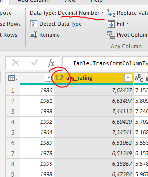
I have a table with board games and one of a column is "average rating" which is a decimal between 1 and 10.
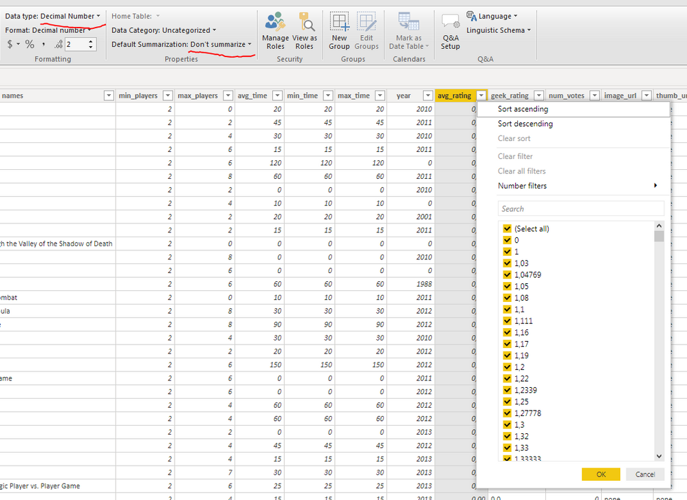
On modeling page default summarization is off
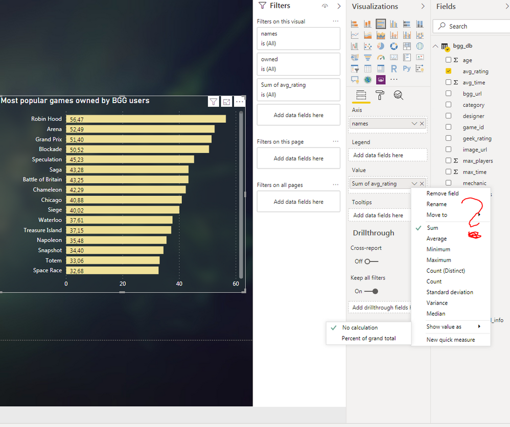
When i put board game names with avg raiting to see top raiting games on clustered bar chart i have no option to set "dont summarize". It shows me some weird data - there is no option that one game have value 56 if raiting is a value between 1 and 10. One game name exists only once in a table. I dont have this option on any bar chart with this column (Avg rating)
How to fix it ?
- Mark as New
- Bookmark
- Subscribe
- Mute
- Subscribe to RSS Feed
- Permalink
- Report Inappropriate Content
Hi @Anonymous
There is no “Don’t summarize” option in clustered bar chart. Since you said “One game name exists only once in a table.”, it should work because the sum value is same as the original value when there is only one rating value for every game name. Can you convert the chart to a table visual and check whether the values are correct? And are the data from the same table?
Otherwise, can you provide some sample data or upload the pbix file without any confidential or sensitive information and share the link here?
I cannot reproduce what you get in the visual. I tested with some dummy data and the clustered bar chart displayed well with the sum of value as the image shows below.
Best Regards,
Community Support Team _ Jing Zhang
If this post helps, please consider Accept it as the solution to help other members find it.
- Mark as New
- Bookmark
- Subscribe
- Mute
- Subscribe to RSS Feed
- Permalink
- Report Inappropriate Content
@Anonymous
For charts, there has to be a summarization option as it works on an axis.
If you want to achieve the same, change the chart to a table visual, and apply conditional formatting on the Average Rating,
________________________
If my answer was helpful, please consider Accept it as the solution to help the other members find it
Click on the Thumbs-Up icon if you like this reply 🙂
⭕ Subscribe and learn Power BI from these videos
⚪ Website ⚪ LinkedIn ⚪ PBI User Group
Helpful resources

Microsoft Fabric Learn Together
Covering the world! 9:00-10:30 AM Sydney, 4:00-5:30 PM CET (Paris/Berlin), 7:00-8:30 PM Mexico City

Power BI Monthly Update - April 2024
Check out the April 2024 Power BI update to learn about new features.

| User | Count |
|---|---|
| 110 | |
| 95 | |
| 76 | |
| 65 | |
| 51 |
| User | Count |
|---|---|
| 146 | |
| 109 | |
| 106 | |
| 88 | |
| 61 |


