- Power BI forums
- Updates
- News & Announcements
- Get Help with Power BI
- Desktop
- Service
- Report Server
- Power Query
- Mobile Apps
- Developer
- DAX Commands and Tips
- Custom Visuals Development Discussion
- Health and Life Sciences
- Power BI Spanish forums
- Translated Spanish Desktop
- Power Platform Integration - Better Together!
- Power Platform Integrations (Read-only)
- Power Platform and Dynamics 365 Integrations (Read-only)
- Training and Consulting
- Instructor Led Training
- Dashboard in a Day for Women, by Women
- Galleries
- Community Connections & How-To Videos
- COVID-19 Data Stories Gallery
- Themes Gallery
- Data Stories Gallery
- R Script Showcase
- Webinars and Video Gallery
- Quick Measures Gallery
- 2021 MSBizAppsSummit Gallery
- 2020 MSBizAppsSummit Gallery
- 2019 MSBizAppsSummit Gallery
- Events
- Ideas
- Custom Visuals Ideas
- Issues
- Issues
- Events
- Upcoming Events
- Community Blog
- Power BI Community Blog
- Custom Visuals Community Blog
- Community Support
- Community Accounts & Registration
- Using the Community
- Community Feedback
Register now to learn Fabric in free live sessions led by the best Microsoft experts. From Apr 16 to May 9, in English and Spanish.
- Power BI forums
- Forums
- Get Help with Power BI
- Desktop
- New update: Dual Axis line chart assistance
- Subscribe to RSS Feed
- Mark Topic as New
- Mark Topic as Read
- Float this Topic for Current User
- Bookmark
- Subscribe
- Printer Friendly Page
- Mark as New
- Bookmark
- Subscribe
- Mute
- Subscribe to RSS Feed
- Permalink
- Report Inappropriate Content
New update: Dual Axis line chart assistance
Hello all! I recently updated to the latest release and I am overjoyed that they now have dual axis line charts.
I have data by day from the beginning of 2019 to current. I would like to use the dual axis functionality to show 2019 vs 2020.
No I know I was able to do this previously without the need of another axis but I also want to bring in the day of the year so they line up accordingly.
How do I go about doing this?
- Mark as New
- Bookmark
- Subscribe
- Mute
- Subscribe to RSS Feed
- Permalink
- Report Inappropriate Content
@nosaj03 ,
Please refer :https://powerbi.microsoft.com/en-us/blog/power-bi-desktop-march-2020-feature-summary/#_Dual_axis
Microsoft Power BI Learning Resources, 2023 !!
Learn Power BI - Full Course with Dec-2022, with Window, Index, Offset, 100+ Topics !!
Did I answer your question? Mark my post as a solution! Appreciate your Kudos !! Proud to be a Super User! !!
- Mark as New
- Bookmark
- Subscribe
- Mute
- Subscribe to RSS Feed
- Permalink
- Report Inappropriate Content
@amitchandak thank you for the link. I read through it and it does tell me how to use the Y2 field but it only pertains to different data sets.
My data is in a single column sorted by date and what Im looking to do is show a line for each relevant day Year over year similar to below which was done in Excel.
- Mark as New
- Bookmark
- Subscribe
- Mute
- Subscribe to RSS Feed
- Permalink
- Report Inappropriate Content
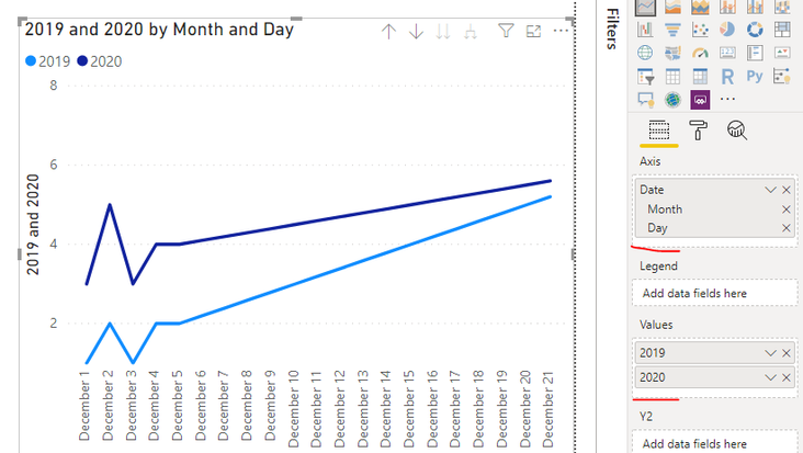
Hi @nosaj03 ,
2019 =
CALCULATE(
    SUM(Sheet3[Vale]),
    FILTER(
        Sheet3,
        Sheet3[Date].[Year] = 2019
    )
)

2020 =
CALCULATE(
    SUM(Sheet3[Vale]),
    FILTER(
        Sheet3,
        Sheet3[Date].[Year] = 2020
    )
)
Use "Month" and "Day" to create a common axis and compare the data for each day in different years.
Best regards,
Lionel Chen
If this post helps, then please consider Accept it as the solution to help the other members find it more quickly.
- Mark as New
- Bookmark
- Subscribe
- Mute
- Subscribe to RSS Feed
- Permalink
- Report Inappropriate Content
@v-lionel-msft this is perfect. The only issue is that its now looking at the specific dates which can compare a Sunday to Monday depending on the differences between the years. How can I compare based on day of the week. For example 1/2/2020 was the first Thursday in January but the first Thursday in January 2019 was 1/3/2019. I dont want to compare 1/2/2020 to 1/2/2019 because they fall on different days. I'm trying to compare relative days year over year.
- Mark as New
- Bookmark
- Subscribe
- Mute
- Subscribe to RSS Feed
- Permalink
- Report Inappropriate Content
Hi @nosaj03 ,
How about creating such a common axis?
//Calculated column
Week =
VAR week_num = WEEKNUM([Date],2)
VAR week_day = WEEKDAY([Date],2)
RETURN
week_num & "-" & week_day
You can add this calculated column to the line chart as the X axis.
Best regards,
Lionel Chen
If this post helps, then please consider Accept it as the solution to help the other members find it more quickly.
- Mark as New
- Bookmark
- Subscribe
- Mute
- Subscribe to RSS Feed
- Permalink
- Report Inappropriate Content
You have to use trailing year measure
Year behind Sales = CALCULATE(SUM(Sales[Sales Amount]),dateadd('Date'[Date],-1,Year))
Microsoft Power BI Learning Resources, 2023 !!
Learn Power BI - Full Course with Dec-2022, with Window, Index, Offset, 100+ Topics !!
Did I answer your question? Mark my post as a solution! Appreciate your Kudos !! Proud to be a Super User! !!
Helpful resources

Microsoft Fabric Learn Together
Covering the world! 9:00-10:30 AM Sydney, 4:00-5:30 PM CET (Paris/Berlin), 7:00-8:30 PM Mexico City

Power BI Monthly Update - April 2024
Check out the April 2024 Power BI update to learn about new features.

| User | Count |
|---|---|
| 107 | |
| 100 | |
| 80 | |
| 63 | |
| 58 |
| User | Count |
|---|---|
| 148 | |
| 111 | |
| 94 | |
| 84 | |
| 67 |


