- Power BI forums
- Updates
- News & Announcements
- Get Help with Power BI
- Desktop
- Service
- Report Server
- Power Query
- Mobile Apps
- Developer
- DAX Commands and Tips
- Custom Visuals Development Discussion
- Health and Life Sciences
- Power BI Spanish forums
- Translated Spanish Desktop
- Power Platform Integration - Better Together!
- Power Platform Integrations (Read-only)
- Power Platform and Dynamics 365 Integrations (Read-only)
- Training and Consulting
- Instructor Led Training
- Dashboard in a Day for Women, by Women
- Galleries
- Community Connections & How-To Videos
- COVID-19 Data Stories Gallery
- Themes Gallery
- Data Stories Gallery
- R Script Showcase
- Webinars and Video Gallery
- Quick Measures Gallery
- 2021 MSBizAppsSummit Gallery
- 2020 MSBizAppsSummit Gallery
- 2019 MSBizAppsSummit Gallery
- Events
- Ideas
- Custom Visuals Ideas
- Issues
- Issues
- Events
- Upcoming Events
- Community Blog
- Power BI Community Blog
- Custom Visuals Community Blog
- Community Support
- Community Accounts & Registration
- Using the Community
- Community Feedback
Register now to learn Fabric in free live sessions led by the best Microsoft experts. From Apr 16 to May 9, in English and Spanish.
- Power BI forums
- Forums
- Get Help with Power BI
- Desktop
- Re: New stacked area chart (and line chart) bug?
- Subscribe to RSS Feed
- Mark Topic as New
- Mark Topic as Read
- Float this Topic for Current User
- Bookmark
- Subscribe
- Printer Friendly Page
- Mark as New
- Bookmark
- Subscribe
- Mute
- Subscribe to RSS Feed
- Permalink
- Report Inappropriate Content
New stacked area chart (and line chart) bug?
I set up some stacked area charts in Power BI about six weeks ago, and things were working well (or at least as well as they can in Power BI), but since the last update the charts have developed some serious problems. I didn't even open the chart or alter the data in any way when this started happening, so I'm pretty confident it's not a reasult of something I've done, but I also tried using the Power BI samples and they are affected by the same problem.
The two main problems are as follows:
- I have dates (month & year) running on the x axis - when I display results with either month or year, it's fine, but when I have both showing (as was the case in my chart originally) and more than one variable, the area below the line doesn't fill all the way to the axis; instead, it is now determining a line between the earliest data point and the last data point that's visible and only fills to that line. If I only represent a single variable the chart behaves as normal.
- When I scroll along the horizontal axis, the content in the visualizaiton disappears! This happens regardless of what axis I use or how many variables are in the chart. It also seems to affect line charts, but not bar charts.
Does anyone have any thoughts on what's happening or what can be done to fix it? Even if you could provide a link to a report that isn't subject to these problems I might be able to figure out something.
Thanks in advance
Kyle
Solved! Go to Solution.
- Mark as New
- Bookmark
- Subscribe
- Mute
- Subscribe to RSS Feed
- Permalink
- Report Inappropriate Content
FYI - I found another topic that was similar to this one, and from those posts it looks like other users were experiencing the same thing. As of today, it appears that the bug has been fixed.
- Mark as New
- Bookmark
- Subscribe
- Mute
- Subscribe to RSS Feed
- Permalink
- Report Inappropriate Content
Hi @kylemaru,
Seems good in my test. Can you share a dummy sample?
Best Regards,
Dale
If this post helps, then please consider Accept it as the solution to help the other members find it more quickly.
- Mark as New
- Bookmark
- Subscribe
- Mute
- Subscribe to RSS Feed
- Permalink
- Report Inappropriate Content
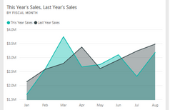
Thanks so much for replying - probably the easiest way to see what I'm talking about with a common reference is to just look at one of the sample data & report packages...for example, I just picked the "Retail Analysis Sample" from the default data samples, and chose the "District Monthly Sales" report by clicking on the "This Year's Sales, Last Year's Sales" tile:
- 
The chart at the top is a bar chart with an x-axis with a scroll bar:

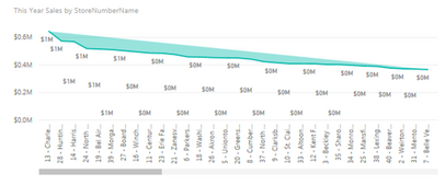
Changing this one to an area chart (or stacked area chart) produces the problems I'm talking about: instead of the entire area under the line filling in (as happens in the "This Year Sales and Last Year Sales by FiscalMonth" chart below it, as shown in the first image in this post), the chart establishes a line between the first and last values displayed and only fills in the difference between that and the values:

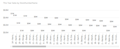
Additionally, if you scroll to the right, the line and fill disappear completely:

I hope this helps illustrate what I'm talking about, but I've tried this with several data sources and chart variations, and it always happens, and other users of our embedded dashboards are seeing the same problems as I am. Would you (or anyone) be able to share the test report that you're using that doesn't exhibit this problem?
- Mark as New
- Bookmark
- Subscribe
- Mute
- Subscribe to RSS Feed
- Permalink
- Report Inappropriate Content
FYI - I found another topic that was similar to this one, and from those posts it looks like other users were experiencing the same thing. As of today, it appears that the bug has been fixed.
Helpful resources

Microsoft Fabric Learn Together
Covering the world! 9:00-10:30 AM Sydney, 4:00-5:30 PM CET (Paris/Berlin), 7:00-8:30 PM Mexico City

Power BI Monthly Update - April 2024
Check out the April 2024 Power BI update to learn about new features.

| User | Count |
|---|---|
| 110 | |
| 95 | |
| 76 | |
| 65 | |
| 51 |
| User | Count |
|---|---|
| 146 | |
| 109 | |
| 106 | |
| 88 | |
| 61 |
