- Power BI forums
- Updates
- News & Announcements
- Get Help with Power BI
- Desktop
- Service
- Report Server
- Power Query
- Mobile Apps
- Developer
- DAX Commands and Tips
- Custom Visuals Development Discussion
- Health and Life Sciences
- Power BI Spanish forums
- Translated Spanish Desktop
- Power Platform Integration - Better Together!
- Power Platform Integrations (Read-only)
- Power Platform and Dynamics 365 Integrations (Read-only)
- Training and Consulting
- Instructor Led Training
- Dashboard in a Day for Women, by Women
- Galleries
- Community Connections & How-To Videos
- COVID-19 Data Stories Gallery
- Themes Gallery
- Data Stories Gallery
- R Script Showcase
- Webinars and Video Gallery
- Quick Measures Gallery
- 2021 MSBizAppsSummit Gallery
- 2020 MSBizAppsSummit Gallery
- 2019 MSBizAppsSummit Gallery
- Events
- Ideas
- Custom Visuals Ideas
- Issues
- Issues
- Events
- Upcoming Events
- Community Blog
- Power BI Community Blog
- Custom Visuals Community Blog
- Community Support
- Community Accounts & Registration
- Using the Community
- Community Feedback
Register now to learn Fabric in free live sessions led by the best Microsoft experts. From Apr 16 to May 9, in English and Spanish.
- Power BI forums
- Forums
- Get Help with Power BI
- Desktop
- New Measure = Today's data compared to the average
- Subscribe to RSS Feed
- Mark Topic as New
- Mark Topic as Read
- Float this Topic for Current User
- Bookmark
- Subscribe
- Printer Friendly Page
- Mark as New
- Bookmark
- Subscribe
- Mute
- Subscribe to RSS Feed
- Permalink
- Report Inappropriate Content
New Measure = Today's data compared to the average
I have a spreadsheet that I update daily. I need a "new measure" to capture today's data (the last data in the column) to be able to use it as a field on a visual in order to compare it to the average. (Basically "how busy today is in relationship to the average workload). The data are in columns. Does "Lastnonblank" work for this? I can't figure it out. A sample of the datat is below:
Date	weekday	workday	Sales Orders    Case QTY
6/5	Mon	 1	 21	        487
6/6	Tue	 2	 12	        1599
6/7	Wed      3	 30	        1480
6/8	Thu      4	 41	        604
6/9	Fri	 5       38	        10209
6/12	Mon	 6	 51	        3043
6/13	Tue	 7

		  Average	32	2904

Todays workload based on average = 59%	4.70%
So, today (Mon 6/12) we have 59% more orders to process than the average.
So, today (Mon 6/12) we have 4.7% more cases to process than the average.
I'm just creating a quick visual to allow the team to quickly see in the morning how busy they will be that day.
Thank you, DaveC123
Solved! Go to Solution.
- Mark as New
- Bookmark
- Subscribe
- Mute
- Subscribe to RSS Feed
- Permalink
- Report Inappropriate Content
Please review this PBIX. I'm sure that can help you.
https://drive.google.com/file/d/0B95C8CKdTZE3NXpVSEdEZ2tPLVk/view?usp=sharing
Regards
Victor
Lima-Peru
Lima - Peru
- Mark as New
- Bookmark
- Subscribe
- Mute
- Subscribe to RSS Feed
- Permalink
- Report Inappropriate Content
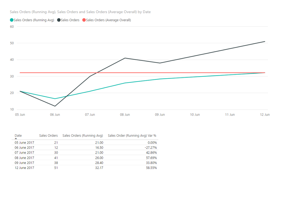
You can try these calculations to get to the above. I have included an averge overall, a running averge, calculating only those days average which are in the past (relative to the current date) and the %. This shouldgive you and indication over time of how you are perfoming not just today. Here is a link to a demo workbook: Today Compared to Average
Sales Order (Running Avg) Var % =
CALCULATE (
DIVIDE (
SUM ( Data[Sales Orders] ) - [Sales Orders (Running Avg)],
[Sales Orders (Running Avg)]
)
)
Sales Orders (Average Overall) =
CALCULATE ( AVERAGE ( [Sales Orders] ), ALL ( 'Data' ) )
Sales Orders (Running Avg) =
CALCULATE (
AVERAGE ( [Sales Orders] ),
FILTER ( ALL ( 'Data' ), 'Data'[Date] <= MAX ( 'Data'[Date] ) )
)
Let me know how you get on.
- Mark as New
- Bookmark
- Subscribe
- Mute
- Subscribe to RSS Feed
- Permalink
- Report Inappropriate Content
Thank you and this will work, but as time goes on, the graph will loose a lot of its eye popping affect. I will use this as another dashboard if someone wants to drill into the details more, but I am not expecting these guys to do this. I am initially just trying to provide a very simple visual (pictures are worth a thousand words). Below is not coming from the same data, as it does not work right, but gives an idea about what I am trying to display. A barchart or any other graph works, but it would only be two bars. (avg and today)

I am looking to just click refresh and it captures the last day on data. And I understand that the average wil adjust over time.
Thanks, DaveC123
- Mark as New
- Bookmark
- Subscribe
- Mute
- Subscribe to RSS Feed
- Permalink
- Report Inappropriate Content
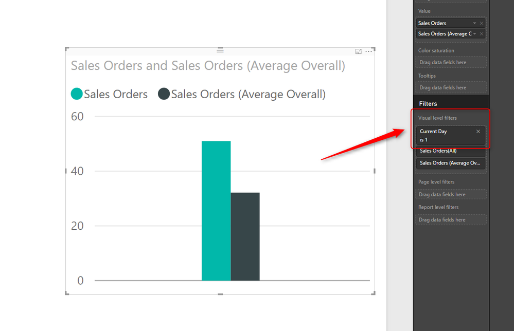
To do this you can create a calculated column like this:
Current Day =
IF ( 'Data'[Date] = CALCULATE ( MAX ( 'Data'[Date] ), ALL ( 'Data' ) ), 1, 0 )
Then you can either filter the report using this column or filter the report. When you add new data the flag will automatically update to the latest day.
I have updated the link to sample dashboard
- Mark as New
- Bookmark
- Subscribe
- Mute
- Subscribe to RSS Feed
- Permalink
- Report Inappropriate Content
This is a great formula. So now the 1 moves as the days data gets filled in. But, I am stuck trying to still have that days data captured for use on a chart or as a "new measure". The chart value shows "1". I do not know how to write DAX, obviously, but was thinking something like this in order to create a "new measure": ?
Todays SO = If('PowerBI Data Table'[Current Day],1,then('PowerBI Data Table'[Sales Orders] Column D)
I was hoping this would pickup that cell which has todays Sales Order number. In the earlier table; 51
- Mark as New
- Bookmark
- Subscribe
- Mute
- Subscribe to RSS Feed
- Permalink
- Report Inappropriate Content
Dave C123 please take a look at the sample workbook I provided, this will show you how to use the flag.
You can use it as either a report, page or visual filter. I have set it up as a visual filter on the sample.
This then allows you to see all the history on the other graphs on the report, whilst the bars chart (or other visual) show just the current day.
- Mark as New
- Bookmark
- Subscribe
- Mute
- Subscribe to RSS Feed
- Permalink
- Report Inappropriate Content
Please review this PBIX. I'm sure that can help you.
https://drive.google.com/file/d/0B95C8CKdTZE3NXpVSEdEZ2tPLVk/view?usp=sharing
Regards
Victor
Lima-Peru
Lima - Peru
- Mark as New
- Bookmark
- Subscribe
- Mute
- Subscribe to RSS Feed
- Permalink
- Report Inappropriate Content
To do this you can create a calculated column like this:
Current Day =
IF ( 'Data'[Date] = CALCULATE ( MAX ( 'Data'[Date] ), ALL ( 'Data' ) ), 1, 0 )
Then you can either filter the report using this column or filter the report. When you add new data the flag will automatically update to the latest day.
I have updated the link to sample dashboard
Helpful resources

Microsoft Fabric Learn Together
Covering the world! 9:00-10:30 AM Sydney, 4:00-5:30 PM CET (Paris/Berlin), 7:00-8:30 PM Mexico City

Power BI Monthly Update - April 2024
Check out the April 2024 Power BI update to learn about new features.

| User | Count |
|---|---|
| 112 | |
| 97 | |
| 85 | |
| 67 | |
| 59 |
| User | Count |
|---|---|
| 150 | |
| 120 | |
| 100 | |
| 87 | |
| 68 |


