- Power BI forums
- Updates
- News & Announcements
- Get Help with Power BI
- Desktop
- Service
- Report Server
- Power Query
- Mobile Apps
- Developer
- DAX Commands and Tips
- Custom Visuals Development Discussion
- Health and Life Sciences
- Power BI Spanish forums
- Translated Spanish Desktop
- Power Platform Integration - Better Together!
- Power Platform Integrations (Read-only)
- Power Platform and Dynamics 365 Integrations (Read-only)
- Training and Consulting
- Instructor Led Training
- Dashboard in a Day for Women, by Women
- Galleries
- Community Connections & How-To Videos
- COVID-19 Data Stories Gallery
- Themes Gallery
- Data Stories Gallery
- R Script Showcase
- Webinars and Video Gallery
- Quick Measures Gallery
- 2021 MSBizAppsSummit Gallery
- 2020 MSBizAppsSummit Gallery
- 2019 MSBizAppsSummit Gallery
- Events
- Ideas
- Custom Visuals Ideas
- Issues
- Issues
- Events
- Upcoming Events
- Community Blog
- Power BI Community Blog
- Custom Visuals Community Blog
- Community Support
- Community Accounts & Registration
- Using the Community
- Community Feedback
Register now to learn Fabric in free live sessions led by the best Microsoft experts. From Apr 16 to May 9, in English and Spanish.
- Power BI forums
- Forums
- Get Help with Power BI
- Desktop
- Re: Need to show last year data in clustered bar c...
- Subscribe to RSS Feed
- Mark Topic as New
- Mark Topic as Read
- Float this Topic for Current User
- Bookmark
- Subscribe
- Printer Friendly Page
- Mark as New
- Bookmark
- Subscribe
- Mute
- Subscribe to RSS Feed
- Permalink
- Report Inappropriate Content
Need to show last year data in clustered bar chart that dynamically show last N months
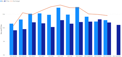
Hi, I have clustered bar chart that dynamically showed 12 months data based on filter by using following DAX formula.
I need to have second bar chart to show same month last year for comparison and cannot find any DAX that works for this.
I have tried SAMEPERIODLASTYEAR and PARALELLPERIOD, but it did shot seems to work. Can anyone please help me on this?
Thank you!
- Mark as New
- Bookmark
- Subscribe
- Mute
- Subscribe to RSS Feed
- Permalink
- Report Inappropriate Content
Not sure if this is still an issue for you, but it was for me and this was my solution. I created a YoY quick measure then converted it to be a sum of the prior year.

- Mark as New
- Bookmark
- Subscribe
- Mute
- Subscribe to RSS Feed
- Permalink
- Report Inappropriate Content
Hi @TanawatP
Hope this is what you're after? Just an FYI, I created two measures as per below:
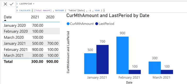
CurMthAmount = CALCULATE ( [Total Amount] , DATESMTD ( Table1[Date] ) )
LastPeriod = CALCULATE ( [Total Amount] , DATEADD ( 'Table1'[Date] , -1 , YEAR ) )
Interestingly, I had to first create a Table with Date, Current Period (2021) and Prior Period (2020) and I then converted the table to a Clustered Column Chart ( as below). For some reason, Power BI did not present the LastPeriod measure I created (above) on the Clustered Column Chart. I have no idea why but I assume it is one of two things: a user error .... or a glitch... Given I have done it a few times before no hassles, I am going to go out and say that it's likely a glitch...
Hope this helps!
Theo 🙂
If I have posted a response that resolves your question, please accept it as a solution to formally close the post.
Also, if you are as passionate about Power BI, DAX and data as I am, please feel free to reach out if you have any questions, queries, or if you simply want to connect and talk to another data geek!
Want to connect?www.linkedin.com/in/theoconias
- Mark as New
- Bookmark
- Subscribe
- Mute
- Subscribe to RSS Feed
- Permalink
- Report Inappropriate Content
Thank you for your response, I tried it but the number of months did not change dynamically based on filter selection. i.e. If I have data from Jan 2019 to Oct 2021. When I select filter on Sep-2021, I expect the chart to show data only from Oct-2020 to Sep-2021 only.
You can refer to my DAX in the first screenshot. Thank you
Helpful resources

Microsoft Fabric Learn Together
Covering the world! 9:00-10:30 AM Sydney, 4:00-5:30 PM CET (Paris/Berlin), 7:00-8:30 PM Mexico City

Power BI Monthly Update - April 2024
Check out the April 2024 Power BI update to learn about new features.

| User | Count |
|---|---|
| 114 | |
| 100 | |
| 78 | |
| 75 | |
| 52 |
| User | Count |
|---|---|
| 144 | |
| 109 | |
| 108 | |
| 88 | |
| 61 |


