- Power BI forums
- Updates
- News & Announcements
- Get Help with Power BI
- Desktop
- Service
- Report Server
- Power Query
- Mobile Apps
- Developer
- DAX Commands and Tips
- Custom Visuals Development Discussion
- Health and Life Sciences
- Power BI Spanish forums
- Translated Spanish Desktop
- Power Platform Integration - Better Together!
- Power Platform Integrations (Read-only)
- Power Platform and Dynamics 365 Integrations (Read-only)
- Training and Consulting
- Instructor Led Training
- Dashboard in a Day for Women, by Women
- Galleries
- Community Connections & How-To Videos
- COVID-19 Data Stories Gallery
- Themes Gallery
- Data Stories Gallery
- R Script Showcase
- Webinars and Video Gallery
- Quick Measures Gallery
- 2021 MSBizAppsSummit Gallery
- 2020 MSBizAppsSummit Gallery
- 2019 MSBizAppsSummit Gallery
- Events
- Ideas
- Custom Visuals Ideas
- Issues
- Issues
- Events
- Upcoming Events
- Community Blog
- Power BI Community Blog
- Custom Visuals Community Blog
- Community Support
- Community Accounts & Registration
- Using the Community
- Community Feedback
Register now to learn Fabric in free live sessions led by the best Microsoft experts. From Apr 16 to May 9, in English and Spanish.
- Power BI forums
- Forums
- Get Help with Power BI
- Desktop
- Re: Need help with Visualization
- Subscribe to RSS Feed
- Mark Topic as New
- Mark Topic as Read
- Float this Topic for Current User
- Bookmark
- Subscribe
- Printer Friendly Page
- Mark as New
- Bookmark
- Subscribe
- Mute
- Subscribe to RSS Feed
- Permalink
- Report Inappropriate Content
Need help with Visualization
I have 3 columns in the data
| Volume YTD | Goal YTD | 2020 Goal |
| 2000 | 2200 | 30000 |
I want to create a horizontal bar chart (see attached sample) out of these values to show the progression. Can you please help me with this. I am not sure if we have similar visuals in PBI
Solved! Go to Solution.
- Mark as New
- Bookmark
- Subscribe
- Mute
- Subscribe to RSS Feed
- Permalink
- Report Inappropriate Content
Hi @itsmeanuj ,
Then measures need to be corrected as below:
2020 Goal1 =
VAR a =
    MAX ( 'Table'[2020 Goal] )
VAR b =
    MAX ( 'Table'[Goal YTD] )
VAR c =
    MAX ( 'Table'[Volume YTD] )
RETURN
    IF ( b > c, a - b, a - c )
Goal YTD1 = ABS(MAX('Table'[Goal YTD])-MAX('Table'[Volume YTD]))Volumn YTD1 = IF(MAX('Table'[Goal YTD])>MAX('Table'[Volume YTD]),MAX('Table'[Goal YTD]),MAX('Table'[Volume YTD]))
The related .pbix file,pls click here.
Best Regards,
Kelly
- Mark as New
- Bookmark
- Subscribe
- Mute
- Subscribe to RSS Feed
- Permalink
- Report Inappropriate Content
Hi @itsmeanuj ,
I‘m afraid there isn't a visual that can show exactly the same as you need,but I can show you a workaround.
First, create 2 measures :
Goal YTD1 = MAX('Table'[Goal YTD])-MAX('Table'[Volume YTD])Goal YTD1 = MAX('Table'[Goal YTD])-MAX('Table'[Volume YTD])
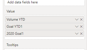
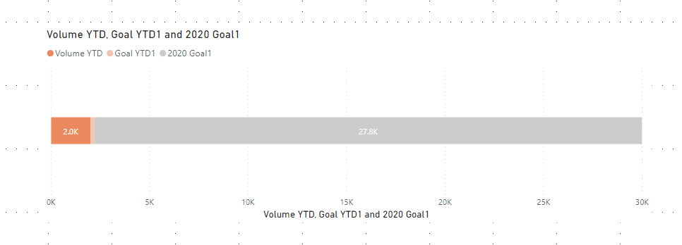
Then choose the visual :"stacked bar chart",and put measures and column you need in the visual field:
Finally you will see :
For the related .pbix file,pls click here.
Best Regards,
Kelly
- Mark as New
- Bookmark
- Subscribe
- Mute
- Subscribe to RSS Feed
- Permalink
- Report Inappropriate Content
Thanks for your response Kelly. However, there would be situations where YTD goal will be less than Volume YTD. In that scenario how will we show both?
- Mark as New
- Bookmark
- Subscribe
- Mute
- Subscribe to RSS Feed
- Permalink
- Report Inappropriate Content
Hi @itsmeanuj ,
Then measures need to be corrected as below:
2020 Goal1 =
VAR a =
    MAX ( 'Table'[2020 Goal] )
VAR b =
    MAX ( 'Table'[Goal YTD] )
VAR c =
    MAX ( 'Table'[Volume YTD] )
RETURN
    IF ( b > c, a - b, a - c )
Goal YTD1 = ABS(MAX('Table'[Goal YTD])-MAX('Table'[Volume YTD]))Volumn YTD1 = IF(MAX('Table'[Goal YTD])>MAX('Table'[Volume YTD]),MAX('Table'[Goal YTD]),MAX('Table'[Volume YTD]))
The related .pbix file,pls click here.
Best Regards,
Kelly
- Mark as New
- Bookmark
- Subscribe
- Mute
- Subscribe to RSS Feed
- Permalink
- Report Inappropriate Content
You can use Bullet Chart 2.0.1 or Bullet chart by OKViz
There you can specify the target, projection and actual along with color
- Mark as New
- Bookmark
- Subscribe
- Mute
- Subscribe to RSS Feed
- Permalink
- Report Inappropriate Content
Hi there,
You could potentially achieve the visual look with a bar chart by creating measures that calcualte the difference between the values and plotting them on the chart, rather than the actual values.
Vol to Goal YTD = MAX([Goal YTD] - [Vol YTD],0)
Vol to Goal 2020 = MAX([Goal 2020] - MAX([Goal YTD], [Vol YTD]),0)
The MAX functions are there to make sure you don't plot negative values when your actual overtakes your goal.
Difficulty with this though will be with the labelling, as the value on the chart for Goal YTD for instance will be 5000 rather than 15000. Purely the chart aspect will look ok though and you could possibly get creative with some cards or just rely on the axis and grid lines for value labels.
I'd suggest as an alternative though looking at the bullet chart visual on the marketplace or something similar which is specifically designed for plotting values against target values and may give you a better and more meaningful result. Also worth exploring some of the gauges and looking at alternative approaches. There's plenty of good ones freely available through the Marketplace.
- Mark as New
- Bookmark
- Subscribe
- Mute
- Subscribe to RSS Feed
- Permalink
- Report Inappropriate Content
Please do check it in Custom visuals.
https://appsource.microsoft.com/en-us/marketplace/apps?product=power-bi-visuals&page=1
Hope it will help you!
Regards,
Siva Mani
- Mark as New
- Bookmark
- Subscribe
- Mute
- Subscribe to RSS Feed
- Permalink
- Report Inappropriate Content
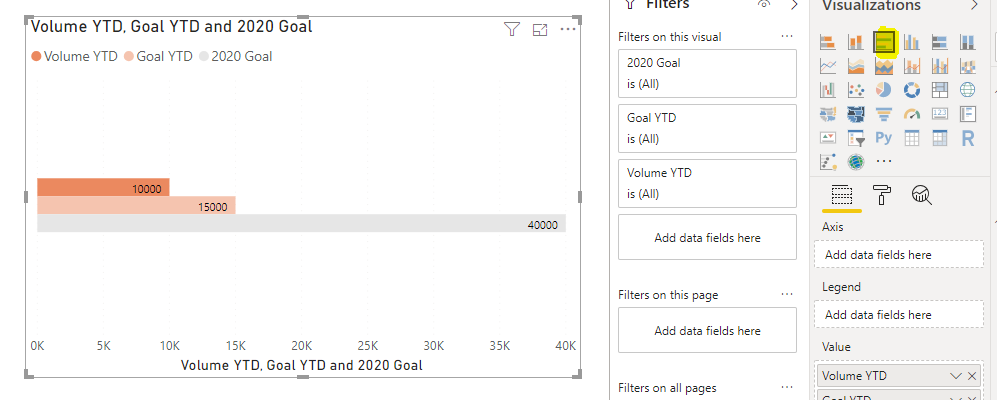
I believe that if you want to display the values correctly you will need to use a Clustered bar chart:
Is this layout acceptable or does it need to be a stacked bar chart?
Br,
J
Connect on LinkedIn
- Mark as New
- Bookmark
- Subscribe
- Mute
- Subscribe to RSS Feed
- Permalink
- Report Inappropriate Content
Hi,
Actually I am doing it for a client and they wants to see it in a stacked chart.
Helpful resources

Microsoft Fabric Learn Together
Covering the world! 9:00-10:30 AM Sydney, 4:00-5:30 PM CET (Paris/Berlin), 7:00-8:30 PM Mexico City

Power BI Monthly Update - April 2024
Check out the April 2024 Power BI update to learn about new features.

| User | Count |
|---|---|
| 106 | |
| 94 | |
| 77 | |
| 65 | |
| 53 |
| User | Count |
|---|---|
| 145 | |
| 105 | |
| 104 | |
| 90 | |
| 63 |


