- Power BI forums
- Updates
- News & Announcements
- Get Help with Power BI
- Desktop
- Service
- Report Server
- Power Query
- Mobile Apps
- Developer
- DAX Commands and Tips
- Custom Visuals Development Discussion
- Health and Life Sciences
- Power BI Spanish forums
- Translated Spanish Desktop
- Power Platform Integration - Better Together!
- Power Platform Integrations (Read-only)
- Power Platform and Dynamics 365 Integrations (Read-only)
- Training and Consulting
- Instructor Led Training
- Dashboard in a Day for Women, by Women
- Galleries
- Community Connections & How-To Videos
- COVID-19 Data Stories Gallery
- Themes Gallery
- Data Stories Gallery
- R Script Showcase
- Webinars and Video Gallery
- Quick Measures Gallery
- 2021 MSBizAppsSummit Gallery
- 2020 MSBizAppsSummit Gallery
- 2019 MSBizAppsSummit Gallery
- Events
- Ideas
- Custom Visuals Ideas
- Issues
- Issues
- Events
- Upcoming Events
- Community Blog
- Power BI Community Blog
- Custom Visuals Community Blog
- Community Support
- Community Accounts & Registration
- Using the Community
- Community Feedback
Register now to learn Fabric in free live sessions led by the best Microsoft experts. From Apr 16 to May 9, in English and Spanish.
- Power BI forums
- Forums
- Get Help with Power BI
- Desktop
- Need help turning gauge visual into a percentage
- Subscribe to RSS Feed
- Mark Topic as New
- Mark Topic as Read
- Float this Topic for Current User
- Bookmark
- Subscribe
- Printer Friendly Page
- Mark as New
- Bookmark
- Subscribe
- Mute
- Subscribe to RSS Feed
- Permalink
- Report Inappropriate Content
Need help turning gauge visual into a percentage
I have this gauge visual which contains Actual sales and target sales
But instead of displaying whole numbers in the visual, I want to display percentages instead. I tried just simply using the "Percent of grand total" option but it shows me 100% which is obviously wrong.
What can I do here?
- Mark as New
- Bookmark
- Subscribe
- Mute
- Subscribe to RSS Feed
- Permalink
- Report Inappropriate Content
I was just dealing with this. Click on the data field in the data column - NOT the checkbox (which should be ticked for the data you are displaying), click the actual data label in the data column. The ribbon at the dop should change to "Column Tools" -
Navigate to "Format" and change the dropdown to "percentage" -
- Mark as New
- Bookmark
- Subscribe
- Mute
- Subscribe to RSS Feed
- Permalink
- Report Inappropriate Content
Hi @RingoSun
I've managed to get the result you are looking for.
However, to get the value as a percent I've had to create a Max measure to divide the sum of sales by (This is hardcoded in this example).
Does your dataset contain a maximum value column or any data at all or would the max be 2x of the value? Which is currently what your 1st post picture shows.
Please find the updated PBIX here.
- Mark as New
- Bookmark
- Subscribe
- Mute
- Subscribe to RSS Feed
- Permalink
- Report Inappropriate Content
Hi,
Are you trying to calculate a percentage of sales against target?
If so I defined 3 measures:
Sum of Sales = SUM ( 'Actual Sales'[Sale] )Sum of Target = SUM ( 'Target Sales'[Target] )% of Target =
DIVIDE (
[Sum of Sales],
[Sum of Target]
)
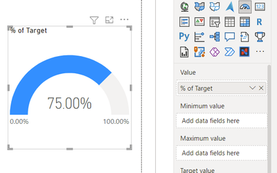
Then set [% of Target] to format as a percentage and used that measure directly in the gauge:
If that's not what you're after let me know and try and unpick.
- Mark as New
- Bookmark
- Subscribe
- Mute
- Subscribe to RSS Feed
- Permalink
- Report Inappropriate Content
Hi there thanks for the reply! But I still want to be able to have this thing right here
So basically the gauge will be between 0% and 100% and then the indicator will be the target
- Mark as New
- Bookmark
- Subscribe
- Mute
- Subscribe to RSS Feed
- Permalink
- Report Inappropriate Content
So just to check you want the gauge aspect to still show as if it was 6000 with a target line at 8000 but the number to read as a percentage?
Will have a play and see what I can do. Not sure if it does it natively but fairly sure we can create the effect at the very least. Will get get back to you.
- Mark as New
- Bookmark
- Subscribe
- Mute
- Subscribe to RSS Feed
- Permalink
- Report Inappropriate Content
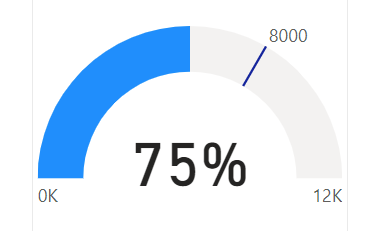
Is this what you're after?
To achieve it I've taken the original gauge but then then dropped a card with category label turned off over the top with the % measure given above.
You can then group the two visuals so they move as one.
Helpful resources

Microsoft Fabric Learn Together
Covering the world! 9:00-10:30 AM Sydney, 4:00-5:30 PM CET (Paris/Berlin), 7:00-8:30 PM Mexico City

Power BI Monthly Update - April 2024
Check out the April 2024 Power BI update to learn about new features.

| User | Count |
|---|---|
| 109 | |
| 98 | |
| 77 | |
| 66 | |
| 54 |
| User | Count |
|---|---|
| 144 | |
| 104 | |
| 101 | |
| 86 | |
| 64 |


