- Power BI forums
- Updates
- News & Announcements
- Get Help with Power BI
- Desktop
- Service
- Report Server
- Power Query
- Mobile Apps
- Developer
- DAX Commands and Tips
- Custom Visuals Development Discussion
- Health and Life Sciences
- Power BI Spanish forums
- Translated Spanish Desktop
- Power Platform Integration - Better Together!
- Power Platform Integrations (Read-only)
- Power Platform and Dynamics 365 Integrations (Read-only)
- Training and Consulting
- Instructor Led Training
- Dashboard in a Day for Women, by Women
- Galleries
- Community Connections & How-To Videos
- COVID-19 Data Stories Gallery
- Themes Gallery
- Data Stories Gallery
- R Script Showcase
- Webinars and Video Gallery
- Quick Measures Gallery
- 2021 MSBizAppsSummit Gallery
- 2020 MSBizAppsSummit Gallery
- 2019 MSBizAppsSummit Gallery
- Events
- Ideas
- Custom Visuals Ideas
- Issues
- Issues
- Events
- Upcoming Events
- Community Blog
- Power BI Community Blog
- Custom Visuals Community Blog
- Community Support
- Community Accounts & Registration
- Using the Community
- Community Feedback
Register now to learn Fabric in free live sessions led by the best Microsoft experts. From Apr 16 to May 9, in English and Spanish.
- Power BI forums
- Forums
- Get Help with Power BI
- Desktop
- Need help to implement a Chart
- Subscribe to RSS Feed
- Mark Topic as New
- Mark Topic as Read
- Float this Topic for Current User
- Bookmark
- Subscribe
- Printer Friendly Page
- Mark as New
- Bookmark
- Subscribe
- Mute
- Subscribe to RSS Feed
- Permalink
- Report Inappropriate Content
Need help to implement a Chart
Hi Experts,
I am sorry to ask you, but I have already spent a lot of time on my problem very specific to my need, I can not find the solution or help in docs and internet...
So I ask for your help to unblock me.
Here is the problem:
I would like to do a PBI report in PBI Desktop, the advantage is that I have complete control over the data and the structure, so if I have to change the table I can do it.
The data are as follows (for example):
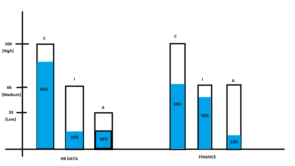
The idea being to be able to view the following info in the same chart, whitout drill down:
- Threat Name groups (HR Data, Finance, ...)
- For each group, there will always be a type C, I and A
- Each type will always have a level (high, medium or low)
- And finally each type has a percentage of completion
Ideally, the level should be displayed in an increasing manner. (high greater than medium and medium greater than low).
I would like to succeed in making a chart that would look like this.
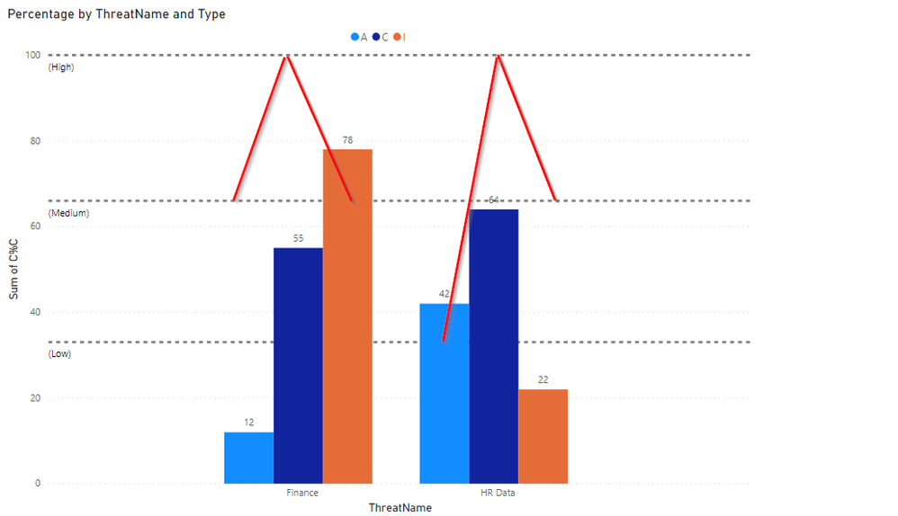
For the moment I managed to do only this one, without the red lines that I added to show you another way to represent the missing level.
Can you help me please ?
Thank you very much in advance !!!
- Mark as New
- Bookmark
- Subscribe
- Mute
- Subscribe to RSS Feed
- Permalink
- Report Inappropriate Content
Hmm, seems like you need a hybrid of a clustered column chart and a stacked column chart. I would investigate third-party visuals perhaps. Actually, you might be able to do what you want with a Line and Clustered Column Chart. The line could add in the missing information.
@ me in replies or I'll lose your thread!!!
Instead of a Kudo, please vote for this idea
Become an expert!: Enterprise DNA
External Tools: MSHGQM
YouTube Channel!: Microsoft Hates Greg
Latest book!: The Definitive Guide to Power Query (M)
DAX is easy, CALCULATE makes DAX hard...
- Mark as New
- Bookmark
- Subscribe
- Mute
- Subscribe to RSS Feed
- Permalink
- Report Inappropriate Content
Hello Greg,
Thank you for your prompt response.
Indeed, for the chart of my draft drawing, I looked quickly on the side of the 3 rd party, without really finding something that could match... If you have any suggestions ?
And for the second chart, the one with the red line that I added. I just thought of using a Line and Clustered Column Chart the problem is that I can't get the "Line Values" to be interpreted on the Level column for all the Type column.
When I try to put the "Level" column in "Line Values" an aggregate is done ... But also, the line that appear on the chart takes into account the group ThreatName and not the Type (C, I and A).
We can clearly see in this screen that the line does not match in addition to being an calculate as an aggregate.
Thx again.
Regards.
- Mark as New
- Bookmark
- Subscribe
- Mute
- Subscribe to RSS Feed
- Permalink
- Report Inappropriate Content
Also here is additional information to help you better understand the data. I tried to represent the notion of Level (High, Medium and Low) in the LevelValue column which has the values 33 for Low, 66 for Medium and 100 for High. In order to try to place the points of the line in the right place in relation to the Y axis.
- Mark as New
- Bookmark
- Subscribe
- Mute
- Subscribe to RSS Feed
- Permalink
- Report Inappropriate Content
Hi again,
Any ideas, Any help on this ?...
I still don't have any solutions to do this chart. Maybe you have suggestion on how display data differently to have the same goal, or to change the data itself, ...
Thx again for your time !
Regards,
Helpful resources

Microsoft Fabric Learn Together
Covering the world! 9:00-10:30 AM Sydney, 4:00-5:30 PM CET (Paris/Berlin), 7:00-8:30 PM Mexico City

Power BI Monthly Update - April 2024
Check out the April 2024 Power BI update to learn about new features.

| User | Count |
|---|---|
| 114 | |
| 99 | |
| 82 | |
| 70 | |
| 60 |
| User | Count |
|---|---|
| 148 | |
| 116 | |
| 104 | |
| 89 | |
| 65 |


