- Power BI forums
- Updates
- News & Announcements
- Get Help with Power BI
- Desktop
- Service
- Report Server
- Power Query
- Mobile Apps
- Developer
- DAX Commands and Tips
- Custom Visuals Development Discussion
- Health and Life Sciences
- Power BI Spanish forums
- Translated Spanish Desktop
- Power Platform Integration - Better Together!
- Power Platform Integrations (Read-only)
- Power Platform and Dynamics 365 Integrations (Read-only)
- Training and Consulting
- Instructor Led Training
- Dashboard in a Day for Women, by Women
- Galleries
- Community Connections & How-To Videos
- COVID-19 Data Stories Gallery
- Themes Gallery
- Data Stories Gallery
- R Script Showcase
- Webinars and Video Gallery
- Quick Measures Gallery
- 2021 MSBizAppsSummit Gallery
- 2020 MSBizAppsSummit Gallery
- 2019 MSBizAppsSummit Gallery
- Events
- Ideas
- Custom Visuals Ideas
- Issues
- Issues
- Events
- Upcoming Events
- Community Blog
- Power BI Community Blog
- Custom Visuals Community Blog
- Community Support
- Community Accounts & Registration
- Using the Community
- Community Feedback
Register now to learn Fabric in free live sessions led by the best Microsoft experts. From Apr 16 to May 9, in English and Spanish.
- Power BI forums
- Forums
- Get Help with Power BI
- Desktop
- Need help to create a visual with resource allocat...
- Subscribe to RSS Feed
- Mark Topic as New
- Mark Topic as Read
- Float this Topic for Current User
- Bookmark
- Subscribe
- Printer Friendly Page
- Mark as New
- Bookmark
- Subscribe
- Mute
- Subscribe to RSS Feed
- Permalink
- Report Inappropriate Content
Need help to create a visual with resource allocation over period of time.
Hi,
I have a dataset which shows an employee name with Start_date & End_date and their allocation type. I need a visual which indicates at a point of time who all are in Bench or Billable with help of slicer applied between start and end date.
Can anyone please help on this. I have tried stacked chart and Gantt chart and not able to get the desired result set. Expecting Employee names on y axis and date on x-axis with date slicer.
| EMP_NAME | allocation type | Start_date | End_Date |
| Employee 1 | Bench | 04 July 2020 | 09 August 2020 |
| Employee 1 | Billable | 10 August 2020 | 31 August 2020 |
| Employee 1 | Bench | 01 September 2020 | 26 December 2020 |
| Employee 2 | Bench | 04 July 2020 | 12 July 2020 |
| Employee 2 | Billable | 13 July 2020 | 18 September 2020 |
| Employee 2 | Bench | 19 September 2020 | 26 December 2020 |
| Employee 3 | Bench | 04 July 2020 | 12 July 2020 |
| Employee 3 | Billable | 13 July 2020 | 18 September 2020 |
Solved! Go to Solution.
- Mark as New
- Bookmark
- Subscribe
- Mute
- Subscribe to RSS Feed
- Permalink
- Report Inappropriate Content
@Anonymous
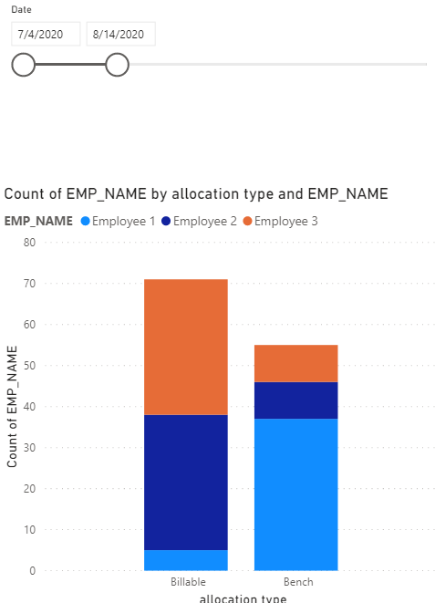
Please check the attached file if you are getting the expected results.
https://1drv.ms/u/s!AmoScH5srsIYgYUcXKgL3pMEYkX8YA?e=rX7oYg
________________________
Did I answer your question? Mark this post as a solution, this will help others!.
Click on the Thumbs-Up icon if you like this reply 🙂
⭕ Subscribe and learn Power BI from these videos
⚪ Website ⚪ LinkedIn ⚪ PBI User Group
- Mark as New
- Bookmark
- Subscribe
- Mute
- Subscribe to RSS Feed
- Permalink
- Report Inappropriate Content
Hi @Anonymous ,
For now, there is not a visual that can show names on y axis. I think the answer of @Fowmy is pretty good. You could add Employee names into Legend and distinguish them by colors.
If you make sense, please accept the helpful answers as solution. Others will benefit from this thread.😉 If you have any questions, please feel free to ask us.
Xue Ding
If this post helps, then please consider Accept it as the solution to help the other members find it more quickly.
- Mark as New
- Bookmark
- Subscribe
- Mute
- Subscribe to RSS Feed
- Permalink
- Report Inappropriate Content
@Anonymous - Seems like a variation on Open Tickets. https://community.powerbi.com/t5/Quick-Measures-Gallery/Open-Tickets/m-p/409364#M147
@ me in replies or I'll lose your thread!!!
Instead of a Kudo, please vote for this idea
Become an expert!: Enterprise DNA
External Tools: MSHGQM
YouTube Channel!: Microsoft Hates Greg
Latest book!: The Definitive Guide to Power Query (M)
DAX is easy, CALCULATE makes DAX hard...
- Mark as New
- Bookmark
- Subscribe
- Mute
- Subscribe to RSS Feed
- Permalink
- Report Inappropriate Content
@Anonymous
Please check the attached file if you are getting the expected results.
https://1drv.ms/u/s!AmoScH5srsIYgYUcXKgL3pMEYkX8YA?e=rX7oYg
________________________
Did I answer your question? Mark this post as a solution, this will help others!.
Click on the Thumbs-Up icon if you like this reply 🙂
⭕ Subscribe and learn Power BI from these videos
⚪ Website ⚪ LinkedIn ⚪ PBI User Group
Helpful resources

Microsoft Fabric Learn Together
Covering the world! 9:00-10:30 AM Sydney, 4:00-5:30 PM CET (Paris/Berlin), 7:00-8:30 PM Mexico City

Power BI Monthly Update - April 2024
Check out the April 2024 Power BI update to learn about new features.

| User | Count |
|---|---|
| 110 | |
| 95 | |
| 76 | |
| 65 | |
| 51 |
| User | Count |
|---|---|
| 146 | |
| 109 | |
| 106 | |
| 88 | |
| 61 |

