- Power BI forums
- Updates
- News & Announcements
- Get Help with Power BI
- Desktop
- Service
- Report Server
- Power Query
- Mobile Apps
- Developer
- DAX Commands and Tips
- Custom Visuals Development Discussion
- Health and Life Sciences
- Power BI Spanish forums
- Translated Spanish Desktop
- Power Platform Integration - Better Together!
- Power Platform Integrations (Read-only)
- Power Platform and Dynamics 365 Integrations (Read-only)
- Training and Consulting
- Instructor Led Training
- Dashboard in a Day for Women, by Women
- Galleries
- Community Connections & How-To Videos
- COVID-19 Data Stories Gallery
- Themes Gallery
- Data Stories Gallery
- R Script Showcase
- Webinars and Video Gallery
- Quick Measures Gallery
- 2021 MSBizAppsSummit Gallery
- 2020 MSBizAppsSummit Gallery
- 2019 MSBizAppsSummit Gallery
- Events
- Ideas
- Custom Visuals Ideas
- Issues
- Issues
- Events
- Upcoming Events
- Community Blog
- Power BI Community Blog
- Custom Visuals Community Blog
- Community Support
- Community Accounts & Registration
- Using the Community
- Community Feedback
Register now to learn Fabric in free live sessions led by the best Microsoft experts. From Apr 16 to May 9, in English and Spanish.
- Power BI forums
- Forums
- Get Help with Power BI
- Desktop
- Re: Need help on comparing records based on date s...
- Subscribe to RSS Feed
- Mark Topic as New
- Mark Topic as Read
- Float this Topic for Current User
- Bookmark
- Subscribe
- Printer Friendly Page
- Mark as New
- Bookmark
- Subscribe
- Mute
- Subscribe to RSS Feed
- Permalink
- Report Inappropriate Content
Need help on comparing records based on date slicer
Hi,
I am working on a powerBI task and I am stuck with it.
The problem statement is as follows -
The context of data is different, but I am using the analogy of a retail store and its sales unit for explaination.
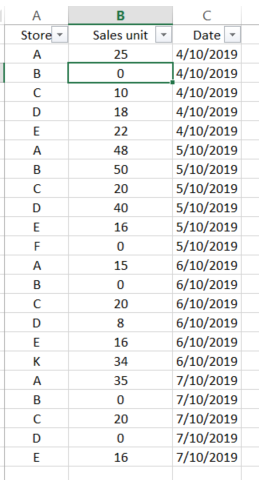
I have a list of stores and its sales unit recorded each month. The data looks like this -
The frequency interval of dates may not be exactly 1 month. It can vary.
My requirement is to have a custom slicer/filter that will be a drop-down and will have the following options -
Increased, Decreased, No Change, Others. These options indicate whether the sales unit of that store increased, decreased, did not change or something else.
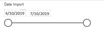
To get this filter, I am having a date filter that will be a slider where I am having the start and end date as the two end points of the slider. Date slider looks somethign like this -
Now below are some use case of how this should work -
Case 1:
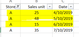
Date slider has start date as 4/10/2019 and end date as 6/10/2019
In this date range, I want to categorize all the Stores in Increased, Decreased, No Change, Others.
This will be based on the increase/decrease of the sales unit.
For example.
On date 4/10/2019, Store A had 25 sales unit and on date 6/10/2019 Store A had 15 sales unit.
So this store will be categorized under 'Decreased'
Note here we are only checking the sales units for start and end date based on the slider.
Similarly other stores will be categorized.
Case 2:
Now if I change the date slider and have the following start/end date -
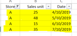
Start date - 4/10/2019 End Date - 7/10/2019
Here the Store A will be categorized as 'Increased' since the
sales unit on 4/10/2019 for Store A is 25 and sales unit on 7/10/2019 for Store A is 35
So, basically when I change the date slider the stores will be categorized accordingly based on the
sales unit for their satrt/end date.
Issue in Implementation -
I have tried various tricks to see if I can compare the records based on the date selected, but I am getting no luck.
I have used to Waterfall chart to atleast show the trend of ups and downs for the stores.
I am now not able to add the Category slicer.
Please suggest me what approach should I follow and which diagram/chart/view will be a best fit for showing such Category.
Solved! Go to Solution.
- Mark as New
- Bookmark
- Subscribe
- Mute
- Subscribe to RSS Feed
- Permalink
- Report Inappropriate Content
So if you create a disconnected table with your 4 different change classifications you could create a measure like the following
Sales =
VAR _minDate = MIN('Date'[Date])
VAR _maxDate = MAX('Date'[Date])
VAR _minDateAmt = CALCULATE(SUM(Sales[Sales unit]), 'Date'[Date] = _minDate)
VAR _maxDateAmt = CALCULATE(SUM(Sales[Sales unit]), 'Date'[Date] = _maxDate)
VAR _eitherMinMaxIsBlank = ISBLANK(_maxDateAmt) || ISBLANK( _maxDateAmt)
VAR _selectedChange = SELECTEDVALUE(Change[Change])
VAR _result = SWITCH(_selectedChange,
"Increased", IF(_minDateAmt > _maxDateAmt && _eitherMinMaxIsBlank = FALSE(), SUM(Sales[Sales unit])) ,
"Decreased", IF(_minDateAmt < _maxDateAmt && _eitherMinMaxIsBlank = FALSE(), SUM(Sales[Sales unit])) ,
"No Change", IF(_minDateAmt == _maxDateAmt && _eitherMinMaxIsBlank = FALSE(), SUM(Sales[Sales unit])),
"Other", IF( _eitherMinMaxIsBlank = TRUE(), SUM(Sales[Sales unit])) ,
// else
SUM(Sales[Sales unit])
)
RETURN _result
It does a sum of the sales unit column over the date range, but also splits the sales into increased, decreased, tec. You can see this working in the attached pbix file
- Mark as New
- Bookmark
- Subscribe
- Mute
- Subscribe to RSS Feed
- Permalink
- Report Inappropriate Content
Hi,
Do you need any help with resolving this question or have you already resolved it?
Regards,
Ashish Mathur
http://www.ashishmathur.com
https://www.linkedin.com/in/excelenthusiasts/
- Mark as New
- Bookmark
- Subscribe
- Mute
- Subscribe to RSS Feed
- Permalink
- Report Inappropriate Content
Hi @Ashish_Mathur , the solution provided by @d_gosbell solves my query. Thank you.
- Mark as New
- Bookmark
- Subscribe
- Mute
- Subscribe to RSS Feed
- Permalink
- Report Inappropriate Content
Hi @Anonymous ,
Does that make sense? If so, kindly mark the proper reply as a solution to help others having the similar issue and close the case. If not, let me know and I'll try to help you further.
Best regards
Amy
- Mark as New
- Bookmark
- Subscribe
- Mute
- Subscribe to RSS Feed
- Permalink
- Report Inappropriate Content
Hi @v-xicai . Sorry for the delay in response. The solution which you offered is actually inverse of what i was looking for. I have to actually click on individual project to see if it falls under "Increase" or "Decrease" category. Wher as my requirement was that I want to categorize the whole list of projects in each category. I appreciate you help though. Thank you so much
- Mark as New
- Bookmark
- Subscribe
- Mute
- Subscribe to RSS Feed
- Permalink
- Report Inappropriate Content
Hi @Anonymous ,
According to your description, you may need a measure to display the trend instead of a calculated column. While it is not supported to put measure into Slicer visual in Power BI Desktop.
As a workaround, you can create measure like DAX below to get trend, put the new measure into Card visual.
Trend = VAR StartDate=CALCULATE(MIN('Table (2)'[Sale Unit]),FIRSTDATE('Table (2)'[Date]))
VAR EndDate=CALCULATE(MAX('Table (2)'[Sale Unit]),LASTDATE('Table (2)'[Date]))
RETURN IF(StartDate=EndDate,"No Change",IF(StartDate>EndDate,"Decreased","Increased"))
Result:
Best Regards,
Amy
If this post helps, then please consider Accept it as the solution to help the other members find it more quickly.
- Mark as New
- Bookmark
- Subscribe
- Mute
- Subscribe to RSS Feed
- Permalink
- Report Inappropriate Content
So if you create a disconnected table with your 4 different change classifications you could create a measure like the following
Sales =
VAR _minDate = MIN('Date'[Date])
VAR _maxDate = MAX('Date'[Date])
VAR _minDateAmt = CALCULATE(SUM(Sales[Sales unit]), 'Date'[Date] = _minDate)
VAR _maxDateAmt = CALCULATE(SUM(Sales[Sales unit]), 'Date'[Date] = _maxDate)
VAR _eitherMinMaxIsBlank = ISBLANK(_maxDateAmt) || ISBLANK( _maxDateAmt)
VAR _selectedChange = SELECTEDVALUE(Change[Change])
VAR _result = SWITCH(_selectedChange,
"Increased", IF(_minDateAmt > _maxDateAmt && _eitherMinMaxIsBlank = FALSE(), SUM(Sales[Sales unit])) ,
"Decreased", IF(_minDateAmt < _maxDateAmt && _eitherMinMaxIsBlank = FALSE(), SUM(Sales[Sales unit])) ,
"No Change", IF(_minDateAmt == _maxDateAmt && _eitherMinMaxIsBlank = FALSE(), SUM(Sales[Sales unit])),
"Other", IF( _eitherMinMaxIsBlank = TRUE(), SUM(Sales[Sales unit])) ,
// else
SUM(Sales[Sales unit])
)
RETURN _result
It does a sum of the sales unit column over the date range, but also splits the sales into increased, decreased, tec. You can see this working in the attached pbix file
- Mark as New
- Bookmark
- Subscribe
- Mute
- Subscribe to RSS Feed
- Permalink
- Report Inappropriate Content
Hi @d_gosbell , thank you for your solution. This absolutely solves my query. Though I had a question - The dax measure uses the SelectedValue function. I did not get that part of the measure. Rest was pretty straight forward. Can you please explain what does that do?
- Mark as New
- Bookmark
- Subscribe
- Mute
- Subscribe to RSS Feed
- Permalink
- Report Inappropriate Content
@Anonymous wrote:
The dax measure uses the SelectedValue function. I did not get that part of the measure. Rest was pretty straight forward. Can you please explain what does that do?
So technically SELECTEDVALUE checks to see if a column has a filter applied and if that filter is for a single value, and if it is filtered in this way it returns that value.
But one of the most common uses is to get the current selection from a slicer. So that is all I am doing here is to get the value that has been selected in the slicer then using that in the switch statement.
Helpful resources

Microsoft Fabric Learn Together
Covering the world! 9:00-10:30 AM Sydney, 4:00-5:30 PM CET (Paris/Berlin), 7:00-8:30 PM Mexico City

Power BI Monthly Update - April 2024
Check out the April 2024 Power BI update to learn about new features.

| User | Count |
|---|---|
| 109 | |
| 96 | |
| 77 | |
| 66 | |
| 53 |
| User | Count |
|---|---|
| 144 | |
| 105 | |
| 102 | |
| 89 | |
| 63 |


