- Power BI forums
- Updates
- News & Announcements
- Get Help with Power BI
- Desktop
- Service
- Report Server
- Power Query
- Mobile Apps
- Developer
- DAX Commands and Tips
- Custom Visuals Development Discussion
- Health and Life Sciences
- Power BI Spanish forums
- Translated Spanish Desktop
- Power Platform Integration - Better Together!
- Power Platform Integrations (Read-only)
- Power Platform and Dynamics 365 Integrations (Read-only)
- Training and Consulting
- Instructor Led Training
- Dashboard in a Day for Women, by Women
- Galleries
- Community Connections & How-To Videos
- COVID-19 Data Stories Gallery
- Themes Gallery
- Data Stories Gallery
- R Script Showcase
- Webinars and Video Gallery
- Quick Measures Gallery
- 2021 MSBizAppsSummit Gallery
- 2020 MSBizAppsSummit Gallery
- 2019 MSBizAppsSummit Gallery
- Events
- Ideas
- Custom Visuals Ideas
- Issues
- Issues
- Events
- Upcoming Events
- Community Blog
- Power BI Community Blog
- Custom Visuals Community Blog
- Community Support
- Community Accounts & Registration
- Using the Community
- Community Feedback
Register now to learn Fabric in free live sessions led by the best Microsoft experts. From Apr 16 to May 9, in English and Spanish.
- Power BI forums
- Forums
- Get Help with Power BI
- Desktop
- Need help of filter selections
- Subscribe to RSS Feed
- Mark Topic as New
- Mark Topic as Read
- Float this Topic for Current User
- Bookmark
- Subscribe
- Printer Friendly Page
- Mark as New
- Bookmark
- Subscribe
- Mute
- Subscribe to RSS Feed
- Permalink
- Report Inappropriate Content
Need help of filter selections
Hi ,
I have a page with slicer Month ( which shows from jan to dec ) . Now I have a graph with Month on X-axis , Measure1(Bar), Meassure2(Line), Measure3(line), Measrue4(line).
Now when i select Month Jan from Slicer, then the bar measure need to show Jan Value and the remaining 4 Line meeasures need to show from Jan to December values.
My understanding is so the X-axis shows Jan - Dec, based on selection the selected Months( shows bars for that Months), for remaining 4 line measures it shows for all 12 months.
Need quick help,Thanks for the support.
Solved! Go to Solution.
- Mark as New
- Bookmark
- Subscribe
- Mute
- Subscribe to RSS Feed
- Permalink
- Report Inappropriate Content
Hi @ramshoney1225 ,
I made a simple example
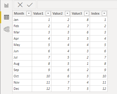
Sample data is this. The index column is to sort the month by the index column.
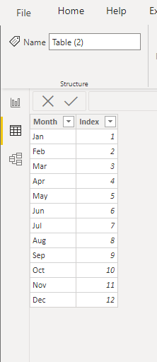
Create a separate table by entering data. There's no relationship between two tables.
Four measure are
Measure1(Bar) = CALCULATE(SUM('Table'[Value1]),FILTER('Table',[Month] in ALLSELECTED('Table (2)'[Month])))Meassure2(Line) = SUM('Table'[Value2])Measure3(line) = SUM('Table'[Value3])Measrue4(line) = SUM('Table'[Value2])+SUM('Table'[Value3])
You can check details from the attachment.
Best Regards,
Stephen Tao
If this post helps, then please consider Accept it as the solution to help the other members find it more quickly.
- Mark as New
- Bookmark
- Subscribe
- Mute
- Subscribe to RSS Feed
- Permalink
- Report Inappropriate Content
@ramshoney1225 you can use the Edit interaction feature to disable remaining chart's interaction off with that Month Slicer.
Step1: Select Month Slicer and go to Format Menu then click on "Edit Interaction".
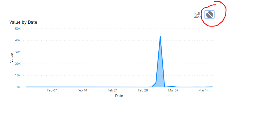
Step 2: Then click on all you charts which you want all 12 months on x-axis and click on None icon like below screen shot:
Please take a quick glance at newly created dashboards : Restaurant Management Dashboard , HR Analytics Report , Hotel Management Report, Sales Analysis Report , Fortune 500 Companies Analysis , Revenue Tracking Dashboard
- Mark as New
- Bookmark
- Subscribe
- Mute
- Subscribe to RSS Feed
- Permalink
- Report Inappropriate Content
@ramshoney1225 , You need to use an independent date table for that. Based on the selected date you change the date range of the measures
refer my video how to use that : https://www.youtube.com/watch?v=lOEW-YUrAbE
Microsoft Power BI Learning Resources, 2023 !!
Learn Power BI - Full Course with Dec-2022, with Window, Index, Offset, 100+ Topics !!
Did I answer your question? Mark my post as a solution! Appreciate your Kudos !! Proud to be a Super User! !!
Helpful resources

Microsoft Fabric Learn Together
Covering the world! 9:00-10:30 AM Sydney, 4:00-5:30 PM CET (Paris/Berlin), 7:00-8:30 PM Mexico City

Power BI Monthly Update - April 2024
Check out the April 2024 Power BI update to learn about new features.

| User | Count |
|---|---|
| 110 | |
| 96 | |
| 76 | |
| 63 | |
| 55 |
| User | Count |
|---|---|
| 142 | |
| 107 | |
| 89 | |
| 84 | |
| 65 |


