- Power BI forums
- Updates
- News & Announcements
- Get Help with Power BI
- Desktop
- Service
- Report Server
- Power Query
- Mobile Apps
- Developer
- DAX Commands and Tips
- Custom Visuals Development Discussion
- Health and Life Sciences
- Power BI Spanish forums
- Translated Spanish Desktop
- Power Platform Integration - Better Together!
- Power Platform Integrations (Read-only)
- Power Platform and Dynamics 365 Integrations (Read-only)
- Training and Consulting
- Instructor Led Training
- Dashboard in a Day for Women, by Women
- Galleries
- Community Connections & How-To Videos
- COVID-19 Data Stories Gallery
- Themes Gallery
- Data Stories Gallery
- R Script Showcase
- Webinars and Video Gallery
- Quick Measures Gallery
- 2021 MSBizAppsSummit Gallery
- 2020 MSBizAppsSummit Gallery
- 2019 MSBizAppsSummit Gallery
- Events
- Ideas
- Custom Visuals Ideas
- Issues
- Issues
- Events
- Upcoming Events
- Community Blog
- Power BI Community Blog
- Custom Visuals Community Blog
- Community Support
- Community Accounts & Registration
- Using the Community
- Community Feedback
Register now to learn Fabric in free live sessions led by the best Microsoft experts. From Apr 16 to May 9, in English and Spanish.
- Power BI forums
- Forums
- Get Help with Power BI
- Desktop
- Need help creating an SPC chart with filter capabi...
- Subscribe to RSS Feed
- Mark Topic as New
- Mark Topic as Read
- Float this Topic for Current User
- Bookmark
- Subscribe
- Printer Friendly Page
- Mark as New
- Bookmark
- Subscribe
- Mute
- Subscribe to RSS Feed
- Permalink
- Report Inappropriate Content
Need help creating an SPC chart with filter capability?
Trying to impress the boss with a fancy SPC chart for monthly sales that can be filtered per product.
It's a line chart showing count of invoices (Or sum of revenue) per month. So first I need to add a line showing the average for all the months (A plain horizontal line, but it needs to adjust depending which product I filter on.)
Next is a calculated line (LCL=Mean-3*stddev)
Every time I have tried it just sees the invoice numbers as individual numbers and gives an average of that, rather than an average of the count per month.
I can easily put in fixed lines for all data, but I specifically want something that will adjust depending on the filter applied. If I can add a banner card that shows the actual calculated number per filter it will also help a lot.
Then I also need a way to sort products by a count of all invoice numbers in a bar chart. Is that possible?
Thanks in advance.
- Mark as New
- Bookmark
- Subscribe
- Mute
- Subscribe to RSS Feed
- Permalink
- Report Inappropriate Content
Hi All
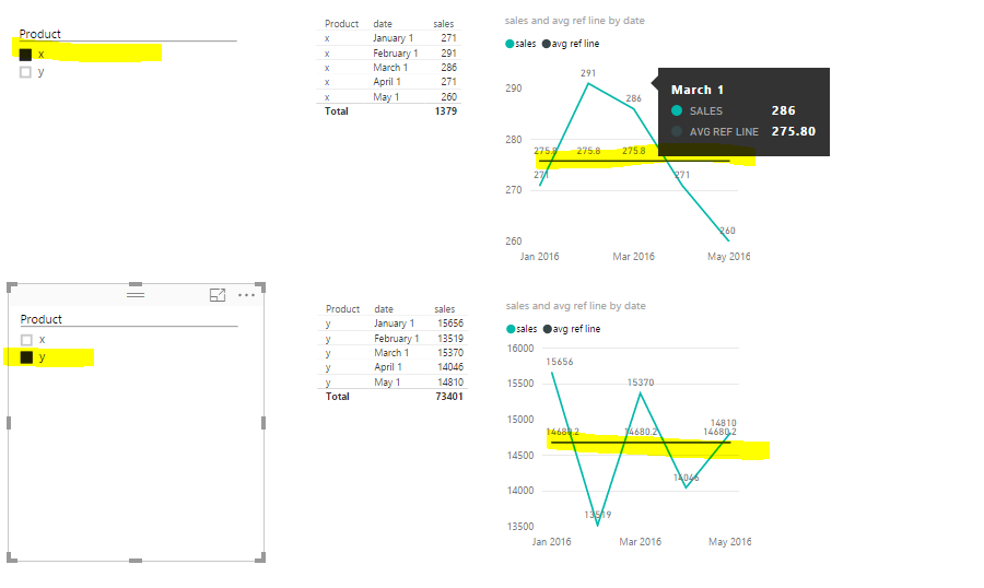
I am trying to impress the boss with some SPC Charts that can show either a count of all invoices per month or a sum of revenue per month with some 6sigma based analysis lines on the chart.
For this I need a basic line chart that shows the count of invoices accross a few months with a filter per product. Easy enough.
Next I get lost: I need to show a mean of the count of invoices accross all the months. It's easy enough to enter a fixed number, but then it doesn't change as I filter per product.
For all I have:
| February | 13519 |
| April | 15370 |
| January | 14046 |
| March | 15656 |
| May | 14810 |
So the mean is 14680
Then if I filter to product X I get
| February | 291 |
| April | 286 |
| January | 271 |
| March | 271 |
| May | 260 |
With mean 276.
So how do I get my graphs to show a horizontal line of the mean that changes as I filter by product?
The next line is the same concept, but the formula is LCL=Mean-(3*StandardDev)
Does anyone know how to create these lines on a line graph?
I also wan't to show all the products with associated revenue on a bar graph, then sort it by amount of revenue so it shows the best performers first.
- Mark as New
- Bookmark
- Subscribe
- Mute
- Subscribe to RSS Feed
- Permalink
- Report Inappropriate Content
- Mark as New
- Bookmark
- Subscribe
- Mute
- Subscribe to RSS Feed
- Permalink
- Report Inappropriate Content
Thank you for the response. I tried your formula but unfortunately it returns a 0 value.
I have voted for the feature.
Helpful resources

Microsoft Fabric Learn Together
Covering the world! 9:00-10:30 AM Sydney, 4:00-5:30 PM CET (Paris/Berlin), 7:00-8:30 PM Mexico City

Power BI Monthly Update - April 2024
Check out the April 2024 Power BI update to learn about new features.

| User | Count |
|---|---|
| 109 | |
| 99 | |
| 77 | |
| 66 | |
| 54 |
| User | Count |
|---|---|
| 144 | |
| 104 | |
| 102 | |
| 87 | |
| 64 |

