- Power BI forums
- Updates
- News & Announcements
- Get Help with Power BI
- Desktop
- Service
- Report Server
- Power Query
- Mobile Apps
- Developer
- DAX Commands and Tips
- Custom Visuals Development Discussion
- Health and Life Sciences
- Power BI Spanish forums
- Translated Spanish Desktop
- Power Platform Integration - Better Together!
- Power Platform Integrations (Read-only)
- Power Platform and Dynamics 365 Integrations (Read-only)
- Training and Consulting
- Instructor Led Training
- Dashboard in a Day for Women, by Women
- Galleries
- Community Connections & How-To Videos
- COVID-19 Data Stories Gallery
- Themes Gallery
- Data Stories Gallery
- R Script Showcase
- Webinars and Video Gallery
- Quick Measures Gallery
- 2021 MSBizAppsSummit Gallery
- 2020 MSBizAppsSummit Gallery
- 2019 MSBizAppsSummit Gallery
- Events
- Ideas
- Custom Visuals Ideas
- Issues
- Issues
- Events
- Upcoming Events
- Community Blog
- Power BI Community Blog
- Custom Visuals Community Blog
- Community Support
- Community Accounts & Registration
- Using the Community
- Community Feedback
Register now to learn Fabric in free live sessions led by the best Microsoft experts. From Apr 16 to May 9, in English and Spanish.
- Power BI forums
- Forums
- Get Help with Power BI
- Desktop
- Need help creating a chart using two different rep...
- Subscribe to RSS Feed
- Mark Topic as New
- Mark Topic as Read
- Float this Topic for Current User
- Bookmark
- Subscribe
- Printer Friendly Page
- Mark as New
- Bookmark
- Subscribe
- Mute
- Subscribe to RSS Feed
- Permalink
- Report Inappropriate Content
Need help creating a chart using two different reports.
Hi all,
I am trying to create a visualization that compares two different sets of data. The first report is a FY19 report showing employees actual hours charged by week. The second report shows budgeted employee hours by week for FY20. Essentially I am trying to create a line/ bar graph that shows over a fiscal year where there are deviations between prior year actual hours/ current year budgeted hours to identify where there is overstaffing or deficiences.
I know I can create pivots to sum the hours by week and compare or generate variances in a chart but looking to create a visual more management presentation purposes.
Anybody have any idea if this is doable? Appreciate any help, thanks!
- Mark as New
- Bookmark
- Subscribe
- Mute
- Subscribe to RSS Feed
- Permalink
- Report Inappropriate Content
Thanks for explaining. I'll play around with it but your explanations have given me some ideas!
- Mark as New
- Bookmark
- Subscribe
- Mute
- Subscribe to RSS Feed
- Permalink
- Report Inappropriate Content
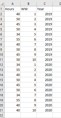
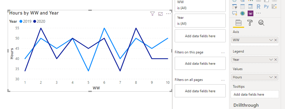
Sure it's doable. Depending on how your data is coming in you may need to create some custom columns. For example if I had this data (just 10 weeks for demonstration):
I could put the Year column as the legend to differentiate between the series.
- Mark as New
- Bookmark
- Subscribe
- Mute
- Subscribe to RSS Feed
- Permalink
- Report Inappropriate Content
Thanks for the quick response! Does the data need to be aggregated into one excel file or table? The problem I think I'm also going to run into is that the FY19 actual hours has charged time in 2020 and that the 2020 budget will project hours into the first month of 2021. I tried to attach some photos so you can see the date format. Would you have suggestions for the custom columns? Does a relationship need to be established to make a chart that displays both sets of data?


- Mark as New
- Bookmark
- Subscribe
- Mute
- Subscribe to RSS Feed
- Permalink
- Report Inappropriate Content
Like I said it depends on how your data is coming in. My example was from one table (the easiest way).
If you have multiple tables you could append them, join them with some sort of bridging table, or build measures that calculate based on values in other tables. There is a lot of flexibility so the method could determine how you do it.
Helpful resources

Microsoft Fabric Learn Together
Covering the world! 9:00-10:30 AM Sydney, 4:00-5:30 PM CET (Paris/Berlin), 7:00-8:30 PM Mexico City

Power BI Monthly Update - April 2024
Check out the April 2024 Power BI update to learn about new features.

| User | Count |
|---|---|
| 106 | |
| 93 | |
| 75 | |
| 62 | |
| 50 |
| User | Count |
|---|---|
| 147 | |
| 107 | |
| 105 | |
| 87 | |
| 61 |


