- Power BI forums
- Updates
- News & Announcements
- Get Help with Power BI
- Desktop
- Service
- Report Server
- Power Query
- Mobile Apps
- Developer
- DAX Commands and Tips
- Custom Visuals Development Discussion
- Health and Life Sciences
- Power BI Spanish forums
- Translated Spanish Desktop
- Power Platform Integration - Better Together!
- Power Platform Integrations (Read-only)
- Power Platform and Dynamics 365 Integrations (Read-only)
- Training and Consulting
- Instructor Led Training
- Dashboard in a Day for Women, by Women
- Galleries
- Community Connections & How-To Videos
- COVID-19 Data Stories Gallery
- Themes Gallery
- Data Stories Gallery
- R Script Showcase
- Webinars and Video Gallery
- Quick Measures Gallery
- 2021 MSBizAppsSummit Gallery
- 2020 MSBizAppsSummit Gallery
- 2019 MSBizAppsSummit Gallery
- Events
- Ideas
- Custom Visuals Ideas
- Issues
- Issues
- Events
- Upcoming Events
- Community Blog
- Power BI Community Blog
- Custom Visuals Community Blog
- Community Support
- Community Accounts & Registration
- Using the Community
- Community Feedback
Register now to learn Fabric in free live sessions led by the best Microsoft experts. From Apr 16 to May 9, in English and Spanish.
- Power BI forums
- Forums
- Get Help with Power BI
- Desktop
- Re: Need column chart that shows a measure for 3 d...
- Subscribe to RSS Feed
- Mark Topic as New
- Mark Topic as Read
- Float this Topic for Current User
- Bookmark
- Subscribe
- Printer Friendly Page
- Mark as New
- Bookmark
- Subscribe
- Mute
- Subscribe to RSS Feed
- Permalink
- Report Inappropriate Content
Need column chart that shows a measure for 3 different time periods
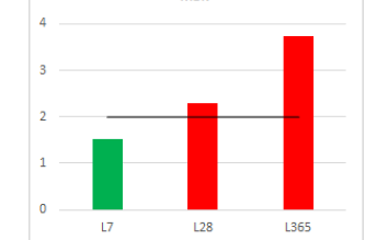
I have a request to build a column chart that shows the value of a measure for the last 7 days, last 28 days and last 365 days. Any suggestions on the best way to approach this? Below is an example of what I'm trying to reproduce (the line is the goal line)...
Solved! Go to Solution.
- Mark as New
- Bookmark
- Subscribe
- Mute
- Subscribe to RSS Feed
- Permalink
- Report Inappropriate Content
Hi @LisaK ,
According to my understanding ,you want to calculate sum of value based on different time periods, right?
You could use the following formula:
last7 =
CALCULATE (
    SUM ( 'Last Period'[Value] ),
    FILTER ( 'Last Period', DATEDIFF ( 'Last Period'[Date], NOW (), DAY ) <= 7 )
)
last28 =
CALCULATE (
SUM ( 'Last Period'[Value] ),
FILTER ( 'Last Period', DATEDIFF ( 'Last Period'[Date], NOW (), DAY ) <= 28 )
)last365 =
CALCULATE (
SUM ( 'Last Period'[Value] ),
FILTER ( 'Last Period', DATEDIFF ( 'Last Period'[Date], NOW (), DAY ) <= 365 )
)

sum value =
SWITCH (
    SELECTEDVALUE ( 'for X-axis'[last period] ),
    "last 7", [last7],
    "last 28", [last28],
    "last 365", [last365]
)
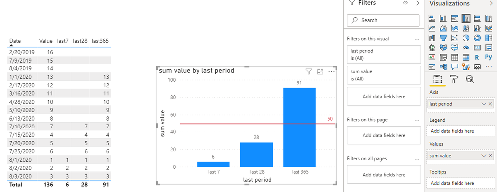
My visualizations look like this:
Please do mask sensitive data before uploading.
Eyelyn Qin
- Mark as New
- Bookmark
- Subscribe
- Mute
- Subscribe to RSS Feed
- Permalink
- Report Inappropriate Content
Great ideas! Thanks everyone. I'll give them a try.
- Mark as New
- Bookmark
- Subscribe
- Mute
- Subscribe to RSS Feed
- Permalink
- Report Inappropriate Content
Hi @LisaK ,
According to my understanding ,you want to calculate sum of value based on different time periods, right?
You could use the following formula:
last7 =
CALCULATE (
    SUM ( 'Last Period'[Value] ),
    FILTER ( 'Last Period', DATEDIFF ( 'Last Period'[Date], NOW (), DAY ) <= 7 )
)
last28 =
CALCULATE (
SUM ( 'Last Period'[Value] ),
FILTER ( 'Last Period', DATEDIFF ( 'Last Period'[Date], NOW (), DAY ) <= 28 )
)last365 =
CALCULATE (
SUM ( 'Last Period'[Value] ),
FILTER ( 'Last Period', DATEDIFF ( 'Last Period'[Date], NOW (), DAY ) <= 365 )
)

sum value =
SWITCH (
    SELECTEDVALUE ( 'for X-axis'[last period] ),
    "last 7", [last7],
    "last 28", [last28],
    "last 365", [last365]
)
My visualizations look like this:
Please do mask sensitive data before uploading.
Eyelyn Qin
- Mark as New
- Bookmark
- Subscribe
- Mute
- Subscribe to RSS Feed
- Permalink
- Report Inappropriate Content
- Mark as New
- Bookmark
- Subscribe
- Mute
- Subscribe to RSS Feed
- Permalink
- Report Inappropriate Content
You need a table with this structure
| Index | Label |
| 7 | L7 |
| 28 | L28 |
| 365 | L365 |
Mark the index column as whole number
Then you can add a measure to that table that based on the index computes the values you need.
Sort the Label column by the Index column.
Now you can add the Label to the legend, and the measure result to the values.
Helpful resources

Microsoft Fabric Learn Together
Covering the world! 9:00-10:30 AM Sydney, 4:00-5:30 PM CET (Paris/Berlin), 7:00-8:30 PM Mexico City

Power BI Monthly Update - April 2024
Check out the April 2024 Power BI update to learn about new features.

| User | Count |
|---|---|
| 110 | |
| 95 | |
| 76 | |
| 65 | |
| 51 |
| User | Count |
|---|---|
| 146 | |
| 109 | |
| 106 | |
| 88 | |
| 61 |


