- Power BI forums
- Updates
- News & Announcements
- Get Help with Power BI
- Desktop
- Service
- Report Server
- Power Query
- Mobile Apps
- Developer
- DAX Commands and Tips
- Custom Visuals Development Discussion
- Health and Life Sciences
- Power BI Spanish forums
- Translated Spanish Desktop
- Power Platform Integration - Better Together!
- Power Platform Integrations (Read-only)
- Power Platform and Dynamics 365 Integrations (Read-only)
- Training and Consulting
- Instructor Led Training
- Dashboard in a Day for Women, by Women
- Galleries
- Community Connections & How-To Videos
- COVID-19 Data Stories Gallery
- Themes Gallery
- Data Stories Gallery
- R Script Showcase
- Webinars and Video Gallery
- Quick Measures Gallery
- 2021 MSBizAppsSummit Gallery
- 2020 MSBizAppsSummit Gallery
- 2019 MSBizAppsSummit Gallery
- Events
- Ideas
- Custom Visuals Ideas
- Issues
- Issues
- Events
- Upcoming Events
- Community Blog
- Power BI Community Blog
- Custom Visuals Community Blog
- Community Support
- Community Accounts & Registration
- Using the Community
- Community Feedback
Register now to learn Fabric in free live sessions led by the best Microsoft experts. From Apr 16 to May 9, in English and Spanish.
- Power BI forums
- Forums
- Get Help with Power BI
- Desktop
- Re: Need Help with Sankey Chart
- Subscribe to RSS Feed
- Mark Topic as New
- Mark Topic as Read
- Float this Topic for Current User
- Bookmark
- Subscribe
- Printer Friendly Page
- Mark as New
- Bookmark
- Subscribe
- Mute
- Subscribe to RSS Feed
- Permalink
- Report Inappropriate Content
Need Help with Sankey Chart
Hi All,
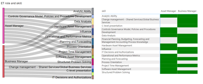
I need to show the following analysis in sankey chart, can anyone help me to achieve this in Power BI:-
Scenario:-
►When user selects their current role and their aspirational role, the visual should show skill overlaps and skill gaps.
For example, Asset Manager (11 skills) and Business Manager (10 skills) have an overlap in 6 skills:
►Analytic Ability (ET)
►Data Analysis (ET)
►Influence
►Planning and Forecasting
►Project Time Management (ET)
►Structured Problem Solving
There are 4 skills that Asset Manager needs to build to become Business Manager:
►Change management – Shared Services/Global Business Services (ET)
►IT Decisions and Authorizations
►Financial Planning, Budgeting, Forecasting and Management Accounting Process Knowledge
►C-level presentation
Please find the visual and link to samle data:-
https://docs.google.com/spreadsheets/d/1TbWId-ZvTvHudYwyfIWdjrVxNVSDx-MCpLlXcel0Av8/edit#gid=0
Regards,
Harish
Solved! Go to Solution.
- Mark as New
- Bookmark
- Subscribe
- Mute
- Subscribe to RSS Feed
- Permalink
- Report Inappropriate Content
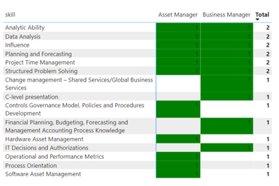
You are using the wrong visual. A matrix visual with conditional formatting would work better but you need to find one that allows for vertical column header text.
If you play with the weighting you can even end up with a visual that spells out exactly which skills are still needed.
- Mark as New
- Bookmark
- Subscribe
- Mute
- Subscribe to RSS Feed
- Permalink
- Report Inappropriate Content
One approach would be to use a binary decision tree
- skills that match - 1
- skills I have but not required in new role - 2
- skills I need - 4
and then add them up.
But it's really up to you to decide what is important to you in this particular scenario.
- Mark as New
- Bookmark
- Subscribe
- Mute
- Subscribe to RSS Feed
- Permalink
- Report Inappropriate Content
Thank you @lbendlin for your help, I will have some logic created with the idea given.
- Mark as New
- Bookmark
- Subscribe
- Mute
- Subscribe to RSS Feed
- Permalink
- Report Inappropriate Content
You are using the wrong visual. A matrix visual with conditional formatting would work better but you need to find one that allows for vertical column header text.
If you play with the weighting you can even end up with a visual that spells out exactly which skills are still needed.
- Mark as New
- Bookmark
- Subscribe
- Mute
- Subscribe to RSS Feed
- Permalink
- Report Inappropriate Content
@lbendlin Thanks for giving me an alternate solution, this helps and all this while I was just glued to achieving this in sankey chart. I just want a visual to tell the story irrespective of which visual I use, could you please help me with the weights if possible.. I am not sure how to achieve that!!
Helpful resources

Microsoft Fabric Learn Together
Covering the world! 9:00-10:30 AM Sydney, 4:00-5:30 PM CET (Paris/Berlin), 7:00-8:30 PM Mexico City

Power BI Monthly Update - April 2024
Check out the April 2024 Power BI update to learn about new features.

| User | Count |
|---|---|
| 111 | |
| 100 | |
| 80 | |
| 64 | |
| 57 |
| User | Count |
|---|---|
| 146 | |
| 110 | |
| 93 | |
| 84 | |
| 67 |


